Painting a 90 Year Old Dog

Buck Painting
“Buck,” 10″ x 8,” oil on canvas.

My pop just celebrated his 90th birthday! My mom will be doing the same in January. Lucky for me, huh? My dad’s unbelievably difficult to buy gifts for. He doesn’t want much, but when he does want or need something, he just goes out and purchases it. Up until recently golf was his passion, so you could always pick him up something associated with that, but a deteriorating back put an end to his time on the greens.

Pop & Buck Photo
My dad at 9, with Buck and his grandparents, Dallas, TX.

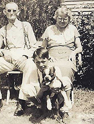
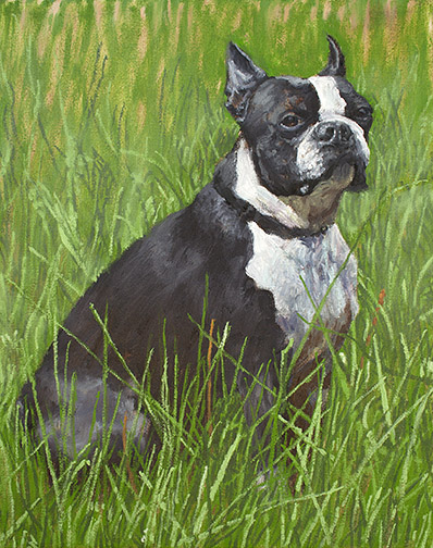
So, I had no idea what I was going to get him for this very special birthday. Then my wife, Betty, came up with a great idea. My father had the worst of childhoods. His mother and father split up, when he was very young. When my dad was 5, his father stopped by on the way out of town to say he was pulling up stakes and didn’t know when he’d be able to see him again. My dad didn’t hear from his father again until his was 13 years old and didn’t see him again until he was 35. His mother took off with her boyfriend (later to become my pop’s step-father) around the same time, leaving her parents, my pop’s grandparents, to care for him. This was during the Great Depression of the 1930s. Stripped of all else, he held two precious possessions, the deep unconditional love of his grandfather and a boston terrier named Buck. Betty suggested I create a painting of Buck for him.

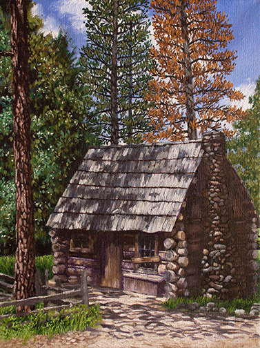
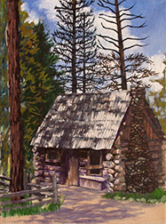
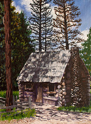
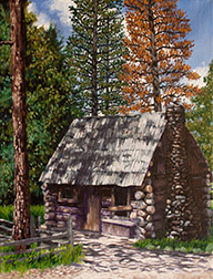
With only a week before the extended family party in L.A., I had to hunker down and make swift progress. My first decision was to work small. They have a small home, filled with the products of their many interests, anyway, so there isn’t a lot of wall space there. I chose an 10″ x 8″ canvas.

Buck Charcoal Layout Image
Charcoal pencil layout sketch.

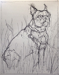
I had a couple of old photographs of Buck, with my pop and his grandparents from the 1930s. These gave me an indication of the dogs specific markings, but I had to do a lot of online photo research of boston terriers to collect the more detailed information about the breed that I needed. I started with a soft charcoal pencil sketch on the canvas to establish my composition. Hard to maintain a clean line, at this small size, where every mark is magnified, but it will get the job done.

Buck Underpainting Image
My turp wash darks underpainting.

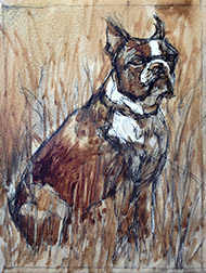
Squinting at my reference, I visualized the gross masses making up my darks, mid-tones and lights. Then, with my eyes fully open (no longer squinting) I moved on to a turpentine wash (actually I use Gamblin’s Gamsol) underpainting, in burnt umber, to establish the orchestration of my darks throughout the painting. Notice how the darks weave in and out of background, mid ground and foreground. It’s these dark shapes that cement your composition together and it’s why I do an underpainting first. Working this way allows me to sneak-up on the finish, closing in on the painting and building my confidence that things are going to work out, more with each step.

Buck End of Day 1 Image
My painting, end of a 6 hr. day 1.

I added basic transparent color washes, to dye each general area, so if I didn’t cover everything completely with opaque paint, I wouldn’t have any bright white holidays (missed areas) showing, before moving on to opaque painting, i.e.: transparent green over the grasses, transparent grays over the black patches on the dog. I always paint dark to light, but sometimes my underpainting darks are dark enough that it makes more sense to move right to the mid-tones and lights, then return to the dark areas and repaint them in the proper colors. At the end of about 6 hrs. on day one, I had most of the work behind me, just detailing the grass and a few adjustments on the dog left.

Buck Day 2 Image
Day 2, I added grass detail.

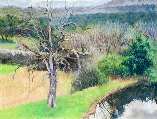
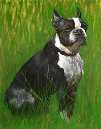
Day 2 only allowed me 2 or 3 hours of painting time, but I managed to make a few passes on the grasses, adding a couple of dark passes and a couple of light passes. I decided that I liked the idea of leaving the extreme, most distant areas of the grass background rough, but determined I’d need to blur the mid-ground grass details into the background a bit, to make it all work.

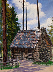
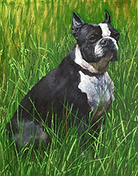
With my last day, day 3, I blurred the mid-ground grass detail a little into the background and added a few more light details to the foreground grasses. I also did a little more final detailing on the dog, Buck, to bring us to the finish, shown at the top of this post.

My pop was totally surprised and emotionally touched by the unexpected gift. The painting brought back a lot of pleasant childhood memories he hadn’t visited in quite some time.

Painting Andersen’s Mountaineering Cabin

Anderson's Mountaineering Cabin Image
“Anderson’s Mountaineering Cabin,” 12” x 9” oil on canvas, Framed $913.00, Unframed $785.00

I recently finished this painting, begun en plein air, in Yosemite, during my stay as a Yosemite Renaissance artist in residence and I thought I’d walk you through its various stages from start to finish.

As many of you may have heard, during my residency, I invited many of my local artist friends to come up to the park and paint with me. This whole trip came together quickly, but even with short notice, 7 of them were able to make it. On this, our last day, 4 artists were painting with me.

Anderson’s Cabin, is located in Pioneer Village, in Wawona, a collection of historic Yosemite structures from all over the park, brought together in one location to form a little trip back in time hamlet. There are many great structures to paint there, but we all decided on this one on that particular day.

Anderson Cabin Turp Wash Image
My ink blue turp wash underpainting, quickly maps out the scene lighting.

I started this outdoor painting, as I most often do, with an ink blue turpentine wash (50% painting medium, 50% solvent) underpainting. I find shadows outdoors tend to be cool, so the blue is a good choice and since I always work from dark to light, using the one color prevents me from having to mix multiple dark colors, prior to getting all my darks blocked in. Mapping the scene lighting out quickly is critical in plein air painting, as the light changes very quickly. Not having to mix multiple dark colors significantly speeds the process.

Anderson's Cabin Plein Air Image
My painting at the end of the plein air, on location painting session.

With the darks laid out, I quickly washed in general area color, prior to roughing in opaque paint. That way, if I miss tiny patches, known as holidays, with the opaque paint, they don’t show, the underlying canvas having been pre-tinted. With my darks down in ink blue, I begin adding medium value opaque colors, then lights and finally start replacing the ink blue dark wash with dark colors of the correct hue. Here’s the painting at the end of my 4 hour, on location, painting session.

I’m rarely happy with the final result of my plein air sessions and generally either work into the canvas back in my studio or use the painting as a color sketch for a larger studio painting. I’d committed to a show of the works we produced during the week, so, in the interest of time I’ve decided to add more detail to the actual plein air canvas this round.

Anderson's Cabin 5/25 Image
After 1st day in the studio

Reviewing the reference photos I shot on location, I realize that in painting the roof I painted out all the shadows from the trees. During this first session in the studio, I begin returning the shadows to the roof, add dark grout to the chimney and lines separating the individual logs that make up the walls of the cabin. I also finalize the sky and clouds, since everything else will be painted over this.

Anderson's Cabin 5/30
End of 2nd studio session

During my next session I finish most of the detailing to the roof (I found I needed to add light values, as well, in order to get the shadows correct), I begin to detail the log walls of the cabin and start adding back branches (painted out by the sky) and foliage to the trees behind the cabin.

Anderson's Cabin 6/1 Image
End of 3rd studio session

Another day and it’s about working the values on the chimney side of the cabin. I needed to adjust until that side of the building  looked like it was truly in shadow. Detailing the stone chimney, including adding the light that hits its stones here and there was a bit tricky, but I finally got it to a point where I was satisfied. I realized the ground shadows, there in the morning, but painted from memory, at the end of the day, were wrong, so I changed those.

Anderson's Cabin 6/6
A couple of sessions later

Through a couple more sessions I detail the foliage and trunks of the trees.

One last session of final details, including the detailing of the rock border around the grass in front of the chimney, takes me to the finish, shown at the top of this post.

I popped the painting into a floater frame and took it wet, along with the other finish (El Cap & Dogwood) and plein paintings I created during the week, over to Gallery 5, so I could help Jon Bock install the show. The show is titled, “A Week in the Park: Plein Air Works by Trowzers Akimbo & Friends.” It’ll be there through June 22, 2017.

Artist in Residence in Yosemite – Day 1

In progress Chilnualna Falls, oil on canvas 12″ x 9.”

I’ve been awarded artist in residence by Yosemite Renaissance, which comes with a 2 bedroom cabin at Wawona, in Yosemite National Park, for a week.

I’ve invited many artist friends, in the area, to come up and join me, so we can go out together and paint plein air. Some are staying with me overnight in the cabin for a day or two, others coming up for the day. 7 days of painting with friends in Yosemite.

I’ve decided to use the week to see if I can make selections and simplify enough to finish the paintings on location, in one sitting. True plein air. It’s tough for me, because I generally like to add a little more finish to my paintings. I haven’t been able to resist taking all the plein air paintings, I’ve produced so far, back to the studio for more polish, but it’s hard to justify all the extra work put into paintings so small. Better to find a personal shorthand I can apply to my plein air paintings.

Today was the first day of the residency and I was joined by Carolyn and Sandee, two artist with a lot of experience painting plein air. We chose to paint a location close to the cabin, Chilnualna Falls. With all the rain and snow we had this winter, combined with the current warmer temperatures, our waterways are breaking records. This normally trickling stream’s been converted into a torrent of quickly moving, twisting, splashing gallons of water.

All good, but I didn’t reach my goal today. This painting still needs more work, before it’s finished, even by plein air standards. I think, with the waterfall, I took on too much for the time allotted. Wish me better luck tomorrow.

The Balancing Act

Bare Tree and Pond Image
In progress pastel painting, “Bare Tree and Pond.”

I chose to use pastels during last month’s Yosemite Western Artists pleinair outing. It had been awhile since I’d worked with the medium and I committed to perform a pastel painting demo in June. I like to have a lot of new samples, in the medium I’ll be using, to display during demos, so it will be pastels from now until the June.

I spend most of my time painting in oils, but last year I painted in acrylics all year long in prep for a week of taking park visitors out to paint Yosemite, on behalf of the Yosemite Conservancy’s Art Center. They didn’t want me taking groups out to paint in oils for fear they’d irresponsibly dispose of their solvents.

I work in a wide variety of mediums, oils, acrylics, watercolors, pastels (haven’t dabbled in encaustics, yet), always have. I think I’ve discovered something useful to all artists in my experience doing this.

With great painting the elements in your subject matter determine application. You apply paint different when painting water than you do when painting trees or rocks, for example. Here’s where balance comes into play: whenever you become comfortable with any given medium (balance), you begin to take its application for granted.  It becomes too easy to rely on past “pat” successful application approaches, instead of letting elements determine fresh methods of application.

When you work with a medium you haven’t touched for awhile, you have no choice but to work with the attributes particular to that medium, redetermining application approaches. You’re a bit out of balance for awhile. The attributes of pastels, for example, force different application solutions when painting water, trees or rocks, than working with oils does. Acrylics, another unique set of attributes, as is the case with watercolors or graphite pencils or encaustics, etc.

When you return to your original medium of choice, you do so with fresh eyes (having been away from it for a time) and possibly new application approaches. For me, anyway, this ongoing introduction of imbalance, through use of a variety of mediums has kept me moving forward and cut down on repetition. I highly recommend it!