Building Canvas Stretcher Bars from Scratch

I’m all for the convenience of buying a commercial pre-stretched canvas at my local art store. I’m ready to start painting as soon as I get it home. I don’t have to spend days, buying the lumber at the lumber yard, fabricating the stretcher bars, stretching the canvas and, if I’ve chosen raw canvas, sizing and priming the canvas, with multiple coats of acrylic gesso (sanding each coat), before I can actually put the canvas up on my easel.

There are occasions/arguments, for building your own canvas from scratch, however:

  • You want to be sure the canvas has been sized & primed following proper archival procedures. To achieve this you’d only need to stretch the canvas. You could buy and assemble commercial stretcher bars.
  • You need a non-standard size canvas. Commercial stretcher bars are only available in one inch interval lengths (12,” 13,” 14,” 15″…etc.), not fractions of an inch.
  • You need a larger canvas. Your local art store is unlikely to carry commercial stretcher bars in long lengths and I’ve never seen them available anywhere beyond 7′ in length.

I’m facing one of the above situation right now. I’ve got a commission for a mural-sized painting on canvas for a children’s hospital. The canvas needs to be 4′ x 7.’ I’ve found a source for commercial stretcher bars in the 7′ length, but I’d still need to figure out how to cross brace it, to prevent warping during the stretching process, and the 7′ lengths are pretty expensive to purchase and ship. I’ve decided it’s just as easy to build my own stretcher bars from scratch and I’m going to take you along on the ride.

Pine 1″ x 2″s

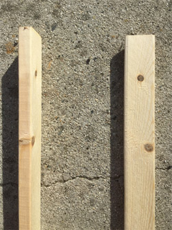
I’ll use 1″ x 2″ common pine for my stretcher bars. I prefer the more expensive kiln dried clear pine, but that’s very difficult to find. The first step is to determine how much lumber I’m going to need. I begin with a free-hand layout of my stretcher bars, including the cross-brace supports and dimensions.  You need cross bracing every 2′ – 3,’ both vertically and horizontally to prevent your stretcher bars from warping, when you stretch the canvas over them.


My Sketch

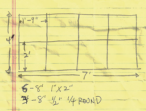
From my sketch I can determine how much lumber I’ll need and in what lengths. Lumber yards usually sell lumber in lengths based on 1′ increments, but your local hardware store or big-box hardware center may only provide lumber in fixed lengths (often 8′), so if one of the later two is going to be your source, check lumber availability out ahead of time.

For my 4′ x 7′ canvas I’ve decided I’m going to need six, 8 foot 1″ x  2″ sticks. They break down like this:

  • Two 8′ sticks provide two 7′ stretcher bars
  • Two 8′ sticks provide one 4′ stretcher bar & one 4′ brace each
  • One 8′ stick provides the 8′ brace
  • One 8′ stick provides two 4′ braces
1/4 round stock

I’m also picking up three 8′ and one 9′ length of 1/2″ quarter-round trim. I’ll explain what this is and why I need it later in this post. I’m also purchasing a small piece of 1/4″ masonite or plywood (if they have a scrap, that will be fine) to make corner triangles to hold my finished stretcher frame square.

Back home with my supplies, I’m ready to begin. We’re going to build our stretcher bars with the lumber standing on its narrow 1″ side (actually about 5/8″), so when complete, our stretcher frame will have a side depth equal to the 2″ side of the lumber (actually  about 1 7/16″).

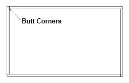
I start by measuring and cutting the stretcher bars (as opposed to the braces). We’re going to butt the corners of our stretcher bars together, as indicated at left. This means we’ll need to subtract the thickness of our sticks from the 7′ and 4′ length to arrive at a finished canvas that is exactly 4′ x 7.’ Since our 1 x 2s are 5/8″ thick, I subtract 5/8″ from my 4′ and 7′ total lengths to arrive at 3′-11 3/8″ and 6′-11 3/8″ respectively. Make your cuts straight across (at 90 degrees). You can use a hand saw or power saw (whatever you have available) to accomplish this.

Corner right triangle

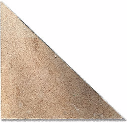
Next I’ll cut my  4 corner right triangles from the masonite or plywood I purchased. For a canvas this size, I’ve decided to make my triangles 4″ on the 90 degree sides. For smaller canvases you can create smaller triangles.

With the parts cut, I’m ready to assemble. I nail each butted corner of my 1 x 2s together.


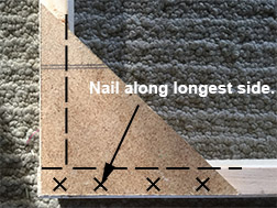
With the outside of the stretcher frame now nailed together, I need to square it (make each corner a true 90 degrees). I start by placing two of my four triangles in corners diagonally opposite each other. I nail the two triangles along their longest side only. Next I measure diagonally from one corner of the frame to the other. Then I measure the distance from the other two corners diagonally located across from each other. Both distances need to be exactly the same. If they’re not, I’ll adjust the square of my frame,

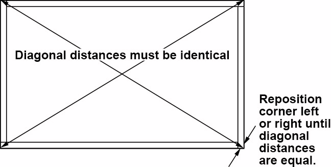
moving one of the corners left or right until they do measure the same. Once both measurements are the same, I nail down the other sides of the two triangles. This will lock my stretcher frame square. I nail the remaining two corner triangles in place along both of their respective sides.

If you have distances of more than 2 1/2′ along any side of your stretcher frame, you’ll need to add supports. Support should be added at least every 2 1/2.’ Stretching canvas over your frame creates a great amount of tension on the frame. Without the braces, the frame will bow/warp.

Vertical braces

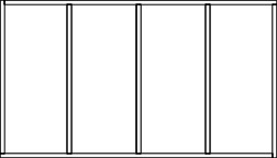
My 4′ x 7′ stretcher bar frame requires 3 braces for the long side and 1 for the 4′ side. I’m starting with the 3 braces that will support the long sides. I subtract 1 1/4″ from my total 4′ length to compensate for the thickness of outside frame on each side (5/8″+5/8″ = 1 1/4″) and cut each (3) of the braces to a length of 3′-10 3/4.” I then nail the braces in place at equal intervals along the 7′ length.

Staggered horizontal brace

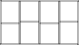
Now I’ll move on to the horizontal brace. I’ll cut this long brace into 4 pieces (one for each space created by the vertical braces) and stagger them along the horizontal center line to facilitate easy nailing. I take an accurate measure of each horizontal space and cut my braces to length accordingly. I then nail each brace in place.

I built frames just like this for many years, but always had to gingerly step around an inherent problem in the design. Since the stretched canvas made full contact with the frame and braces, their edges could telegraph onto the surface of the canvas, as I was painting, if I wasn’t careful. Rotating the braces 90 degrees, so their widest side faced the back of the canvas and positioning them in the exact middle, front to back, of the frame prevented their telegraphing, but this allowed the frame to warp on the front or back edge, when the canvas was stretched over the frame and still left me with the edges of the perimeter frame telegraphing.

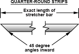
While visiting our property in Taos, NM, an artist friend living there showed me the new custom canvases he’d just had built. They were a little deeper than the ones I’d been building myself and, on examining the backside, I discovered a great solution to my telegraphing problem. Here’s where the 1/2″ quarter-round trim we purchased at the lumber yard comes in (and you thought I’d forgotten about that). By nailing the quarter-round trim, curve side facing in, along the top of the perimeter of our stretcher bar frame, we raise the canvas 1/2″ above the  framing lumber. Because of the curve, the canvas only makes contact with the quarter-round on the outside edge of the trim, completely eliminating the telegraphing problem. Eureka!

Finished, butted quarter-round corner.

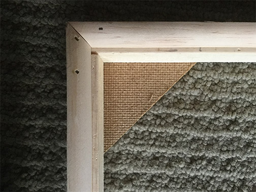
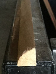
To do a professional job with the quarter-round you need to invest in a basic miter box  and the box saw that works with it, to cut accurate 45 degree corners. I measure my quarter-round to exact lengths of my stretcher bars (in my case two 7′ and two 4′ pieces). This is the top or outside measure of my 45 degree cuts. I make my cuts accurately, then butt my strips at the corners, making sure the edge of the quarter-round aligns with the outside edge of the stretcher bars. I nail the quarter-round in place (one nail about every 8″).

That’s it! A lot more complicated to describe than do. I’ll walk you through the process of stretching canvas over the stretcher bars, as well as how properly prepare the canvas for painting, in a future post.

Making Marks vs Blending

Cézanne Still Life Image
“Still Life with Chest of Drawers,” Paul Cézanne.

One of the final levels of sophistication in painting is the character of the marks you make on your canvas. Growing artists often overlook this attribute in painting, choosing to blend everything instead. Over-blending is a contrived approach to painting surfaces and removes the power and character of the painting process that marks bring to the work.

I suppose this over-blending tendency comes from seeing the paintings of the Renaissance masters, who’s surfaces appear blended. Those surfaces were the result of the painting mediums and required application techniques available at the time. Most artists of the fifteenth century were painting with egg tempera, a very transparent painting medium. The application required elaborate underpainting and glazing techniques, where a complete, dark, monochromic underpainting base was created, before layer after layer of semi-transparent egg tempera color was glazed, painstakingly, over the top. The slow building up of these many semi-transparent levels gave the edges in the final surfaces of the painting a very smooth and blended appearance.

Sargent Painting
“Alice Vanderbilt Shepard Amon Carter,” By John Singer Sargent

Sargent Detail
“Alice” close up

If you examine the paintings of later oil painting masters, you’ll find the character of THEIR surfaces to be more active. Take a close look at a painting by John Singer Sargent, for example. In your memory you see his surfaces as smooth and blended, but through a more precise examination you’ll realize they’re made up of precisely placed individual marks. Areas of less focus, like her lace blouse and jacket are painted with even more energetic strokes.


Other painting giants were even more expressive. Each with a character to their marks that were all their own.

Manet Detail
Detail, “Le Printemps,” by Edourd Manet

 
Monet Detail
Detail, “Madame Monet and Her Son,” by Claude Monet

 
Renoir Detail
Detail, “Luncheon of the Boating Party,” by Pierre-Auguste Renior

 
Degas Detail
Detail, “Waiting,” by Edgar Degas (pastel)

 
Cézanne Detail
Detail, “Still Life with a Chest of Drawers,” Paul Cézanne

 
Van Gogh Detail
Detail, “Self Portrait,” by Vincent Van Gogh
Close values soften edges

While most subjects present both hard and soft edges, you don’t have to blend an edge to make it appear soft. A more interesting approach is to retain your marks and simply apply a series of close


Close values soften edges

values to turn an edge, like Vincent did on the leading edge of his face and the back of his head in the above, “Self Portrait.”


One of the best ways I know of for breaking the habit of blending everything is to do what you should be doing anyway and work the entire painting at the same time, working from rough to tight. When you’ve adjusted everything else to your satisfaction, then and only then ask yourself if any of the edges need to be blended. I think you’ll find that they do not!

Painting from Photographs

Painting & Photos of Wawona Covered Bridge
Begun on location, I utilized both of these photos to finish my “Wawona Covered Bridge” painting in the studio.

I just ended my fall 10 week “Painting Tune-Up” workshops with a discussion about painting from photographs. It would be great to always paint from life, that remains my goal and should be yours, but there are always situations when working from a photograph is the best or even the only solution. With that in mind, I thought I’d discuss the pitfalls to watch out for and some techniques for getting the most out of working from photos.

Painting from photographs gets a bad rap. It’s always better to work from life (I’ll discuss why later in this post), but in certain situations a photograph is the only way to access a subject. Here are some situations when photography offers a solution:

• Painting postumous portraits
• Insufficient time to finish a painting on location
• Freezing quickly moving subjects in motion
• Locations offering no place to set up an easel
• Limited physical mobility
• Capturing a record of your subject, as insurance, for future emergency use
• Documentation of subjects you want to return to, when time allows
• Capturing intricate subject details for later reference
• Getting your painting on a computer for non-destructive experiments

Photographs can be a wonderful aid for artists, but they do present some inherent problems for which we need to compensate. A photograph is a technical recording of a live subject. It can’t capture the physical or emotional feeling presented by a subject or location that being there can.

A painting from life is a direct personal interpretation of all the 3 dimensional information presented by the subject. A photograph is a pre-flattened 2 dimensional recording of a 3 dimensional subject. It’s missing all the 3 dimensional information.

Even today’s latest cameras can only capture a subset of the full color and value spectrums present in a subject. The lighter areas in photos tend to be blown out (over-exposed) and the darker areas darker than the original subject (masking detail in the shadows).

Because a camera evenly records all attributes of the subject before it, painting exclusively from photographs can lead to over detailing, no distinction of detail in the focal area from the rest of the painting.

Cameras also inject their lens distortions into photographs, exaggerating foreshortening and distorting perspective towards the edges of the image. You need to be aware and compensate for these inaccuracies, when painting from photographs.

Photo Exposure Bracketing Image
Example of “bracketing” your photographs with multiple exposure, © 2017 Blaize.

Here are a few good practices to overcome the problems and limitations in photography, discussed above.

  1. Begin your paintings from life, whenever possible, even when you know the majority of  work will be done in the studio from reference photographs.
  2. Shoot your reference photos a bit wider than the composition on your canvas. You’ll often find, during the painting process, that you want to bring elements along the edges further into frame.
  3. Bracket your reference shots. Bracketing is a term to describe the practice of taking multiple shots of your subject at different exposure settings, from slightly over-exposed, through correct exposure, to slightly under-exposed. Most cameras and smart phones today have a bracketing setting to automate this process.
  4. Examine your subject, through the camera’s viewfinder, for the following: details that require dedicated shots, light areas that will likely over-expose or wash out, dark areas that will under-expose, losing color and details. Compensate for these losses by making mental and physical color notes.
  5. Paint a color key thumbnail or add patches of the correct colors in unfinished areas of your painting, while on location.
  6. Avoid working from photographs shot by others. You have no relationship to the live subject in these.
  7. Paint from the photos you’ve taken A.S.A.P. while the actual location is still fresh in your memory.
  8. Simplify areas of unnecessary detail present in the photo
  9. Correct lens distortions present in the photos

We all must work from photos at one time or another. Remaining aware of photo limitations and compensating for their flaws assures a successful outcome in the painting from photographs process!

How to Properly Hinge Artwork

Completed Hinges Image

When I was a kid and I finished a piece of artwork I felt warranted a mat and frame, I cut the mat, grabbed my roll of masking tape and tapped the piece into the mat. When a dark stain began to appear, years later, where tape touched art, I suspected I was doing something wrong.

Since those early days, I’ve learned about pH acid levels in papers, mat and mounting boards and the proper way to mount an artwork. Hinging is used to properly attach original art to acid free mounting boards in a manner that does no harm to the artwork and provides a weak link, should the work ever be mishandled. The concept is that the hinge, not the artwork will tear from the mounting, if the artwork is abused.

Wheat Starch

The hinges should be made of Japanese paper (rice paper or mulberry paper). If you take your original art to a framer to be hinged, matted and framed and they want to use something other than Japanese paper for the hinges, find another framer. It’s that important! The hinges need to be attached to the artwork and mounting board using neutral pH Wheat Starch paste. Both the paper and wheat starch can be purchased at your art supply store. The wheat starch is turned into a paste, by adding distilled water and heating it in a double boiler or microwave oven (my preferred method). Instructions on accomplishing this are on the package. Wait until all your other materials are prepared and ready, before making the wheat starch paste or it can harden before you’re ready to apply it.

Wheat Starch Paste
Wheat starch paste

You want to tear, not cut out, your hinges from the sheets of Japanese paper. Sharp, straight, uniform edges are more likely to telegraph through the artwork you’re hinging, than the organic, feathered torn edges will. The tearing and feathering is easily achieved. Wet a small, thin paint brush with water. Draw you tear line on the Japanese paper with the wet brush and pull the paper apart along the wet tear line.

Tearing the Hinges

You’re going to create a “T” or cross, made up of two, overlapping strips of the Japanese paper for each hinge. A minimum of two hinges, across the top of your artwork, are necessary, but I like to add a third along one side of my art, for more stability, in case someone carries it sideways.

Glueing 1st Part of Hinges
Glue half of each hinge to the back of the artwork.

Apply 1/4″ of the wheat starch paste to one end of half of your paper strips. Allow the paste to dry a bit, so it’s not sloppy wet and glue these hinges to the back of your artwork, leaving the long dry portion of the hinge protruding. Set the artwork, with attached paper strips, aside to dry. Because the paste is moist when you attach the strips to your artwork, I don’t like to use hinges on artwork created on thin paper, like normal weight pastel paper or drawing paper. I don’t want to take a chance on the artwork buckling where the hinge attaches, due to the moisture and, with thin paper, I’m also concerned about the paper hinge strip telegraphing through. In these cases, I avoid paper hinges and use archival corners instead (see my post Special Framing for Soft Pastels for an image of an archival corner).

Hinge the Mat
Hinge the mounting board to the mat with archival tape.

Proper archival mounting of your artwork requires you to hinge the art to an acid free mounting board, not the mat. You want to set up mounting board and mat as a hinged sandwich for your artwork. Butt top edges of mounting board and mat and attach them together with a hinge made with a piece of archival, acid free tape.


Weighing Down the Art
Align art in the window & add a weight.

Slip your artwork, with the paper hinge strips attached, into the mat-mounting board sandwich and properly align the image in the mat window. You’ll need to place a weight on the artwork, to hold it in place, while you flip up the mat out of the way and paste down the final strips of paper, to complete your hinges. I’ve found a heavy old-fashioned glass to be a great weight. Be sure to place a piece of paper (I’ve used tracing paper here) beneath your weight to prevent it from marring your artwork.

Using your wheat starch paste once again, paste down the final paper strips to make the “T’s” and complete your hinges. Allow this paste to dry and you’re ready to close the mat-mounting board sandwich and install the assembly in your frame.

Glue Down Final T-Hinge Strips

Rest easy in knowing you’ve done all you could to provide a professional, museum quality, safe, acid free, archival home for you valuable piece of art!

Final Frame Photo

Brush Up

Applying Paint Photo

Too often we overlook the full capabilities of the tools in our paint boxes and forget that they were designed to ease our workload and extend the impact of our work. Let’s talk a bit about brushes.

Ancient Egyptian Brush Photo
Ancient Egyptian Brush formed from sticks flayed at one end.

The artist paint brushes in our hands today are the product of centuries of evolution. They are modern marvels, the result of extensive, in the field, use and contemporary engineering. That’s all wasted, however, if we ignore all they can do.

It’s important to use the proper brush for the job at hand. My favorite workhorse brush, when painting with oils or acrylics, is the bristle brush. This baby’s stiffness can move the thickest of paints across a canvas and is great for scumbling, dry brush and impasto techniques. It’s my go to brush for most of my painting needs.

When you’re painting wet into wet, especially in a single session, alla prima, you’ll find the bristle brush less effective in paint over paint application. It’s rigidity tends to pick up the wet paint from lower layers, mixing them with the new paint you’re attempting to apply, preventing you from applying clean new strokes. This is when you want to utilize your sable brushes. A light touch with one of these, will float the new color on top of the previous applied wet layers.

Glazing (transparent layers of color utilizing large amounts of painting mediums) can be accomplished by either bristle or sable brushes. It all depends on the viscosity of your mixture.

I covered the proper brush for the job in more detail in a previous post, “Be Good to Your Brushes & They’ll Be Good to You!

Grasses Image
Thin, overlapping vertical & diagonal strokes for grass.

What I actually wanted to talk about in this post was allowing your brushes to do some of the work for you. All the subjects you paint possess visible characteristics quite different from each other. These characteristic are the result of things like growth patterns, chemical make-up, environment wear, etc. The leaves on a tree present a much different surface characteristic than, say, the granite face of Half Dome, in Yosemite, for example. Yet, it’s easy to ignore this fact and apply paint to canvas in the same uniform manner, when executing all elements in our compositions. Boring!

Clouds Image
Rolling a bristle brush around, with occasional edge flicks to communicate clouds.

Instead, pay attention to how the elements you’re painting grow, what they’re made of, how they move, how their surface reflects light and color and then allow your brushwork to communicate this. The British painter, Alwyn Crawshaw, famous for tv shows, books and videos on painting, suggests you try to become the element you’re painting, “I’m a fluffy little cloud!” Then paint the element accordingly. A bit over the top form me, but I get what he’s saying.

El Cap Detail Image
Crisp vertical strokes for granite.

What does this actually mean: allow your brush to reflect the characteristics of various elements in your paintings? Well, when studying the granite face of a monument like Half Dome or El Capitan, in Yosemite, you’ll notice it has very chiseled characteristics with strong vertical concave and convex up and down forms. A great approach in painting these, might be to use the edge of a flat brush to create vertical strokes, occasionally rolling the brush a bit, from side to side, to vary width in the process.

Leaves Image
Globbed paint then flicked at the edges for leaves.

Foliage on trees often starts with a glob of paint and ends with a flick of the brush towards the edges. With clouds, rolling the brush around, then flicking an edge here and there might be the best solution. Ground is often a series of short horizontal strokes, reflecting the years of overlapping footprints of man and animals. The directions of strokes over a face in a portrait reflect the anatomical structure beneath. Strokes representing a flowing river tell of the repeating pattern it creates as it travels around rocks and over an uneven river bottom.

How you portray the various characteristics of the elements that make up your paintings is a personal choice, there’s no ONE good solution. I’m suggesting that your paintings will be more dynamic, more interesting, if you consider the actual structure, make up, of the elements in your compositions, then reflect this to your audience with how you use your brush in your paint application.

Chasing Shadows

Ahwahnee Bridge Detail Image
“Ahwahnee Bridge (detail),” by Trowzers Akimbo

One of the most difficult concepts for artists to understand or accept, I find, is color theory. It’s a tough buy-in to ask of anyone who’s been taught all their lives that the primary colors are red, blue and yellow (subtractive color) and that when these 3 are combined, a murky black is the result, to now understand, that with light (additive color), the primary colors are red, blue and green and, when combined, result in white. It doesn’t seem possible!

Subtractive Primaries Image           Additive Primaries Image

An extension of that reluctance of acceptance is the fact that shadows on an object are not just darker versions of the color of that object in light, but, in fact, completely different colors. For example, a red apple’s shadows are actually some form of green, not just a darker red. The consequence of this lack of acceptance is artists just adding black to colors to create shadows, resulting in myriad, otherwise beautifully executed, paintings continuing to exhibit dull, dirty, lifeless shadows.

Viewing Color Image
Red light reflected back to eye.

In hope of convincing those holdouts, let’s quickly review how the eye perceives the color of elements in the world. Clean white light is the resulting combination of all colors in the light spectrum. All colors in the light spectrum being those we see, when this white light is refracted, then reflected by a Prism or in a Rainbow. The various subjects we encounter in the world don’t actually have a color, per se. Instead their molecular make-up either absorbs the various colors of the light spectrum or reflects them off the surface of the subject and back to our eyes. So, when you perceive an apple as red, you’re doing so because that apple could not absorb red colored light and reflects that light back to your eyes. All other colors in the light spectrum (blue, purple, green, yellow, etc.) are absorbed by the apple. In the case of shadows, direct light is blocked, in turn, the light color being bounced back to our eyes is also blocked, leaving a combination of all remaining colors of light in the shadow. Confusing? Yes, but there’s a simpler way to remember this!

Color Wheel Image
The Color Wheel

The color wheel is one of the most important tools in an artist’s paintbox. Among other things, it’s your simple guide to the color in shadows. As it turns out, the shadow color of any given color is its compliment. Take the primaries red, blue and yellow. Yellow’s compliment is violet. Remember our discussion above, stating the shadows of any given color are a combination of all the remaining colors in the color spectrum? Well, those astute readers out there have likely already realized that yellow’s compliment, violet, is the combination of the two remaining primary colors, red and blue. The color wheel makes calculation unnecessary and locates each color’s compliment directly across from it on the wheel.

While there are other factors involved in determining the final color of a given shadow, like value, nearby reflected color, color of the surface on which the shadow falls, etc., knowing the base color of shadows, moves you away from black and assists you in using your eyes to determine what’s really there before you.

Carry a small color wheel around with you, use it diligently to help determine color in shadows and you’ll find, in a very short time, that you have it memorized. Your shadow depth will increase and your paintings become more lively!


Necking

Dirty Paint Tube Photo
Dirty paint tube neck.

I never used to even consider paint tube hygiene to be of any concern in my painting. I just put up with the built up dried, gooey, messy paint that collected around the neck of my paint tubes, the difficulty this caused in getting the caps to screw on properly and even broken paint tube caps. I just thought this was the way all painters lived: simply a cost of doing business in this bohemian world.

After a lifetime in this “dirty” world, I recently discovered a path to a cleaner life. It requires a change of habit and a bit of diligence, but I think I’m up for the task. I’m tired of grinding concentrated bits of pigment into the floor of my studio or tracking it through the house, when a bit of this goop, unseen, falls from the neck of a tube and ends up on the bottom of my shoe.

Clean Paint Tube Photo
Tube neck after cleaning and oiling.

How do you adapt this change in lifestyle? You start by removing the paint goop from the neck of each paint tube in your paintbox. If the tube is almost empty or the gunk is too difficult to remove, just give up on this tube and begin your new regimen of hygiene, when you’ve used the color up and replaced it with a new tube. Once the paint is removed from the neck, apply a drop of linseed, walnut or safflower oil (your oil of choice) to the threads on the neck of the tube. You won’t believe how smoothly the cap now screws on and off. From there, it’s just a matter of wiping away wet paint from the threads, whenever it begins to collect and applying the oil.

Stay the course and your paint tubes will function like well oiled machines. Ugh!

Painting a 90 Year Old Dog

Buck Painting
“Buck,” 10″ x 8,” oil on canvas.

My pop just celebrated his 90th birthday! My mom will be doing the same in January. Lucky for me, huh? My dad’s unbelievably difficult to buy gifts for. He doesn’t want much, but when he does want or need something, he just goes out and purchases it. Up until recently golf was his passion, so you could always pick him up something associated with that, but a deteriorating back put an end to his time on the greens.

Pop & Buck Photo
My dad at 9, with Buck and his grandparents, Dallas, TX.

So, I had no idea what I was going to get him for this very special birthday. Then my wife, Betty, came up with a great idea. My father had the worst of childhoods. His mother and father split up, when he was very young. When my dad was 5, his father stopped by on the way out of town to say he was pulling up stakes and didn’t know when he’d be able to see him again. My dad didn’t hear from his father again until his was 13 years old and didn’t see him again until he was 35. His mother took off with her boyfriend (later to become my pop’s step-father) around the same time, leaving her parents, my pop’s grandparents, to care for him. This was during the Great Depression of the 1930s. Stripped of all else, he held two precious possessions, the deep unconditional love of his grandfather and a boston terrier named Buck. Betty suggested I create a painting of Buck for him.

With only a week before the extended family party in L.A., I had to hunker down and make swift progress. My first decision was to work small. They have a small home, filled with the products of their many interests, anyway, so there isn’t a lot of wall space there. I chose an 10″ x 8″ canvas.

Buck Charcoal Layout Image
Charcoal pencil layout sketch.

I had a couple of old photographs of Buck, with my pop and his grandparents from the 1930s. These gave me an indication of the dogs specific markings, but I had to do a lot of online photo research of boston terriers to collect the more detailed information about the breed that I needed. I started with a soft charcoal pencil sketch on the canvas to establish my composition. Hard to maintain a clean line, at this small size, where every mark is magnified, but it will get the job done.

Buck Underpainting Image
My turp wash darks underpainting.

Squinting at my reference, I visualized the gross masses making up my darks, mid-tones and lights. Then, with my eyes fully open (no longer squinting) I moved on to a turpentine wash (actually I use Gamblin’s Gamsol) underpainting, in burnt umber, to establish the orchestration of my darks throughout the painting. Notice how the darks weave in and out of background, mid ground and foreground. It’s these dark shapes that cement your composition together and it’s why I do an underpainting first. Working this way allows me to sneak-up on the finish, closing in on the painting and building my confidence that things are going to work out, more with each step.

Buck End of Day 1 Image
My painting, end of a 6 hr. day 1.

I added basic transparent color washes, to dye each general area, so if I didn’t cover everything completely with opaque paint, I wouldn’t have any bright white holidays (missed areas) showing, before moving on to opaque painting, i.e.: transparent green over the grasses, transparent grays over the black patches on the dog. I always paint dark to light, but sometimes my underpainting darks are dark enough that it makes more sense to move right to the mid-tones and lights, then return to the dark areas and repaint them in the proper colors. At the end of about 6 hrs. on day one, I had most of the work behind me, just detailing the grass and a few adjustments on the dog left.

Buck Day 2 Image
Day 2, I added grass detail.

Day 2 only allowed me 2 or 3 hours of painting time, but I managed to make a few passes on the grasses, adding a couple of dark passes and a couple of light passes. I decided that I liked the idea of leaving the extreme, most distant areas of the grass background rough, but determined I’d need to blur the mid-ground grass details into the background a bit, to make it all work.

With my last day, day 3, I blurred the mid-ground grass detail a little into the background and added a few more light details to the foreground grasses. I also did a little more final detailing on the dog, Buck, to bring us to the finish, shown at the top of this post.

My pop was totally surprised and emotionally touched by the unexpected gift. The painting brought back a lot of pleasant childhood memories he hadn’t visited in quite some time.

Painting & the Digital Preview

Rare Sighting Image

Computers and computer software have played a major role in my working life. As some of you may know, prior to becoming a full-time fine artist, I spent a considerable amount of time earning my living by developing computer games, as chief creative officer. So, I’ve been using image editing applications, like Photoshop (PS), since they first appeared for sale (and many others, before PS arrived on the scene). Finding my way around in apps, like PS, is pretty second nature to me.

Where in the past when I had an idea for a major painting change or addition I wasn’t 100% sure would work, I just had to bite the bullet and try it with paint. When it didn’t work out, I had to scrape out and repair, if I was working with oils, paint over my change, trying to remember what was there before, if working with acrylics or start over from scratch, if working with watercolors. These days, I instead turn to the computer to try out a quick digital preview test, before committing to paint.

You don’t have to be an expert with computer image editing software to perform these digital previews. In most cases you’re just using very basic image editing tools. You also don’t have to purchase Photoshop. There’s a pretty good free image editor offered at: www.pixlr.com that will do the trick.

I’m going to demonstrate my process in Photoshop, but Pixlr works very similarly.

Bear Without Hair Image
The bear before I tried the hair pattern.

When I was painting the bear in my picture, “Rare Sighting,” from the start I’d intended to cover him with some type of hair pattern, but the detailing I put into the bear was a lot of work. I was concerned about adding the hair pattern on top of this great effort, without testing it first. I didn’t want to have to go back and re-render large parts of the bear, painting the pattern out, if the hair turned out to be a mistake. So I turned to PS.

Bear With Hair Image
The bear with the hair pattern on a separate layer.

I shot the bear with my digital camera, but you could use your smart phone or tablet to take the shot. I transferred the digital shot to my computer and opened it in PS. Then I created a separate layer, on top of my digital painting image and I painted the hair pattern on this new layer. An added bonus in working this way is that you can turn the layer off and on, flashing back and forth from the painting with the change to the painting without. Something you could never do, if you just added the change to the actual painting.

You’re not limited to simple, straightforward changes like this one. As you become more proficient with the image editor, you can try out just about anything. I’ve tested glazing, color changes, textures, gradients, shadows, you name it, only executing them in the actual painting if they work. I’ve abandoned as many tests, as those I’ve followed through with, but when I followed through, I did so with complete confidence.

I’ve had some tell me they feel this is cheating. That’s a whole lotta’ bull! As the saying goes, they need to get with the program! To not take advantage of new visualization tools made available in the artist paintbox would just be ridiculous! Save yourself a lot of headaches and give digital previewing a try.

Turpentine, Good to the Last Drop!

Solvents Photo

Did you realize you can easily reclaim your dirty brush cleaning solvent, whether turpentine, Turpenoid or Gamsol? For years I was collecting my dirty solvent in an old closed container for later collection by (or delivery to) a toxic waste center. Then I learned about the simple painting solvent reclamation process.

When dirty brush cleaning solvents are left undisturbed for a period of time, all the paint solids settle to the bottom of the solvent container, with clean solvent, only, left on top. This allows you to pour off the clean solvent into a temporary container, leaving the paint solids, settled in the bottom of the solvent container, behind. Then it’s just a matter of wiping the solids out of the bottom of the container, with paper towels or old disposable rags and disposing of the dirty paper towels or rags properly (I’ll discuss this shortly). You can now pour your reclaimed, clean solvent back into your brush cleaning container.

How long the solids take to settle depends on the paint colors you’ve been using, but they usually settle, for the most part, overnight. If you let them settle for a couple of days you get an even cleaner separation. I generally paint during the working week and take the weekends off to deal with household chores. My approach is to use the solvent all week, let the solids settle over the weekend and do my reclamation before I begin painting on Monday. The reclaimed solvent looks almost like I’ve poured it out clean from it original bottle or can.

Firesafe Can Photo
My “firesafe” can.

Now, what to do with those dirty, paint soaked paper towels or rags. You do know you should have a firesafe can in your studio don’t you? When you paint with oils, the solvents, mediums and paints themselves are highly flammable. Remember those cautionary film strips in elementary school that talked about old oil and paint soaked rags, out in the garage, spontaneously bursting into flame? Well, the rags you’re using while painting, to wipe your brushes, palette, spills, etc., are those spontaneously combustable items they we referring to in those films. All these materials should be isolated, in a firesafe can, while in your studio, until you put them into your regular trash for collection.

I purchased my firesafe can online at www.uline.com or you can ask your local hardware store about one. Keeping your painting rags and other discarded painting materials (old tubes, latex gloves, etc.) in a firesafe can is important, whether you adopt my solvent reclamation routine or not. You don’t want to be responsible for setting your home ablaze, while you’re away from the house or sleeping.