“Left to the Village,” by Trowzers Akimbo, rejected by the 2016 Yosemite Renaissance exhibit/competition
First, let me apologize for my lack of new posts over the last two weeks. I’d received two new commissions for mural paintings from two different children’s hospitals a few day apart from each other and they required me to create 4 designs in 16 days. This, along with the 3 workshops I’ve been teaching each week, made it impossible for me to put together new posts.
Anyway, now that I’m writing again I wanted to talk about rejection. It seems to be going around lately! I recently ran into an artist friend, at an opening, who told me her submission had been rejected from a recent exhibit/competition. This from one of the most sought after, financially successful artists I know.
Two days later, at a local art organization holiday party, two more artist friends presented their work, prefacing with the fact the pieces had been rejected by recent shows. This prompted me to ask all present (about 50 artists) to raise their hands if they’d ever been rejected from an exhibit or competition. Every hand in the place shot up!
These bold admissions illustrate an important point for all artists, beginning or well established, to remember. Rejection is just a part of being an artist and rarely has anything to do with the piece of art being rejected. Instead, it has everything to do with the judges making the selection: their personal tastes or bias, their education, life experience, relationships, mood, even what they had for breakfast and their drive to work that morning. Different judges or a different day, completely different result.
Vincent Van Gogh only sold a single painting, during his lifetime.They hated his stuff! The Impressionist proudly chose their art movement’s name from a “catty” art critic, rejecting their work in whole as simply impressions of paintings, in a newspaper review he’d written.
All artists, big and small, are faced with rejection of their work. It goes with the territory. It signifies nothing. Don’t let it discourage you!
A recent announcement in the news reminded me of an incident I hadn’t pondered in a very long time. I apologize for straying from my discussions of art in this post, but couldn’t resist sharing this experience, once it came to mind.
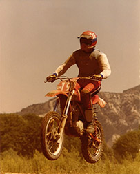
Back when I was in art school, my father, brothers and I were into off-road motorcycle riding and motocross racing. My father was seriously involved in a motorcycle club which shared these interests, the Dirt Diggers. In fact he eventually became president of this organization.
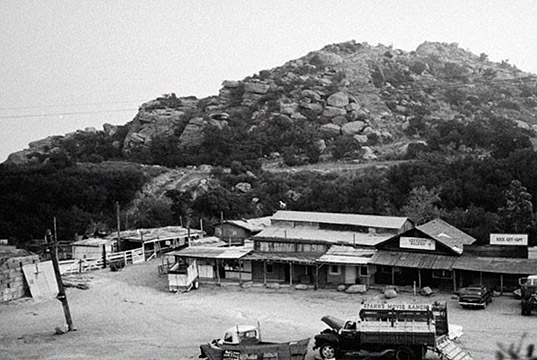
The Dirt Diggers biggest event of the year was to hold a pretty famous motocross race at Hope Town, a collection of old movie sets, then owned by Bob Hope, located in the Santa Susana Mountains of California. The course took participants along a serpentine route which included travel down many old western town streets. We’d all travel out to Santa Susana, the weekend before the race, to grade the course with tractors, set up hay bales in corners, string flags, generally, build the track. A bonus was that after all the work was complete, we could start our bikes up and give it a few test runs.
While we were running the course, one of my younger brothers thought he’d improve the track by adding a side trip down a short unpaved road to the dirt front yard of an old run-down ranch house. There we could plant one foot on the ground, cross our handlebars, crank the throttle, perform a tight doughnut turn (throwing a rooster tail of soft dirt into the air with our back tires) and head back onto the rest of the course.
A few trips down this addition and we’d apparently interrupted a couple of guys working on dune buggies in a nearby open garage on the property. A few more trips and they walked over to where we were making our turnarounds, yelling, screaming and shaking big wrenches at us.
Typical teenagers, right or wrong, we didn’t respond well to threats, so on our next and last trip down the side road, we directed the dirt streams thrown from our back tires, as we made the hairpin turnaround in this makeshift cul de sac, all over individuals shaking tools at us.
A year later, when along with the rest of America, we were familiarized with every detail of their sinister, horrifying actions, we learned who we’d offended. Whether Charlie Manson was present at the Spahn Ranch that day, with those members of his dune buggy army, we’ll never know, but the experience made clear to me that you NEVER know who you’re dealing with.
No matter who you are, how much education, experience or opportunity you’ve had, there’s always more to learn. A closed mind is an atrophied mind. This is especially true in art. Art dies when you close the door to learning, experimentation and new experiences.
It’s never been easier to gain knowledge. We live in a time when worldwide learning opportunities and experiences (secondhand anyway) are at our fingertips. The Internet is your door to all this information. Let me get you started on this mind-expanding journey.
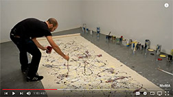
Corey D’Augustine painting as Pollock.
One of my favorite online sources for learning is the Museum of Modern Art’s (MoMA) YouTube channel. There is so much information presented here, by category, I don’t know where to begin. Don’t miss the on-going In The Studio series. This constantly growing collection of videos, hosted by, painter, restoration artist and art historian, Corey D’Augustine, allows you a fly on the wall view of famous artist processes. Corey shares details of how various modern artists worked, as he actually creates new works of art, before your eyes, utilizing their procedures. Fascinating!
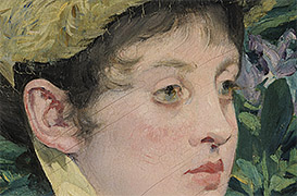
Want to study paintings up close, brush stroke by brush stroke? Travel! Just kidding…a few years ago Google took on a project to archive as many of the art treasure of the world for posterity, as the artwork’s owners would allow. The result was the Google Art Project, now part of the total Google Arts & Culture site. For this Art Project, Google has been traveling around the world making high
Zoom In on “In the Conservancy”
resolution scans of great works of visual arts (paintings). Many of the paintings are scanned at such high resolution you can zoom in to see the threads that make up the canvas, between the strokes of paint. What a learning device! Even if you have super-human eyesight, security would never let you close enough to a painting in a museum to see this kind of detail. For the first time, see what the individual brush strokes look like that make up that Manet masterpiece! You can travel through the front doors of the Google Arts & Culture or Google Art Project (click the View Project Site button in the upper right corner to get to the paintings) sections, but here’s a shortcut directly to the paintings.
There’s likely a whole lot more out there waiting for you that I haven’t discovered yet, but these will whet your appetite. As the saying goes, “The world is your oyster!” Now get out there and begin collecting those pearls!
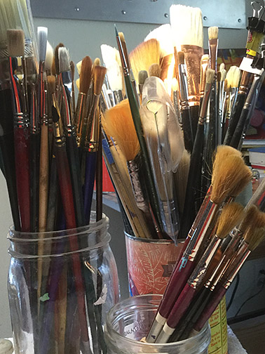
I believe in investing in good brushes. I know it’s a poor artist that blames their tools, but I’m annoyed by brushes with wild hairs sticking out this way or that, applying color everywhere but where I want it to go. As I’ve grown older, I’ve reluctantly learned to accept hair from my head in the sink, but I’ll be damned if I’m going to accept it falling from my paint brushes, when I clean them.
Good brushes are expensive, so it makes sense to care for them properly, extending their life as long as is possible. When I was a kid, there weren’t any specialized products available for cleaning brushes, so the best choice was a bar of Ivory soap. Times have changed and today there are specialized products that not only aid in keeping your brushes clean, but also even condition the hair in your brushes. Two of the most popular are Speedball’s Pink Soap and my favorite, The Master’s Brush Cleaner and Conditioner.
Using the proper brush for the medium with which you’re working, I’ve learned, plays a huge role in brush life. If you’re painting with oils or watercolors, you can use either natural, synthetic or blended brushes. If you’re painting with acrylics, do yourself a favor and restrict yourself to synthetic brushes. Using natural hair brushes or even natural/synthetic blends with acrylics will quickly turn even the very best of these brushes to junk. I’ve learned this the hard way, through experience. If you’re painting with oils, you’ll get the best results with natural hair brushes, especially natural hair bristle brushes. They’ve yet to develop a synthetic bristle brush as stiff as a natural hog’s hair brush. A stiffer brush better moves paint in its fresh out of the tube consistency. With watercolors, purchase Kolinsky Sable brushes, if you can, otherwise buy the best synthetic sables you can afford.
Keep your acrylic brushes wet, at all times, when working with them. If you don’t, you won’t be able to get all the pigment our of your brushes, during your end of the day clean-up. Don’t leave them sitting in the water. Instead dip the hair of the brushes in the water from time to time, during your painting sessions, to keep them wet. Leaving them standing in water will loosen the hairs from the ferrules and break the paint down on the brush handles, causing it to crack and pop off, resulting in loose ferrules on the brush handles. Having to keep brushes wet is one of the reasons synthetic brushes are the best solution for acrylics, natural hair breaks-down, when kept wet all day.
I avoid dipping a completely dry brush into paint, first wetting it with the solvent or medium I’m using. With oils this is linseed oil, painting medium or turpentine (or an odorless substitute). With acrylics or watercolors this is just water. I believe this prevents the pigment from latching onto or being absorbed into brush hairs.
At the end of every painting session and I mean every painting session (don’t close the studio door and tell yourself you’ll deal with cleaning your brushes tomorrow), I first get my brushes as clean as I can with the solvent I’m using. I then use my brush cleaning product and clean my brushes until the soap foam being produced is no longer tinted with color, being sure to pay attention to the area where the hairs meet the ferrule (I gently squeeze the hairs between my thumb and finger here to get all the pigment out).
“Frizzies,” without cardboard shaping.
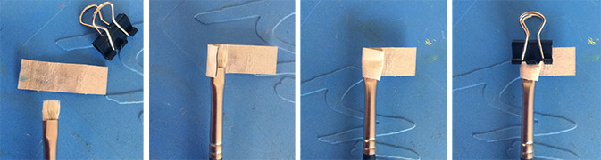
Lately I’ve adopted one last step to my brush care. I’m sure you’ve noticed how perfectly your brushes are shaped when you first bring them home from the art store. That’s because the manufacturers have dipped them into a soluble solution, prior to shaping them. This solution washes out with the first use, leaving even the best of brushes with a case of the frizzies. I’ve always done most of my own house painting. I’m cheap, have always known my way around paints and brushes and it’s difficult for me to hand over thousands of dollars to someone else, to do for me, what I can do myself. I’ve always wrapped my house painting brushes, after I’ve cleaned them, in newspaper or their original cardboard cases, if they came with them, to help the brushes maintain their original shape. It took hearing one or two others were doing this with their fine art brushes, for it to occur to me that this might be something good to try out. I’m now a convert!
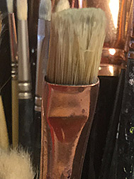
Brush after cardboard shaping.
With round brushes, while they’re still wet from my cleaning them with brush cleaning soap, I just shape them back to a point with my fingers. With flat brushes, however, while they’re still wet, I wrap them in thin cardboard, held in place with a small binder clip. I use cardboard from old cereal boxes, cut into strips a little wider than the distance from the bottom of the flat part of the ferrule to a little past the end of the brush hair. I leave the cardboard longer in length than what is needed to wrap around the brush, for easier handling. I use these cardboard strips over and over again on brushes of the same width. Through trial and error, you’ll be amazed how close you can get to achieving a shape similar to the one they had, when you brought them home from the art store.
With proper care, brushes can live a long, useful life. I’m still working with some of the brushes I purchased back in art school!
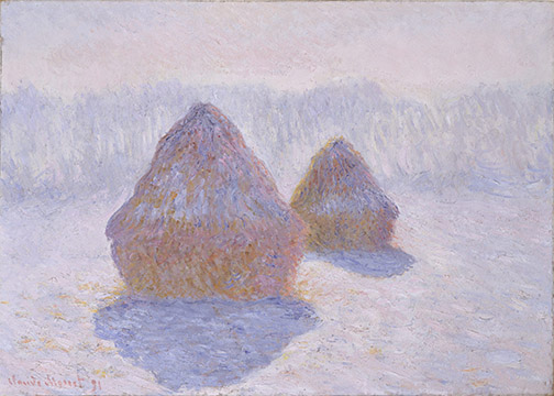
“Haystacks, Effect of Snow and Sun,” by Claude Monet
Many factors came together, at a particular place in time, for Impressionism, one, to come about and two, to succeed.
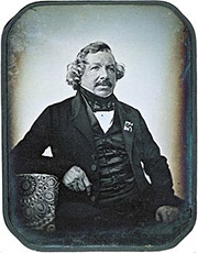
First was the arrival of a fairly efficient method of making tangible, hold in you hands, copies of the images captured by a camera. Cameras, in the form of the Camera Obscura, had been in use by artists since before the Italian Renaissance, but a practical means of recording the images viewed through a box with a lens didn’t come about until about 1840. It’s also significant that this development (excuse the pun) was revealed by Louis Daguerre, in Paris.
Daguerreotype of Louis Daguerre.
Photography quickly replaced the artists as visual documenter and encouraged them to look introspectively at what it was they did. Turner, Delacroix and Manet were some of the first to move away from treating their paintings as if they were a window through which to view subject matter, paying more attention to the canvas surface and its 2 dimensional attributes. They flattened their picture planes and explored the expressive qualities in paint application.
Driven by the needs of its growing textile industry, The Industrial Revolution introduced new, brightly-colored pigments to the artist’s palette: cadmium yellows, reds, oranges and greens, cobalt based colors like blue and violet. Prior to this, only earth toned colors were available. The most brilliant paint color in the Renaissance palette was something like an Indian Red.
American John Rand enabled artist color portability with the invention of the tin paint tube, in 1841. Before his invention, the most popular container for storage of mixed colors was a ram’s bladder. A bit of discouragement in transportation of paints.
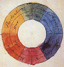
Goethe’s color wheel from his 1810, “Theory of Colours.”
The french easel appearing in the mid-19th Century, also encouraging outdoor, on location work, but one of the biggest developments changing the direction of painting was artists exposure to 19th Century scientific discussions of Color Theory. Although color theory principals actually appeared in the notebooks of Leonardo da Vinci, the study was furthered by Isaac Newton in the 18th Century, then fine tuned and published widely throughout the 19th Century, accelerated largely by the color needs of Industrial Revolution’s textile industry. Primary, secondary, complimentary and tertiary color and how it is produced in nature was being discussed openly for the first time, along with the publication of Color Wheels and charts, leading directly to the Impressionist use of Broken Color and Pointillism.
So these developments and innovations brought Impressionism to the canvases of Monet, Renoir, Cassatt, Pissarro, Degas, Morisot and the others, but “If you build it they will come,” does not always work out, the paintings of these iconoclasts were far from well received. In fact, the label Impressionists was derived from an insult by a French art critic, of the period, Louis Leroy, who described an exhibition of the work as merely impressions of paintings. Bad boys and girls that they were, the painters proudly adopted the insult as a label for their movement.
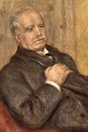
“Portrait of Paul Derrand-Ruel,” by Pierre-Auguste Renoir.
Like the Beatle’s George Martin, there was another individual, behind the Impressionist’s curtain, a French expatriate art dealer, living in London, Paul Derrand-Ruel, crucial to Impressionisms success. Derrand-Ruel believed in their work, when no one else did, and put his money where his belief was, purchasing their canvases in bulk, providing them additional monthly funds, paying their bills for rent, tailors, paint suppliers, doctors, etc., keeping them afloat and painting. He also provided moral support, even offering a room in his home to Monet, for use as a studio. Derrand-Ruel loaned Monet the funds to purchase his now famous home Giverny. The art dealer tried many methods, at the time untraditional, to gain popularity for his artists, print reproductions, solo shows, but it was a trip to America with 300 paintings that proved the ultimate solution. American buyers carried none of negative prejudice towards the work, present in Europe, and lapped the canvases up.
Ironically, through the efforts of Paul Derrand-Ruel, it was America, not France, responsible for survival of the artists and the success of Impressionism!
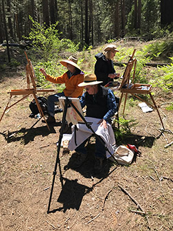
On Day 6 of my Yosemite Renaissance artist residency in Yosemite, I’m joined by artists Vicki Thomas and Terry Robinson. Photographer/artist, Kerby Smith, has decided to stay over another night, so he’ll be with us on the last two days of the residency. Kerby’s wife and my artist friend of 25 years, Lura Schwarz Smith, will be joining us tonight and painting with us tomorrow. I actually met Lura (and Kerby for that matter) through my wife, potter/fabric artist, Betty Tikker Davis. Lura and Betty have been part of a small quilting group that have been getting together, once a week, at our house for 25 years. Anyway, this promised to be the largest group visiting me all week.
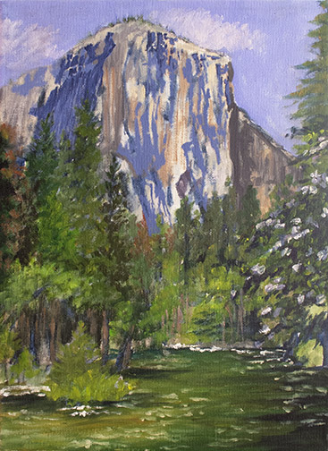
We’re traveling to Yosemite Valley to finally paint that elusive perfect view of El Capitan. Kerby had a scheduled photo shoot at Glacier Point, in the morning and will join us when he’s done. Terry was running late, so he plans to meet us at the painting location.
On arrival, the Valley is packed. Traffic is backed up near Bridal Veil Falls and visitors are double parking at the areas designated for cars, along the roadways, waiting for a slot to open up. We’re painting at a little known location, so chances are we’ll have a place to park. Trying to find the spot on my own, I realize I didn’t landmark it well enough and circle around twice, without success. I call both Kerby and Terry, who both know the location well, from my cell for guidance. We catch Terry as he’s entering the Valley and he guides us in.
As hoped, crowded as the Valley is today, parking alongside the road is wide open at our location. We’re good to go.
We want to avoid blocking the trail, which limits the perfect point of view to a small patch of semi-flat ground in which to set up, so we’re going to be a tightly packed group today. The setting offers us something from all the major food groups: a Yosemite monument, a rushing river and a blooming dogwood in the foreground (there was also a fallen redwood framing the scene in the foreground, but none of us included it). We paint until about 5pm.
The best of settings, great weather, good friends, an ideal plein air painting day!
No painting the morning of my 4th day as a Yosemite Renaissance artist in residence, I had to drive down from the cabin to teach art to two 5th grade classes in Mariposa. It’s a twelve week teaching artist program on behalf of the Mariposa Arts Council and I still had 3 weeks left.
There’s been no cell phone reception on my AT&T phone, while I’ve been up in Wawona. The artist/photographer, Kerby Smith, who’s going to be with me over the next three days, tells me his Verizon cell phone is working in Wawona, so I picked up a Verizon burner phone in town, before I headed over to the school.
I’d agreed to meet Kerby at tunnel view, above Yosemite Valley, when I was done at the school. He wanted to share a couple of possible locations for painting in the valley, he’d discovered through his photography outings. I’ve learned that photographers search locations like Yosemite, for those special spots from which to take the money shots and they’re very protective of them. If a photographer friend ever offers to share one of these with you, take them up on it, it’ll be well worth your time.
So, Kerby showed me ideal settings for painting Bridal Veil Falls (more powerful than I’ve ever seen it, due to the warm weather snow melt) and El Capitan: a location with the Merced River and a blooming dogwood in the foreground. Too late to start a painting that day, we agreed to return tomorrow.
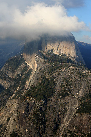
On the way back to the cabin, we discovered they just opened the road to Glacier Point, so we traveled on up. Still a lot of snow up there. It was cold and windy and clouds had started rolling in from a predicted storm to occur the following day. Among other vistas, I snapped the above shot for future painting reference. We returned to the cabin, well after dark to discover there were absolutely no signal bars on our Verizon phones. Without cell phone reception or an Internet connection, we were forced to talk to each other all night.
Under concern of the predicted storm, we decided to rise early and head back to Yosemite Valley to paint. Even if the weather services forecast was correct, maybe we could sneak in a few hours before the rain hit.
As promised here’s my painting from Day 2 of my Yosemite Renaissance artist residency in Wawona. Those of you who’ve being following my recent posts will recall circumstances made it necessary for me to post Day 3 before Day 2. You can catch up by reading the Day 3 post.
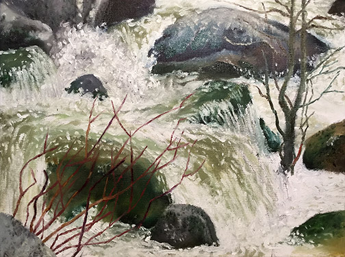
Local artist, Sandy Kowallis, was up here painting with me, over two days (Tuesday & Wednesday). She was pretty excited about all the water running down Chilnualna Falls, so, even though I painted this location on my first day, up here in Wawona, with Carolyn Hartling and Sandee Scott, I agreed to paint it again. The thing about painting a long waterfall like this is, you move up or down the falls, even change your point of view and you have a drastically different composition.
Can’t get over how cold it is in the shade here at the stream edge. Tourist hiking up and down the trail, alongside the falls, out in the sun, are in shorts and t-shirts, but I’m wearing a long-sleeved t-shirt, covered by a light polyester fleece, covered by a wind and water-proof shell and I’m barely comfortable. It’s a reminder of why it’s important to layer, when out on location, even in the spring and summer.
So hard to see what’s really going on with the splashing, foaming, boiling water moving at this volume and pace. It’s so active it never seems to repeat itself. I’m stuck with just trying to put down an impression of what’s going on. It’ll be interesting to study the reference photos I’ve taken, a regular intervals, when I’m back in the studio. The sound matches the action…roaring! Can’t hear what Sandy is saying to me, just a few feet away.
Sandy’s a trooper, we painted late into the afternoon, ’til 4:30 or 5 pm, before heading back to the cabin. The light had become too severely horizontal to keep working.
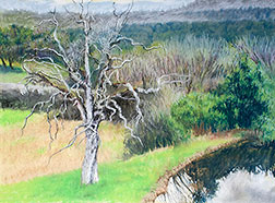
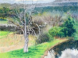
I recently completed the above pastel. Back when I was in high school, I used to create work with pastels all the time. I didn’t have a dedicated place to work back then, I worked on my bedroom floor: a bedroom I shared with 3 younger brothers. I couldn’t leave anything I was working on out. Projects had to be set up, worked on then put away until I had time to work on them again. Pastels allowed for quick set up and take down. An oil left out in the bedroom, for example, would likely get a hand, tongue or other body part (don’t ask) dragged across it. We were animals!
I also used pastels from time to time in my illustration and animation work (I directed and designed animated tv commercials for about 16 years), but I think this might have been the first time I used them in creating a landscape. I generally paint landscapes in oils, watercolors or acrylics.
My pastel at the end of the plein air session.
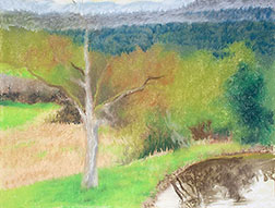
Anyway, since this was a fairly new journey for me, I thought I’d take you along for the ride. The piece was started during a Yosemite Western Artists (YWA) plein air outing I hosted at my place in the Sierra Foothills. We’ve had an unusual amount of rain this year (we needed it to end our 6 year drought), so the ground everywhere is pretty soggy and you can’t plan on not having rain on the day of the event, given you have to schedule ahead of time. We’ve got a large covered deck on the back of our home, with a great panoramic, unobstructed view. Good thing we chose this spot, it was freezing that day and we experienced both rain and hail throughout our session.
I was working on pretty smooth pastel paper. On a surface like this, I like to rub my first layer of chalk into the paper to lay down a ground. I find later applications lay down better, if I do. Hosting the session, I didn’t get as much done as I generally would. The group worked 3- 4 hrs. that day.
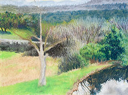
My pastel at the end of the second session.
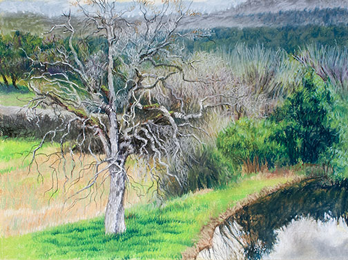
With the next working session, I really started to dig in. Working from far to near, I detailed the background first, ignoring the tree, knowing myriad thin branches would be involved later in the execution and I didn’t want to have to work the background around them. I generally set aside 4 hrs. for each of my working-week daily sessions, but there was a lot going on, on the gallery show front, during the creation of this one and sessions could be 1 1/2 – 4 hrs. I felt I’d really nailed the pond reflections in this session.
I begin to work on the tree.
Now that the background was pretty much laid in, I moved on to the tree in my next session. I was beginning to dread the fact that I chose to paint this complicated oak, without leaves. Even if I greatly simplified and reduced, there was going to be a lot of branches to execute on this one. I really felt this was my only decent composition choice, though, the weather confining us to the covered porch.
Added a lot of lights, to distinguish branches from background.
Another session, where I really started to hone in on which branches I HAD to execute and which I should eliminate, to give the tree interest and represent the silhouette that was in front of me. I really didn’t want to add any more than I had to. I may be detail-oriented but I’m not a masochist. This I find to be the hardest part of painting: the necessary simplification.
Next to the last session, where I added detail to the grasses and did what was necessary to separate the parts of the tree that I wanted to stand out from the background.
That took me to the final session, where I added the nit-picking details, like lacy masses to represent micro branches/stems and the beginnings of buds: whatever was necessary to communicate it was finished.
Artist friends are always complementing me on the volume of paintings I produce. Interesting, because in my mind I’m not getting into the studio to paint enough. And I’m a slow painter. I work slow to be sure I’m paying attention to the details of every painting as it develops in front of me. I study as much as I paint. I never know when a “happy accident” will occur, leading me in a totally new direction.
My art school illustration professor, Harold Kramer, used to quote another painter or teacher he knew (terrible, but I can’t remember who that was) in saying, “Work slow, finish fast.” In other words, work too quickly and you make mistakes, travel down roads that dead-end, need to backtrack and start over. Work slowly, but meticulously, thoughtfully and you’re more likely to determine what is working and not working at the start, avoiding the dead-ends, keeping the painting moving in a fruitful direction to the finish.
Anyway, on the off chance that my friends are right and I do produce a lot, I’ll share how I work. First, I aim to paint everyday of the working week: Monday – Friday. Why not work Saturday and Sunday? I’d love to, but I have chores to complete, like everyone else, a home and cars to maintain, errands to run, etc. And parties or get-togethers are generally planned for the weekends. The rest of world runs on a Monday – Friday working week, with Saturday and Sunday off. Buck the system and you’ll find your painting time interrupted by personal commitments and unexpected visitors.
Next, I set aside a dedicated time to paint each of those working days, the same time each day. I try to get into the studio every day as early as I can, but if all else fails, when my dedicated painting start time arrives, I stop whatever else I’m doing and head into the studio. My family knows and respects this as my painting time and truth be told, probably enjoy the fact that they have a given time each day, when they don’t have to deal with me.
How much time you set aside, depends on your personal schedule, how much time you realistically have to paint. In my case it’s 4 hours a day. Why not 8? The experts say running your own business is 50% production and 50% infrastructure and marketing. The other 4 hours in my day are spent running and marketing my business.
From time to time things do occur, which prevent me from getting into the studio on time (I’m on the road returning from picking up art supplies or I set up everything to shoot my work and it’s taking longer than I planned, etc.), but just because I’m starting late, is no excuse to skip working that day. I get in there as close to my designated start time as possible and use whatever time is left, no matter how little, to paint.
If you’re not working to a dedicated schedule already, try it; I think you’ll discover a significant increase in your production!
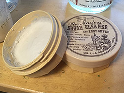 Good brushes are expensive, so it makes sense to care for them properly, extending their life as long as is possible. When I was a kid, there weren’t any specialized products available for cleaning brushes, so the best choice was a bar of Ivory soap. Times have changed and today there are specialized products that not only aid in keeping your brushes clean, but also even condition the hair in your brushes. Two of the most popular are Speedball’s Pink Soap and my favorite, The Master’s Brush Cleaner and Conditioner.
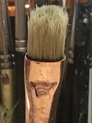
 With proper care, brushes can live a long, useful life. I’m still working with some of the brushes I purchased back in art school!