Forever Young

Enjoying California Treasures Image
“Enjoying California Treasures,” by Trowzers Akimbo for Children’s Hospital.

I love that Dylan song! It’s Bob at his best, raising an intimate toast to an individual, he identifies all the challenges, pitfalls and fears we face throughout life and, possibly, gives criticism to a youth who dismisses all those older than herself. But that’s not what this post is about.

I’ve been fortunate to have worn a lot of creative hats throughout adult life: tv graphic artist, print illustrator and graphic designer, animation director, game creative director and fine artist. Some of my favorite work has been aimed at children.

Kid's Castle Image
Cover for “Sesame Street Magazine,” by Bill Davis.

I love kids! Everyone says that, but I really mean it. They crack me up in a way adults rarely do. They’ve figured a lot of things out for themselves, often wrongly, but share this misguided information with love and confidence. Maybe I enjoy their company so much, because there is still much about me that is a child. I’m pretty good at being an adult too. I happily accept responsibility and deliver my best, when others are depending on me. I’m happy to share anything I’ve learned, but enjoy many of the same things children do.

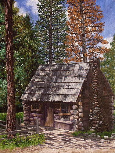
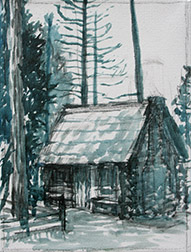
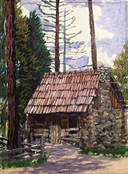
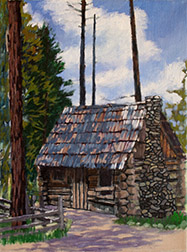
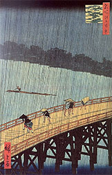
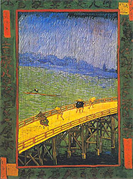
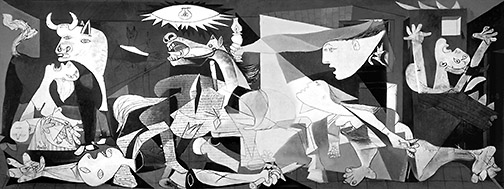
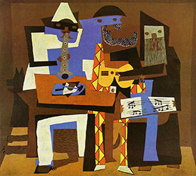
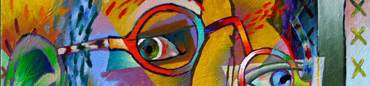
I love pure, non-local color. I want to paint things in the colors I choose, not necessarily the colors nature has assigned to things. I’m also most intrigued with that I’ve never encountered before, the first book in a new genre (I remember my ravaging my first Marquez book), a painter or illustrator with a new take on the everyday (VanGogh blew my mind, when I was 7 or 8 years old), new music, I mean really new, something I haven’t heard before. This joy in surprise is probably why I enjoy abstracting so much.

Croak Show Image
Children’s style art for the “Tonight Show, starring Johnny Carson,” by Bill Davis.

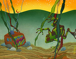
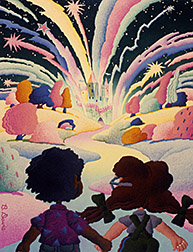
So, no surprise, I’ve always been attracted to illustrated children’s books. I love the anything goes approach in the content and the often experimental illustration. I’ve been fortunate to create a lot of artwork for children. I illustrated a lot of text books and workbooks (the most fun), early in my career and was a monthly contributor to all the magazines produced by Sesame Street Workshop in the ’80s.

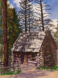
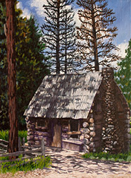
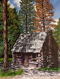
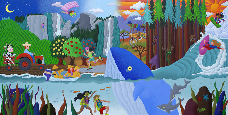
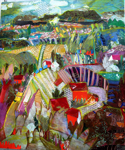
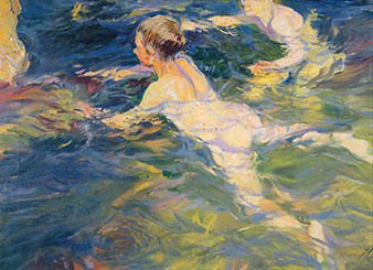
I was recently commissioned to created a 3′ x 6′ painting for Valley Children’s Hospital, in Madera, CA. That painting led to orders from multiple other children’s hospitals for large gicleé prints of the earlier described work I created for kids.

The work is living a second life. The best kind of life, one offering distraction and lifting the spirits of children and their families, if just for a short time, while they face the greatest challenges of their young lives. May you stay forever young!

How I Kept My Mother Out of My Art School

Chouinard Photo
Chouinard Art Institute, circa 1970.

I’d known my mother planned to attend the Chouinard Art Institute right after high school, study fashion design there, then set the fashion industry on fire, since I was a little kid. From the age of 8 or 9, I knew I was going to be an animator, working for Walt Disney, when I grew up, so discussions of Chouinard and Disney’s close affiliation with the school came up often.

My mother is a powerhouse, always involved with several complicated creative projects at once: oil painting, ceramics, PTA President, Den Mother, poetry, local drama, sewing, knitting, etc. You wouldn’t believe the Halloween costumes she designed and fabricated for me and my four younger siblings over the years: Hollywood quality. She closely followed the career of Edith Head, a Chouinard grad, by the way.

Disney died the year before I graduated from high school. My dream of animating for him died with this legend. During my senior year in high school, I started attending Saturday life drawing classes at Chouinard. One of my high school art teachers, Mrs. Pardoe, arranged and encouraged these sessions. At the end of the year, I applied to all the art schools Mrs. Pardoe recommended: The Art Center, Long Beach State and Chouinard. I was fortunate to be accepted by all 3, but chose Chouinard. It seemed to fit me best.

Many years after my graduation, I was reading a biography of my mother in a high end porcelain doll magazine. She’d added doll making and, more importantly, the design and fabrication of original doll clothes design to the many things she does. In the article she elaborated on why she never attended Chouinard, revealing a fact, that in all our one on one conversations about Chouinard, she’d never shared with me before.

Mom and Pop Photo
My mother and father, in high school.

Like myself, my mother had applied and been accepted to Chouinard after graduating high school. This was at the end of World War II. The art school told her, yes, we’d love to have you, but we have to put you at the back of the entry line, behind all the WWII GI’s returning from the war and entering the school through the GI Bill. They said they’d call her, as soon as there was an opening.

Months went by, then years, but finally she got her call. She told them she wouldn’t be attending. In the interim, she’d married my father and was now 8 months pregnant with her first child: Me!

She never attended Chouinard, but did get the necessary fashion design training she required at Los Angeles Trade Technical College and with my youngest brothers in high school, began an over 30 year career as a fashion designer, creating for some of the biggest labels in the industry.

I love you mom!


If a Tree Falls in the Forest & No One is Around…

Dixie Salazar Landscape Image
A landscape by Dixie Salazar.

Last Saturday night, July 8th, local gallery, Gallery 5, hosted an artist’s reception for master painter, poet, novelist and activist, Dixie Salazar, as introduction to her stunning one woman show there this month. The show is a milestone event, one, gallery curator, Jon Bock, has been attempting to procure for many years. Ms. Salazar embodies a major presence in the Central California art scene and securing a retrospective exhibit of her work for our small town, up here in the Sierra Nevada foothills, is quite a coup for the local creative community.

Dixie Reading Photo
Poetry read during artists reception © 2017 Jonathan Bock

Which is why I was puzzled by the poor turnout last Saturday night. In addition to gallery personnel, the guests were myself and my wife, two personal friends of Dixie and two other local residents. What gives? The show was well publicized. In addition to all the online marketing Gallery 5 did, on behalf of the reception, I know I personally, spread the word to local artists I ran into at art organization gatherings, in the final days leading up to the opening. There was live music, barbecue, drink and personal readings by Dixie of some of her exceptional contemporary poetry.

Was it the heat? The voluntary $5 donation to cover the cost of the barbecue? Dixie’s work suggests story, like Chagall, contains the color harmonies of Matisse, the liveliness present in the works of VanGogh and Gauguin, all uniquely synthesized through her personal brush. Did they not like her work?

Whatever the reason, while it’s too late to meet and pick the brain of this petite giant, too late to hear her read her poetry, the show will still be there until July 30th. I’ve seen it twice already and plan to return multiple times, before it’s gone. I urge anyone in the area with even a fleeting interest in art to not miss this museum quality show!


Keep Your Eyes Wide Open & Your Ear to the Ground!

MoMA Image

I’ve been the beneficiary of a great art education and had the added advantage of working alongside other artists most of my adult life. I’ve always been confident that I knew who all the important artists were, working currently and in the past. I’ve had great art history teachers, I’ve always been a frequent visitor to local art museums and when I’ve traveled, I’ve made visiting all available museums part of my itinerary. In fact, if it’s vacation travel, visiting the museums is always central to the trip. I’m also a frequent reader of significant art magazines and artist biographies. So when I learn of an important artist I don’t know about, I go into a state of shock. Say what!

In my defense, up until recently, my focus has always been on artists exhibited in art museums. My own work had been exclusively focused on abstraction, so my interest lie with Modern and post WW II Contemporary Art. I hadn’t paid much attention to the work in small local or regional galleries.

Niños Tomando su Bano Image
“Niños Tomando su Baño,” by Joaquín Sorolla

That changed recently, when joining a local art association, Yosemite Western Artists (YWA), reawakened my interest in representational art. You can learn more about that transition in my earlier post, “The Power in Painting with Friends.” Anyway, this revitalized interest in representational art has introduced me to some of the leading artists creating representational art today, artists to whom I’d never been exposed in the past. That, in turn, pointed me to the artists, through history, they feel are important influences on their representational work. Many of them are the same Modern Art giants that have, in some way, been effecting my abstract work: Manet, Degas, Monet, Cézanne, Lautrec, Van Gogh, etc., but others, like Anders Zorn and Joaquín Sorolla, I’d never heard of. Look at the color and brush work in the attached Impressionistic Sorolla painting, ” Niños Tomando su Baño.” Unbelievable!

What a treat! To find this cornucopia of new works to digest is like a childhood Christmas morning! I can’t see and study all these works, new to me, fast enough! I’m now on a quest to uncover all the other important artists to whom I’ve yet to be exposed. This all grew out of my recent association with YWA. Another, very important reason to become an active part of local art associations in your area.

I always new that education was a life-long undertaking, but I must admit, I was surprised to discover, that with all the attention I’ve given it, there were avenues in art history down which I’d never traveled. Bon Voyage!

Pastel Painting Priscilla Bugg

Portrait of Priscilla Image
“Portrait of Priscilla Bugg,” 16” x 12,” pastel on paper, $700.00.

I haven’t created a pastel portrait in a while, so I thought I’d walk you through the process involved in creating this one.

It was started live, during a Yosemite Western Artists (YWA) model session. YWA is the only artist group up here in my area of the California side of the Sierra Nevada Mountains. I live in the foothills, just south of Yosemite National Park. Luckily, they sponsor a lot of art activities including weekly 3 hour live model sessions, monthly plein air outings and photography group get togethers, as well as the annual Tri-County art competition and exhibit. This particular Friday, a young woman named Priscilla Bugg, who has been posing for the group since she was a little girl, was our model.

Portrait of Priscilla Start Image
My pastel by the end of the live model session.

It began pretty humbly. Our models pose for 20 minutes, then take a 10 or 15 minute rest break, then pose again for another 20 minutes, etc., etc., so of the 3 hour session, you only get about 2 hours of actual painting time. I like to add a few strokes, step back and see how what I’ve done compares to what’s up on the model stand, add a few more strokes, step back again and see how what I’ve done compares to the model…you get the picture. If I get a whole painting roughed out by the end of the session, I’m happy.

Invariable, no matter how carefully I sketch out/layout my subject, prior to actually painting, I don’t notice where my drawing is off until I have all the 3 dimensional forms blocked in. That’s when I realize things like the face is not wide enough or too wide or the nose is too big or small. I believe this has to do with the fact that the layout is just outline. Once you add form to outline it changes. For example, take a look at the line drawn and form rendered pipes below. Both are exactly the same size and shape, yet the form rendered version appears smaller in diameter (they ARE supposed to be pipes!) then the line drawing.

Outline - Form Image
The span of a outline drawn object appears changed, when form is added.
Priscilla 5/2 Image
Began correcting forms & color first day in the studio.

So, when I got to the studio, put the day’s pastel painting on the easel and compared it to the reference photos I’d taken, I could see a lot of the forms were off. I set to work by  raising the height of her forehead, reshaping her eyes and I began widening the left side of her face, at the cheek bone.

The big difference in working with pastels when compared to other mediums, is the fact that you can’t mix custom colors on a palette, prior to applying them to your painting. You can mix all the custom colors you desire with pastels, however, you have to mix them on the painting itself. This takes a bit more planing as you work. You’ll often see me applying garish colors on my first or second pass. I do this knowing they’ll be made more subtle with later passes. If I don’t apply those purples, blues and greens with my early passes, the subtle version of those colors won’t be there, when I’m finished.

Priscilla 5/3 Image
Modifying facial colors and values.

During my next session I added more detailing to and around her eyes. I also reshaped and detailed her mouth (including the Lauren Hutton gap between her teeth, cute!). The rest of my time, that day, was taken up with modification of the facial colors and values overall, adding a lot of pale pinks, oranges and yellows to neutralize the greens and purples a bit. Her face is really starting to have volume.

Priscilla 6/8 Image
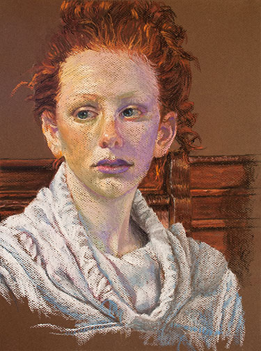
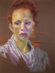
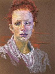
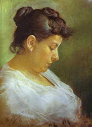
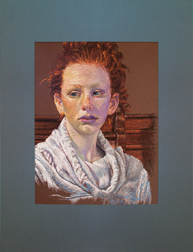
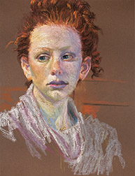
Another session, a longer one, and I had time to make a lot of progress. I finalized the shape of her face, made more changes to her facial skin tones, did a bit more work on her mouth, did a lot of work on her hair (I changed the shape and I added darks and lights) and I began to work on her neck with some new cool pale blues and some lights. I also reconstructed her ears.

Priscilla 6/12
Face, neck, sweatshirt and background work.

In this, the 2nd to the last session, I added a bit more warmth (warm colors) to her face, pretty much finished all the detailing on her neck and then began detailing the hooded sweatshirt she’s wearing. I also started working on what is showing of the chair she’s sitting in and the other woodwork behind her.

My work during the very last session took her to the finish, shown at the top of this post, and included the final detailing of the woodwork behind her and finicky touches here and there overall. She really went through a lot of changes from the initial sketch of Priscilla live to my last, in studio, session. They don’t always change this drastically, but when they do, I think it makes for a more entertaining ride for the viewer!

Value: The Drama Queen in Painting

Portrait of Joris de Caullery Image
Rembrandt achieves maximum drama in a static pose, in “Portrait of Joris de Caullery,” through contrasting light and dark values.

In a couple of past posts, Got Color! – Part 1 and Part 2, I spoke of how your use of color controls the life of your painting. Well, if color controls life, your use of value determines the level of drama in your paintings.

For those of you non-painters out there, value, in painting, refers to the gray scale levels in a painting: what’s left when you strip a painting of its color or hue, similar to what you’d see in a black and white photograph of a full color painting.

Value Guide Image
9 step value guide

Most painters work with 9 values: 9 even incremental stages of gray from pure white to pure black. There are some painters out there who believe in reducing this spread, limiting their paintings to only 4 values. They believe the 4 value limit increases unity and cohesiveness in a painting. You’ll have to decide for yourself in which camp to pitch your tent.

Rouen Cathedral Image
Light, tint values make for the serene in Monet’s “Rouen Cathedral.”

Colors with values at the light, white side of the scale are referred to as Tint. Colors with values at the dark side of the scale, towards black, are referred to as Shade. The more contrast you provide between your light values and your dark values (see Rembrandt’s, “Portrait of Joris de Caullery,” at the top of this post), the more tension, drama your painting will communicate. Paintings with all their values at the shade end of the value scale, exude a dark, melancholy feeling. Paintings with all their values on the light, tint end of the value scale, tend to be serene in mood.

Black in Deep Red Image
Dark, shade values communicate melancholy in Mark Rothko’s “Black in Deep Red.”

Additionally, the darks in a painting act as a kind of armature or foundation, supporting the entire composition, as they weave in and out of background, mid ground and foreground.

Rubens Shadow Painting Image
Underpainted in uncharacteristic red, Rubens binds his image together with darks.

When you determine how values will be used in your paintings, you are determining the drama to be communicated by your canvas, as surely as if you were a lighting director, lighting a set for a play or film.


Teach a man to DRAW a fish…

Art Tree Logo Graphic

I just returned from a trip to Santa Clarita, CA (a bedroom community just north of Los Angeles) to make a presentation at the ARTree, a non-profit 501(c)(3) organization engaged in bringing creativity to youth and adults in the surrounding community. While the ARTree expands awareness and participation in the arts to the population in general, a primary goal of the organization is to fill the void left by cut-backs or complete elimination of the art and music programs in public schools.

My presentation covered the personal opportunities that presented themselves to me over my, now, 46 years as a professional artist. Through my partially scholarship funded education at CalArts, I was able to perform as illustrator, graphic designer, animation director, fine artist, art director, creative director, chief creative officer and even CEO, providing income for my family: opportunities that stemmed from a love of drawing as a child and the continued support of family and the art programs in public schools.

Sadly, at a time when there are more opportunities than ever before in which an individual can earn a very good living as an artist, our public education system has ear-marked art and music programs in schools as unnecessary disciplines and targets for trimming from the education budget. Through public outcry, school sports programs, also once marked for elimination were able to survive, while art and music were eliminated. Sports programs do perform a vital function keeping youth physically fit, teaching cooperation and team building towards a common goal, not to mention providing activities that engage the whole family and entire community, but I guarantee, a lot more public school graduates will have the opportunity to earn their livelihood through art, than as a professional athlete.

There has long been work for artists in the creation of illustrations or graphic designs for the advertising and editorial print industry (magazines), TV commercial industry, television and feature film animation industries, but the quickly expanding Internet and technology industry has increased the demand for artists. The ever increasing demand for web sites provides endless opportunities for artists, in their design and fabrication. Television and feature animation has gone from being a solely hand drawn and painted undertaking to a computer generated discipline, expanding the size of their creative teams 30 fold. If you doubt this, stay in your seat to read the closing credits the next time you watch an animated feature. Feature live action films, heavy in computer generated special effects, now have the same increased demand for artists. The computer game industry, as big or bigger than the feature film industry, employs myriad artist and new companies in this industry appear every day. Remember when I say computer games, that includes not only games played on computers, but those on dedicated game machines (Xbox, Sony Playstation, Nintendo), tablets, mobile phones and, now, smart watches: each separate efforts by separate creative teams. You get the picture, increases in the need for artists and increases in the use of new technologies go hand and hand.

While we’re unlikely to be able to quickly redirect our lumbering ship of state to toss life preservers to the drowning public school art and music programs, bringing them safely back on board, non-profit private sector art education organizations, like the ARTree, and local government Teaching Artist programs are there to fill the gap.

These organizations deserve your support, both as a financial contributor and, if possible, a volunteer: if not just to keep cultural participation, awareness and opportunity alive in our society, than to guarantee our populations are equipped and ready for the jobs that are available!

Special Framing for Soft Pastels

Portrait of Priscilla Bugg Image
“Portrait of Priscilla Bugg,” 16″ x 12,” soft pastel on paper by Trowzers Akimbo in special pastel mat.

A few years ago I came across a great system to use when matting soft pastel artwork for framing. Those of you who frame a lot of work created with this medium have likely noticed that, over time, some of the chalk falls from the artwork and collects along the bottom inside edge of the mat. The system I’ll demonstrate avoids this.

Pastel Board Cut Diagram
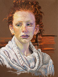
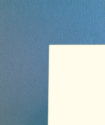
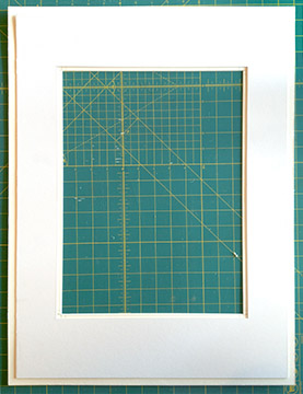
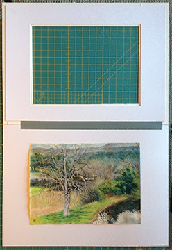
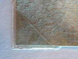
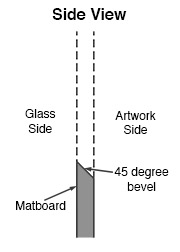
Key to this system is that you cut your mat with a 45 degree bevel, but reverse the bevel so the 45 degree cut edge faces inward, towards the artwork, not outward towards the glass, as it normally would. When cut correctly, you see a sharp edge on the inside of the mat surrounding your artwork, not the 45 degree cut edge that reveals the center color of the matboard (generally white).

Mat Cut Corner Image
Corner of the top mat, cut using a reverse 45 degree bevel.
Hidden Mat Image
Hidden Mat attached to the back of Top Mat.

Next you need to cut a second hidden mat to be attached to the back of the first top mat to create an airspace between the artwork and the top mat. Any falling pastel chalk dust will fall behind the top mat and come to rest at the bottom of the airspace, out of view.

Since you won’t see this 2nd hidden mat, it’s a great opportunity to use scraps of that hideous colored mat board you have laying around. I cut mine from one piece of board, but there’s no reason why you couldn’t use separate strips of board for this function. I size my hidden mat so the viewing opening is 1/4″ smaller, all the way around, than my top mat and 1/2″ smaller, all the way around from the top mat’s outside edge. This way I’m sure no one will be able to see the hidden mat, when viewing my framed artwork from the side and by keeping my overall hidden mat smaller than the top mat, I avoid it getting in the way of the frame, when I put everything together. Remember, that this hidden mat will come into contact with the backer board you’ve attached your artwork to and possibly the artwork itself, so you need to use acid free, archival mat board, if longevity is important to you.

Hinged Image
The mat assembly & backer board hinged together with acid free tape.

From here you just finish the framing following your normal procedure. I hinge my mat board to the backer board with archival tape.

Because I usually create my pastels on normal pastel paper, I couldn’t hinge the artwork to the backer board, as I normally do with works created on other substrates, using Japanese paper for the hinges and wheat starch as the adhesive. The wet wheat starch mixture would cause the paper to buckle, where the attachments were made. So, I used archival polypropylene photo corners, which I purchased at my local art store, to make the attachment.

Corner Image
Archival Polypropylene Photo Corner

That’s it! Use this mating system and you’ll never again have to pull your artwork out of the frame to clean the collected pastel dust from the edge of the mat.

Painting Andersen’s Mountaineering Cabin

Anderson's Mountaineering Cabin Image
“Anderson’s Mountaineering Cabin,” 12” x 9” oil on canvas, Framed $913.00, Unframed $785.00

I recently finished this painting, begun en plein air, in Yosemite, during my stay as a Yosemite Renaissance artist in residence and I thought I’d walk you through its various stages from start to finish.

As many of you may have heard, during my residency, I invited many of my local artist friends to come up to the park and paint with me. This whole trip came together quickly, but even with short notice, 7 of them were able to make it. On this, our last day, 4 artists were painting with me.

Anderson’s Cabin, is located in Pioneer Village, in Wawona, a collection of historic Yosemite structures from all over the park, brought together in one location to form a little trip back in time hamlet. There are many great structures to paint there, but we all decided on this one on that particular day.

Anderson Cabin Turp Wash Image
My ink blue turp wash underpainting, quickly maps out the scene lighting.

I started this outdoor painting, as I most often do, with an ink blue turpentine wash (50% painting medium, 50% solvent) underpainting. I find shadows outdoors tend to be cool, so the blue is a good choice and since I always work from dark to light, using the one color prevents me from having to mix multiple dark colors, prior to getting all my darks blocked in. Mapping the scene lighting out quickly is critical in plein air painting, as the light changes very quickly. Not having to mix multiple dark colors significantly speeds the process.

Anderson's Cabin Plein Air Image
My painting at the end of the plein air, on location painting session.

With the darks laid out, I quickly washed in general area color, prior to roughing in opaque paint. That way, if I miss tiny patches, known as holidays, with the opaque paint, they don’t show, the underlying canvas having been pre-tinted. With my darks down in ink blue, I begin adding medium value opaque colors, then lights and finally start replacing the ink blue dark wash with dark colors of the correct hue. Here’s the painting at the end of my 4 hour, on location, painting session.

I’m rarely happy with the final result of my plein air sessions and generally either work into the canvas back in my studio or use the painting as a color sketch for a larger studio painting. I’d committed to a show of the works we produced during the week, so, in the interest of time I’ve decided to add more detail to the actual plein air canvas this round.

Anderson's Cabin 5/25 Image
After 1st day in the studio

Reviewing the reference photos I shot on location, I realize that in painting the roof I painted out all the shadows from the trees. During this first session in the studio, I begin returning the shadows to the roof, add dark grout to the chimney and lines separating the individual logs that make up the walls of the cabin. I also finalize the sky and clouds, since everything else will be painted over this.

Anderson's Cabin 5/30
End of 2nd studio session

During my next session I finish most of the detailing to the roof (I found I needed to add light values, as well, in order to get the shadows correct), I begin to detail the log walls of the cabin and start adding back branches (painted out by the sky) and foliage to the trees behind the cabin.

Anderson's Cabin 6/1 Image
End of 3rd studio session

Another day and it’s about working the values on the chimney side of the cabin. I needed to adjust until that side of the building  looked like it was truly in shadow. Detailing the stone chimney, including adding the light that hits its stones here and there was a bit tricky, but I finally got it to a point where I was satisfied. I realized the ground shadows, there in the morning, but painted from memory, at the end of the day, were wrong, so I changed those.

Anderson's Cabin 6/6
A couple of sessions later

Through a couple more sessions I detail the foliage and trunks of the trees.

One last session of final details, including the detailing of the rock border around the grass in front of the chimney, takes me to the finish, shown at the top of this post.

I popped the painting into a floater frame and took it wet, along with the other finish (El Cap & Dogwood) and plein paintings I created during the week, over to Gallery 5, so I could help Jon Bock install the show. The show is titled, “A Week in the Park: Plein Air Works by Trowzers Akimbo & Friends.” It’ll be there through June 22, 2017.

Picasso Haters! – Part 2

Les Demoiselles d'Avignon Image
“Les Demoiselles d’Avignon,” Pablo Picasso

The purpose of this second installment in my discussion of Picasso is to explain WHAT it is about his work that makes it so important and , yes, why it IS art, in fact, likely the most important contribution to art in the 20th Century.

Japanese Print Image
“Evening Shower at Atake and the Great Bridge,”Japanese Print by Hiroshige

In my last post, Picasso Haters!, I mapped out the representational art environment/history that led up to Picasso’s appearance on stage. You can catch up by visiting that post HERE.

So, one last huge development that changed Western painting, before Picasso makes his appearance. Japan ended it isolationist policy in the middle of the 19th Century and  began exporting to the outside world. Japanese Prints were so plentiful in Europe, that you could even find them wrapped around exported pottery, to protect the objects from breakage. Contemporary artists at the time, among them,

Van Gogh Painting Image
Painted copy of the Japanese Print by Vincent Van Gogh

VanGogh, Gauguin, Degas and Lautrec saw this stunning artwork for the first time, with its strong use of outline, flat color and its lack of shadows. The effect caused a seachange and Post Impressionism was born.

This is the world Pablo Picasso entered in 1900, when he arrived in Paris. His first efforts were highly influenced by the work of the Post Impressionists, but he still managed to contribute something brand new here: monochromatic painting. Before Picasso’s Blue and Rose Periods no artist had thought to limit their palettes to a single hue.

Blue Period Painting
Painting from PIcasso’s “Blue Period.”

But an even bigger invention was presented around 1910.  Inspired by the later works of Paul Cézanne, Picasso and Georges Braque blew apart painting and reassembled it. Frustrated by the fact that, unlike sculpture, painting had been limited to describing subject matter from a single point of view, Braque and Picasso sought a more honest way to represent a 3 dimensional world on a 2 dimensional surface. The result was the multiple view point perspective approach, Cubism (Analytical Cubism) to be more precise.

To better understand Picasso, it’s important that

Analytical Cubism Image
“Portrait of Ambroise Vollard,” Picasso, analytical cubism.

you understand how Fine Art changed direction here. With cubism, fine art was no longer just about a beautiful esthetic, as it had been up to this point in history. Cubism raised concept to the top of the list, above beauty. So now we have art divided into 3 general categories: commercial art (illustration), gallery art (a search for a beautiful esthetic) and museum or fine art (intellectual pursuits). Picasso was the king of conceptual art and would remain so his entire life.

Others before him, had already separated painting from its marriage to the realistic representational image, Picasso realized he was now presented with the ball and given the opportunity to run with it as far as he could.

He broke painting into 6 graphic means, means for arriving at an end: line, form, value, color, texture and pattern. This enabled him to think of them as independent entities, to be used all alone, if desired, as well as used together in combination. This led to uncovering various systems of abstraction (ways to abstract): reductive abstraction, geometric abstraction, organic abstraction and the use of multiple viewpoint perspective in abstraction.

Guernica Image
“Guernica,” Pablo Picasso, synthetic cubism.

Through his exploration, in addition to cubism and monochromatic painting, he invented collage, assemblage and found object construction. Before he was done, he’d produced 200,000 pieces of art and covered every form of abstraction that could be created from subject matter. Since Picasso, any time an artist, abstracting from subject matter, believes they’re on a new course,

The Artist's Mother Image
“The Artist’s Mother,” Pablo Picasso, realism.

they round a corner and run right, smack into Picasso. In fear of taking on Picasso, after world World War II, painters in New York avoided subject matter altogether and Abstract Expressionism was the result. Even here you could make the argument that Abstract Expressionism was heavily influenced by some of Picasso’s brushwork.

Many believe Picasso did what he did, because he lacked traditional skills. They’d be wrong. Picasso could draw and paint like an angel and did consistently, alongside his abstractions, throughout his career.

Three Musicians Image
“Three Musicians,” Pablo Picasso, geometric abstraction.

So when you stand before a Picasso, realize what you’re looking at is an intellectual pursuit, that values concept over pleasing esthetic, created by a genius who invented many of the forms of art in use today, that this artist almost single handedly brought us Modern Art, taking art from the Post Impressionist to the Abstract Expressionists. It’s not important that it be pretty, just that it’s brilliant!