Chasing Shadows

Ahwahnee Bridge Detail Image
“Ahwahnee Bridge (detail),” by Trowzers Akimbo

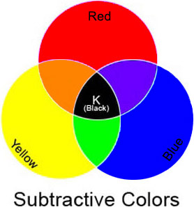
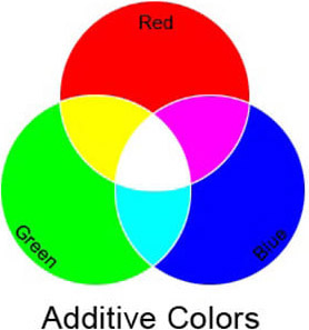
One of the most difficult concepts for artists to understand or accept, I find, is color theory. It’s a tough buy-in to ask of anyone who’s been taught all their lives that the primary colors are red, blue and yellow (subtractive color) and that when these 3 are combined, a murky black is the result, to now understand, that with light (additive color), the primary colors are red, blue and green and, when combined, result in white. It doesn’t seem possible!

Subtractive Primaries Image           Additive Primaries Image

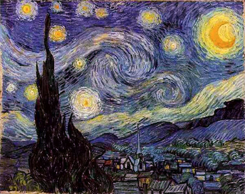
An extension of that reluctance of acceptance is the fact that shadows on an object are not just darker versions of the color of that object in light, but, in fact, completely different colors. For example, a red apple’s shadows are actually some form of green, not just a darker red. The consequence of this lack of acceptance is artists just adding black to colors to create shadows, resulting in myriad, otherwise beautifully executed, paintings continuing to exhibit dull, dirty, lifeless shadows.

Viewing Color Image
Red light reflected back to eye.

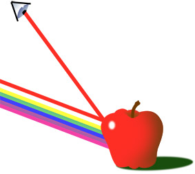
In hope of convincing those holdouts, let’s quickly review how the eye perceives the color of elements in the world. Clean white light is the resulting combination of all colors in the light spectrum. All colors in the light spectrum being those we see, when this white light is refracted, then reflected by a Prism or in a Rainbow. The various subjects we encounter in the world don’t actually have a color, per se. Instead their molecular make-up either absorbs the various colors of the light spectrum or reflects them off the surface of the subject and back to our eyes. So, when you perceive an apple as red, you’re doing so because that apple could not absorb red colored light and reflects that light back to your eyes. All other colors in the light spectrum (blue, purple, green, yellow, etc.) are absorbed by the apple. In the case of shadows, direct light is blocked, in turn, the light color being bounced back to our eyes is also blocked, leaving a combination of all remaining colors of light in the shadow. Confusing? Yes, but there’s a simpler way to remember this!

Color Wheel Image
The Color Wheel

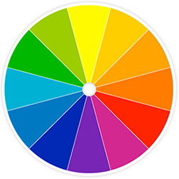
The color wheel is one of the most important tools in an artist’s paintbox. Among other things, it’s your simple guide to the color in shadows. As it turns out, the shadow color of any given color is its compliment. Take the primaries red, blue and yellow. Yellow’s compliment is violet. Remember our discussion above, stating the shadows of any given color are a combination of all the remaining colors in the color spectrum? Well, those astute readers out there have likely already realized that yellow’s compliment, violet, is the combination of the two remaining primary colors, red and blue. The color wheel makes calculation unnecessary and locates each color’s compliment directly across from it on the wheel.

While there are other factors involved in determining the final color of a given shadow, like value, nearby reflected color, color of the surface on which the shadow falls, etc., knowing the base color of shadows, moves you away from black and assists you in using your eyes to determine what’s really there before you.

Carry a small color wheel around with you, use it diligently to help determine color in shadows and you’ll find, in a very short time, that you have it memorized. Your shadow depth will increase and your paintings become more lively!


Got Color! – Part 2

Subtractive Color Wheel Image
The Subtractive Color Wheel

In my last post I talked a bit about how the two color systems, Additive Color and Subtractive Color work and how our eyes physically perceive color. In this post we’ll get down to the fun and helpful part of the color theory discussion: the color wheel and how to use it.

How the color wheel is laid out, is vitally important to its function. The 3 Primary Colors: yellow, red and blue are at 12 o’clock, 4 o’clock and 8 o’clock. They form the Triad of the color wheel. At locations halfway between each of the primary colors, as you work your way around the wheel, are the Secondary Colors: orange, violet and green. Colors that are next to each other on the color wheel are referred to as Analogous Colors, colors directly across from each other are Complementary Colors.

Understanding this information can assist you in establishing Mood in your paintings. For the most harmonious, serene mood in your work use analogous colors, colors next to or near each other on the color wheel. For the most lively color themes in your paintings, utilize complementary or near complimentary colors: colors opposite each other on the color wheel.

Select any color, at any location on the color wheel. Locate the color directly across from it, its Compliment, and realize that the complement is made up of all the colors in the color spectrum that the first color lacks. For example: red’s complement, green, is made up of blue and yellow. Orange’s (red and yellow) complement is blue. When you abut pure complements of identical value against each other, the two colors are so lively they’ll create a color vibration producing an optical illusion in your eye of a third color along their adjoining sides.

Too often, I’ve seen painters using black to darken their paints. Black paints are made from charcoal. So adding black to darken your colors is kinda’ like adding a  charcoal briquette to your color. It makes your colors dirty.  Since the world is lit by a spectrum of colored light (remember the discussion of the Additive Color spectrum in my last blog) there is color even in shadows. They’re really not black. A better solution, than using black, is to bring the value of your colors down by adding a dark version of the compliment or a near compliment. Using the complimentary color is also the best way to mute colors that are too bright for your purpose. The muted colors and grays you create are scrumptious (did I just say scrumptious?)!

Color Strip Image
Starting with orange & adding its complement turquoise until we arrive at pure turquoise.
The grey created halfway between orange & turquoise.

If you must use black and you’re working with oils, at least take a look at the new black, Chromatic Black, created by Gamblin Artists Colors. They avoided charcoal and instead mixed very dark versions of Phthalo Green and its compliment Alizarin Crimson to create a black. So you may still be using black, but you’ll be working with color not charcoal.

And here’s probably the most important thing the color wheel can assist you with. Ever stand there pondering your subject matter, whether an old barn on location or a live model in the studio and ask yourself, “What the hell IS that color in the shadow?” We’ve all been there, many times! Determine the color of lit area of your subject and know the shadow is going to be some value of its compliment. Colored light casts a complimentary colored shadow. Doubt this? Grab a light source, a colored piece of cellophane, a white card and an egg and find yourself a dark room. Point your light wrapped in the colored cellophane at the egg resting on the white card. The shadow cast will be a brilliant version of the cellophane’s complimentary color.

Add a color wheel to your paintbox. Use it religiously and in no time you will have it committed to memory. The colors in your paintings will be become cleaner and more lively!

Got Color! – Part 1

Subtractive Color Wheel Image
The Subtractive Color Wheel

It’s surprising the number of artists I encounter who have never been introduced to the color wheel and the important role it plays in color theory. Many have seen it, but most have never been shown how to use it. Yet, it’s one of the most important tools in your paintbox.

The color wheel can help you identify the true color present in your subject matter, especially in the shadows, help you properly mix and mute paints and chose an appropriate palette for establishing the mood of your undertaking.

There are actually two color systems (three if you include the Munsell’s system), one for the color of light, Additive Color and one for color of pigment, Subtractive Color. I’ll give you a brief description of both systems (we’ll save discussion of Munsell’s system for a later time) and then describe how to use the Subtractive color wheel to your benefit in painting.

Additive Primaries ImageAdditive color theory is important to understand, though, since it is all about how the LIGHT color spectum functions, unless you’re a photographer or lighting director in theater or film you won’t have the opportunity to manipulate it.  It is the system by which you view color in the world. The primary colors in the Additive color system are red, blue and green (not red, blue and yellow, the primaries in the Subtractive color system). Mixing all 3 primaries results in white light. When you see an object as red, like an apple, the molecular make up of the apple is such that it is absorbing all colors in the light spectrum, but red. Because the apple can’t absorb the red light, the red light rays bounce off the surface of the apple and back to your eye. Ironically, you could say the apple is every color but red, since it’s absorbing all the other colors in the light spectrum, but red.

Subtractive Primaries ImageIn subtractive color theory the primary colors are the more familiar red, blue and yellow. This is the system we work in, when we mix paints. The combination of all three primaries in this system result in black. You’re mixing pigments in this system, not light. Your eye perceives the colors you mix, however, in the same way it perceives the colors of the light spectrum. The molecular structure of any particular pigment color absorbs all color but the color you perceive. Blue, for example, absorbs all colors of the spectrum accept blue light and, therefore, bounces or reflects the blue light back to your eye.

Confused? I know this can  be a little disorienting at first. Be comforted in knowing it’s not as important to understand how the eye physically perceives color, as it is to understand how the color wheel can help you work with color, when you’re painting. I think I’ve probably given you enough to ponder here, so I’ll break this one post in two and cover the function of the color wheel and its benefits to the painter in my next post.

Too Good to Be True

Starry Night Image
Vincent Van Gogh’s “Starry Night.”

Any painter I’ve ever met, regardless of experience, possessed the desire to expand their abilities with each new canvas. I never met anyone who felt they possessed all available knowledge or had developed all necessary skills. We’re all seeking growth, but there are hazards to avoid along the way. When you encounter an artist that seems to always get it right, always chooses the best point of view, lays out the best composition, chooses the perfect palette, puts down paint with seemingly effortless skill and confidence and consistently delivers one beautiful image after another, it’s a good bet there are yards and yards of canvas in their history.

Beware of those who would offer you shortcuts to becoming a master painter. Along the path to accomplishment you’ll be offered both knowledge and illusions. It’s important to absorb the first and avoid the last. When someone tells me these colors must be used in creating the perfect flesh tones or that counting the number of hard and soft edges in my paintings will lead me to Nirvana, I run as fast as I can in the opposite direction. Flesh tones change based on environment: available light, reflection, what the model is wearing, etc. How edges are rendered should be suggested by the subject matter, not arbitrarily contrived in one direction or another by me. The greatest KNOWLEDGE I ever received was that everything I needed to know was right there in front of me, I only needed to learn to SEE it.

Value Guide Image
Value Guide

That’s where the years of experience come in, learning to see, takes time. Baby steps at first, giant strides later. The good news is, all of us can achieve it, the only requirement is a passion for getting there.

Color Wheel Image
The Color Wheel

Consider Vincent Van Gogh. A man in his 20s decides, one day, that painting is his future. Lacking any affinity for his newly chosen profession, he embarks first on teaching himself to draw. The first products are crude and childlike, but within 2 years of drawing anything and everything he encounters he becomes a master draftsman. He then picks up paints and travels down a similar road, producing crude amateur works first (his Potato Eater period), masterpieces later. Friends know I can never get over the realization that while Mr. Van Gogh made one of the greatest contributions to art, both in number and quality of works, his time as an artist, from deciding it was what he wanted to do, until he breathed his last breath, numbered only 9-10 years.

Right Brain Drawing Image
Drawing on the Right Side of the Brain by Betty Edwards

There ARE some good solid vehicles available to inform us of what we’re looking for with our artist’s eye: right brain drawing exercises, the color wheel, value guides and the rule of thirds, for example, but be forever suspicious of the quick-fixes presented. There are no shortcuts to good painting, we have to put in the mileage!