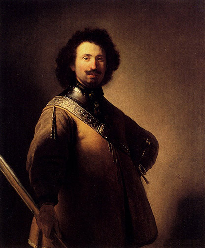
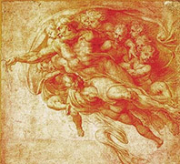
Rembrandt achieves maximum drama in a static pose, in “Portrait of Joris de Caullery,” through contrasting light and dark values.
In a couple of past posts, Got Color! – Part 1 and Part 2, I spoke of how your use of color controls the life of your painting. Well, if color controls life, your use of value determines the level of drama in your paintings.
For those of you non-painters out there, value, in painting, refers to the gray scale levels in a painting: what’s left when you strip a painting of its color or hue, similar to what you’d see in a black and white photograph of a full color painting.
9 step value guide
Most painters work with 9 values: 9 even incremental stages of gray from pure white to pure black. There are some painters out there who believe in reducing this spread, limiting their paintings to only 4 values. They believe the 4 value limit increases unity and cohesiveness in a painting. You’ll have to decide for yourself in which camp to pitch your tent.
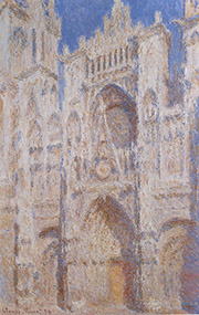
Light, tint values make for the serene in Monet’s “Rouen Cathedral.”
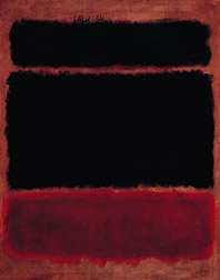
Colors with values at the light, white side of the scale are referred to as Tint. Colors with values at the dark side of the scale, towards black, are referred to as Shade. The more contrast you provide between your light values and your dark values (see Rembrandt’s, “Portrait of Joris de Caullery,” at the top of this post), the more tension, drama your painting will communicate. Paintings with all their values at the shade end of the value scale, exude a dark, melancholy feeling. Paintings with all their values on the light, tint end of the value scale, tend to be serene in mood.
Dark, shade values communicate melancholy in Mark Rothko’s “Black in Deep Red.”
Additionally, the darks in a painting act as a kind of armature or foundation, supporting the entire composition, as they weave in and out of background, mid ground and foreground.
Underpainted in uncharacteristic red, Rubens binds his image together with darks.
When you determine how values will be used in your paintings, you are determining the drama to be communicated by your canvas, as surely as if you were a lighting director, lighting a set for a play or film.
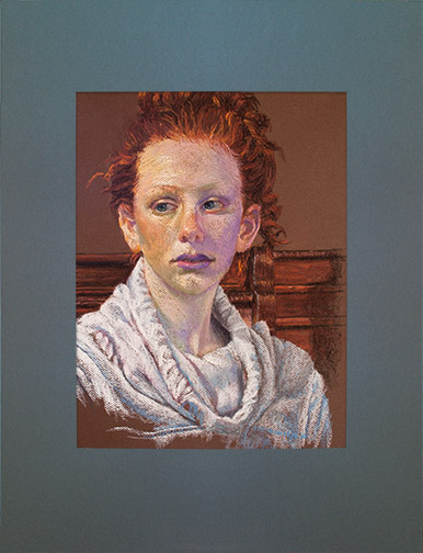
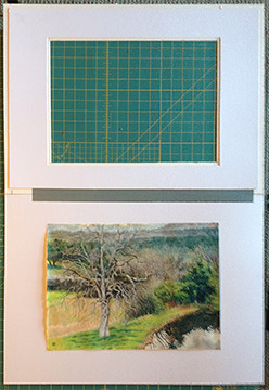
“Portrait of Priscilla Bugg,” 16″ x 12,” soft pastel on paper by Trowzers Akimbo in special pastel mat.
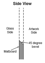
A few years ago I came across a great system to use when matting soft pastel artwork for framing. Those of you who frame a lot of work created with this medium have likely noticed that, over time, some of the chalk falls from the artwork and collects along the bottom inside edge of the mat. The system I’ll demonstrate avoids this.
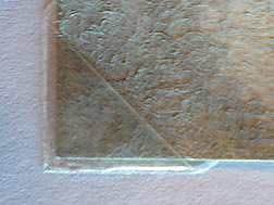
Key to this system is that you cut your mat with a 45 degree bevel, but reverse the bevel so the 45 degree cut edge faces inward, towards the artwork, not outward towards the glass, as it normally would. When cut correctly, you see a sharp edge on the inside of the mat surrounding your artwork, not the 45 degree cut edge that reveals the center color of the matboard (generally white).
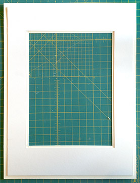
Corner of the top mat, cut using a reverse 45 degree bevel.Hidden Mat attached to the back of Top Mat.
Next you need to cut a second hidden mat to be attached to the back of the first top mat to create an airspace between the artwork and the top mat. Any falling pastel chalk dust will fall behind the top mat and come to rest at the bottom of the airspace, out of view.
Since you won’t see this 2nd hidden mat, it’s a great opportunity to use scraps of that hideous colored mat board you have laying around. I cut mine from one piece of board, but there’s no reason why you couldn’t use separate strips of board for this function. I size my hidden mat so the viewing opening is 1/4″ smaller, all the way around, than my top mat and 1/2″ smaller, all the way around from the top mat’s outside edge. This way I’m sure no one will be able to see the hidden mat, when viewing my framed artwork from the side and by keeping my overall hidden mat smaller than the top mat, I avoid it getting in the way of the frame, when I put everything together. Remember, that this hidden mat will come into contact with the backer board you’ve attached your artwork to and possibly the artwork itself, so you need to use acid free, archival mat board, if longevity is important to you.
The mat assembly & backer board hinged together with acid free tape.
From here you just finish the framing following your normal procedure. I hinge my mat board to the backer board with archival tape.
Because I usually create my pastels on normal pastel paper, I couldn’t hinge the artwork to the backer board, as I normally do with works created on other substrates, using Japanese paper for the hinges and wheat starch as the adhesive. The wet wheat starch mixture would cause the paper to buckle, where the attachments were made. So, I used archival polypropylene photo corners, which I purchased at my local art store, to make the attachment.
Archival Polypropylene Photo Corner
That’s it! Use this mating system and you’ll never again have to pull your artwork out of the frame to clean the collected pastel dust from the edge of the mat.
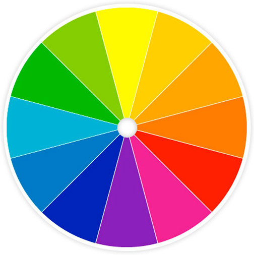
In my last post I talked a bit about how the two color systems, Additive Color and Subtractive Color work and how our eyes physically perceive color. In this post we’ll get down to the fun and helpful part of the color theory discussion: the color wheel and how to use it.
How the color wheel is laid out, is vitally important to its function. The 3 Primary Colors: yellow, red and blue are at 12 o’clock, 4 o’clock and 8 o’clock. They form the Triad of the color wheel. At locations halfway between each of the primary colors, as you work your way around the wheel, are the Secondary Colors: orange, violet and green. Colors that are next to each other on the color wheel are referred to as Analogous Colors, colors directly across from each other are Complementary Colors.
Understanding this information can assist you in establishing Mood in your paintings. For the most harmonious, serene mood in your work use analogous colors, colors next to or near each other on the color wheel. For the most lively color themes in your paintings, utilize complementary or near complimentary colors: colors opposite each other on the color wheel.
Select any color, at any location on the color wheel. Locate the color directly across from it, its Compliment, and realize that the complement is made up of all the colors in the color spectrum that the first color lacks. For example: red’s complement, green, is made up of blue and yellow. Orange’s (red and yellow) complement is blue. When you abut pure complements of identical value against each other, the two colors are so lively they’ll create a color vibration producing an optical illusion in your eye of a third color along their adjoining sides.
Too often, I’ve seen painters using black to darken their paints. Black paints are made from charcoal. So adding black to darken your colors is kinda’ like adding a charcoal briquette to your color. It makes your colors dirty. Since the world is lit by a spectrum of colored light (remember the discussion of the Additive Color spectrum in my last blog) there is color even in shadows. They’re really not black. A better solution, than using black, is to bring the value of your colors down by adding a dark version of the compliment or a near compliment. Using the complimentary color is also the best way to mute colors that are too bright for your purpose. The muted colors and grays you create are scrumptious (did I just say scrumptious?)!
Starting with orange & adding its complement turquoise until we arrive at pure turquoise.The grey created halfway between orange & turquoise.
If you must use black and you’re working with oils, at least take a look at the new black, Chromatic Black, created by Gamblin Artists Colors. They avoided charcoal and instead mixed very dark versions of Phthalo Green and its compliment Alizarin Crimson to create a black. So you may still be using black, but you’ll be working with color not charcoal.
And here’s probably the most important thing the color wheel can assist you with. Ever stand there pondering your subject matter, whether an old barn on location or a live model in the studio and ask yourself, “What the hell IS that color in the shadow?” We’ve all been there, many times! Determine the color of lit area of your subject and know the shadow is going to be some value of its compliment. Colored light casts a complimentary colored shadow. Doubt this? Grab a light source, a colored piece of cellophane, a white card and an egg and find yourself a dark room. Point your light wrapped in the colored cellophane at the egg resting on the white card. The shadow cast will be a brilliant version of the cellophane’s complimentary color.
Add a color wheel to your paintbox. Use it religiously and in no time you will have it committed to memory. The colors in your paintings will be become cleaner and more lively!
It’s surprising the number of artists I encounter who have never been introduced to the color wheel and the important role it plays in color theory. Many have seen it, but most have never been shown how to use it. Yet, it’s one of the most important tools in your paintbox.
The color wheel can help you identify the true color present in your subject matter, especially in the shadows, help you properly mix and mute paints and chose an appropriate palette for establishing the mood of your undertaking.
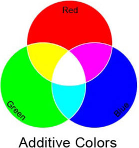
There are actually two color systems (three if you include the Munsell’s system), one for the color of light, Additive Color and one for color of pigment, Subtractive Color. I’ll give you a brief description of both systems (we’ll save discussion of Munsell’s system for a later time) and then describe how to use the Subtractive color wheel to your benefit in painting.
Additive color theory is important to understand, though, since it is all about how the LIGHT color spectum functions, unless you’re a photographer or lighting director in theater or film you won’t have the opportunity to manipulate it. It is the system by which you view color in the world. The primary colors in the Additive color system are red, blue and green (not red, blue and yellow, the primaries in the Subtractive color system). Mixing all 3 primaries results in white light. When you see an object as red, like an apple, the molecular make up of the apple is such that it is absorbing all colors in the light spectrum, but red. Because the apple can’t absorb the red light, the red light rays bounce off the surface of the apple and back to your eye. Ironically, you could say the apple is every color but red, since it’s absorbing all the other colors in the light spectrum, but red.
In subtractive color theory the primary colors are the more familiar red, blue and yellow. This is the system we work in, when we mix paints. The combination of all three primaries in this system result in black. You’re mixing pigments in this system, not light. Your eye perceives the colors you mix, however, in the same way it perceives the colors of the light spectrum. The molecular structure of any particular pigment color absorbs all color but the color you perceive. Blue, for example, absorbs all colors of the spectrum accept blue light and, therefore, bounces or reflects the blue light back to your eye.
Confused? I know this can be a little disorienting at first. Be comforted in knowing it’s not as important to understand how the eye physically perceives color, as it is to understand how the color wheel can help you work with color, when you’re painting. I think I’ve probably given you enough to ponder here, so I’ll break this one post in two and cover the function of the color wheel and its benefits to the painter in my next post.

 Key to this system is that you cut your mat with a 45 degree bevel, but reverse the bevel so the 45 degree cut edge faces inward, towards the artwork, not outward towards the glass, as it normally would. When cut correctly, you see a sharp edge on the inside of the mat surrounding your artwork, not the 45 degree cut edge that reveals the center color of the matboard (generally white).
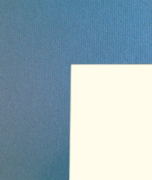


 Additive color theory is important to understand, though, since it is all about how the LIGHT color spectum functions, unless you’re a photographer or lighting director in theater or film you won’t have the opportunity to manipulate it. It is the system by which you view color in the world. The primary colors in the Additive color system are red, blue and green (not red, blue and yellow, the primaries in the Subtractive color system). Mixing all 3 primaries results in white light. When you see an object as red, like an apple, the molecular make up of the apple is such that it is absorbing all colors in the light spectrum, but red. Because the apple can’t absorb the red light, the red light rays bounce off the surface of the apple and back to your eye. Ironically, you could say the apple is every color but red, since it’s absorbing all the other colors in the light spectrum, but red.
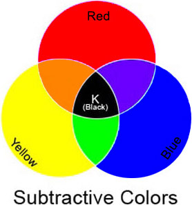 In subtractive color theory the primary colors are the more familiar red, blue and yellow. This is the system we work in, when we mix paints. The combination of all three primaries in this system result in black. You’re mixing pigments in this system, not light. Your eye perceives the colors you mix, however, in the same way it perceives the colors of the light spectrum. The molecular structure of any particular pigment color absorbs all color but the color you perceive. Blue, for example, absorbs all colors of the spectrum accept blue light and, therefore, bounces or reflects the blue light back to your eye.