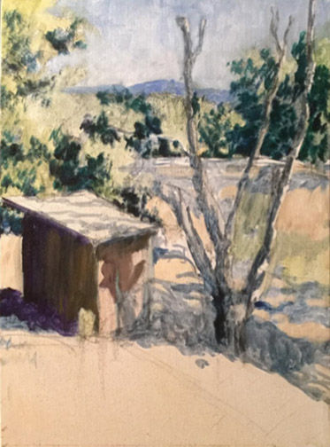
“Left to the Village,” by Trowzers Akimbo, rejected by the 2016 Yosemite Renaissance exhibit/competition
First, let me apologize for my lack of new posts over the last two weeks. I’d received two new commissions for mural paintings from two different children’s hospitals a few day apart from each other and they required me to create 4 designs in 16 days. This, along with the 3 workshops I’ve been teaching each week, made it impossible for me to put together new posts.
Anyway, now that I’m writing again I wanted to talk about rejection. It seems to be going around lately! I recently ran into an artist friend, at an opening, who told me her submission had been rejected from a recent exhibit/competition. This from one of the most sought after, financially successful artists I know.
Two days later, at a local art organization holiday party, two more artist friends presented their work, prefacing with the fact the pieces had been rejected by recent shows. This prompted me to ask all present (about 50 artists) to raise their hands if they’d ever been rejected from an exhibit or competition. Every hand in the place shot up!
These bold admissions illustrate an important point for all artists, beginning or well established, to remember. Rejection is just a part of being an artist and rarely has anything to do with the piece of art being rejected. Instead, it has everything to do with the judges making the selection: their personal tastes or bias, their education, life experience, relationships, mood, even what they had for breakfast and their drive to work that morning. Different judges or a different day, completely different result.
Vincent Van Gogh only sold a single painting, during his lifetime.They hated his stuff! The Impressionist proudly chose their art movement’s name from a “catty” art critic, rejecting their work in whole as simply impressions of paintings, in a newspaper review he’d written.
All artists, big and small, are faced with rejection of their work. It goes with the territory. It signifies nothing. Don’t let it discourage you!
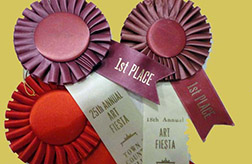
Among the many things discussed this weekend with 3 artist friends, during our 8 hour round trip journey to the San Francisco Bay area, was judging in art competitions. We belong to a local chapter of a San Francisco based art organization and had volunteered to transport our member paintings up and back from the annual exhibit held at our headquarters gallery.
We’re, all four, often asked to judge various competitions or to be involved with the selection of judges. I, personally, believe in a 3 judge system. Having a single judge, I feel, is unfair to the entrants, as it’s very one-sided, reflecting the nonobjective personal tastes and opinions of a single individual. While having two judges is a little better, with the decision making a bit more objective, the decision weighting is now just 50/50 and the two judges decisions can cancel each other out. A piece that one judge loves, can be knocked out of prize competition because the other judge doesn’t agree. With 3 judges, prize winning works are selected through majority decisions, each single judges judgement call is tempered by the judgement of the other two. I feel so strongly about the fairness of the 3 judge system, that I consider this in deciding whether or not to participate in a competition.
Another central topic surrounding our competition judging discussion was the importance of who the selected judges are: their background and expertise. Organizations have a lot of tasks on their plate when putting together an exhibit or competition and too often judge selection it made quickly, without adequate consideration, in an effort to mark the task done and move on to one of the other items on the list. The problem is compounded if you’re making the selection for an organization who offers competitions annually or even more frequently. In attempts to avoid using the same qualified judges too often, it’s easy to relax standards a bit, in the name of adding variety to the judging panel. Don’t do it! Who is selected to judge the competition is the single most import decision made in an art competition. Unqualified judges make for unfair, competitor head-scratching decisions.
Selecting judges with expertise specific to the flavor of your competition is another important consideration. If you’re mounting a representational art only competition, you don’t want to bring in judges known for their fantastic abstract work. If you’re including an abstraction category in your competition, you don’t want to only invite hardcore realists to do your judging.
While a lot of this is just common sense, when the calls for entry have gone out and you’re under the gun to get everything done before the posted show opening night date, it’s easy to use up the time necessary to consider and vet appropriate judges. You owe it to yourself, organization and competitors to never let that happen.
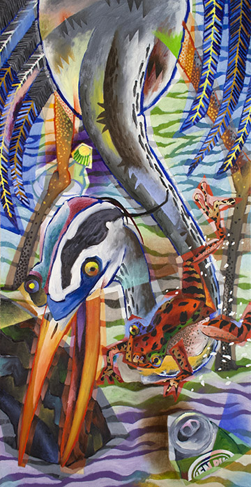
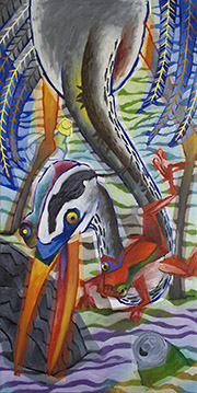
Here’s my process on an abstraction I recently finished for the upcoming show titled “AVIAN: Birds in a Changing World.” The competition will be open to artist across North America and sponsored by local non-profit organizations Sierra Art Trails (the group that puts together our annual artist’s open studio tour) and Yosemite Audubon, with proceeds going to support the two organizations.
I’ve never painted a bird before and had some difficulty in selecting a subject. We’ve got a seasonal pond on our property, up here in the Sierra Nevada foothills, and, on occasion, a great blue heron will drop in for an hour or so to sample from the many frogs that call the basin home. We’re pretty excited when this occurs, so I figured that would be a good subject to begin with.
While our watershed is pretty pristine, these guys travel great distances, stopping for a quick meal at myriad locals as they go. Even up here, near Yosemite, I’m amazed at what people will dump in remote locations (I’m talking old sofas and refrigerators). I imagined what the herons might be facing when they feed in more urban areas.
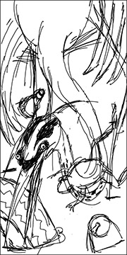
A quick thumbnail sketch, done on my computer.
I started by collecting a lot of photos, from the Internet, of herons and frogs. Then created a quick thumbnail sketch on my computer. Given that everything on the heron is elongated, long legs, long neck, long beak, I thought utilizing a 1:2 ratio canvas might work well, so sketched using that aspect ratio. Usually, it takes two or three thumbnails, before I land on a composition or concept I like, but this time I felt I had something I could work with in my first sketch. I was a little concerned as to whether or not the frog’s placement over the bottom curve in the heron’s neck would be a problem, but I was confident I’d be able to work it out through color and value.
Day 1 progress.
I had a blank 36″ x 18″ canvas already, put it up on the easel and had at it. Even with the time eaten by the thumbnail concept sketch, I got pretty far with the painting that first session (with a large part of the day taken up by communications and marketing, I clear at least four hours, at the end of each day, to paint).
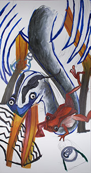
With base color down, I started to paint.
Three more sessions and I had most of the base color blocked in and could start actually painting. I began by dividing the heron’s neck into two surfaces, with a line down the center, adding a few stylized feather tufts in the process. I also added a pattern to the front of the neck, inspired by the coloring actually on the bird. I scrubbed in a bit of Indian Red at the neck base to delineate it from the body. Inspiration prompted me to add a bit of blue and green to the frog, so I slapped that in, before the thought evaporated. I decided to make the right side to the heron’s head a kind of negative of the left. Finally, I added quill spines to the feathers and tried out a possible paint pattern application. At the time, I felt the light yellow spines might need to be toned down, both in chroma and value, but decided to wait until the painting was more complete, before making that decision.
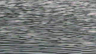
One of several reference photos used to determine my pond surface pattern.
From the start, I’d planned some kind of pattern for the surface of the pond. Since I paint both foreground and background images with color of equal intensity, I need to rely on other graphic means to achieve separation and a hierarchy of importance. Patterns recede, so I knew using one here would be a good way to move the heron and frog to the forefront of interest. I didn’t want realism here, I wanted a graphic solution, but a solution inspired by reality. I went to the Internet again for reference.
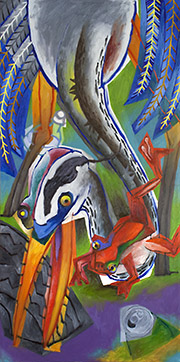
Painting with the pond surface pattern added.
Testing my solution out as a layer overlay in Photoshop, I refined my pattern until I was confident it would work, before committing it to paint. I do this often if I’m considering something that will require a lot of scrapping out and repainting, if it doesn’t work. A huge time and frustration saver. Here’s the painting with the surface pattern added.
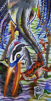
Jump ahead about 3 more sessions and I’ve made a lot of painting progress. I’ve separated the frog from the heron’s neck with a medium blue and cad yellow/orange and added a black pattern to his skin. Your mind is geared to interpret everything as 3 dimensional, so even when it’s confronted with a clearly 2 dimensional image, its tendency is to process it in 3D terms. For example, it interprets large elements as being closer to it than smaller ones and an element that overlaps the edge of another element as being in front of that element, etc. This is so we can safely navigate a 3 dimensional world.
About 3 sessions later.
A lot of what I’m doing, in my abstracts, is trying to bring attention back to the 2 dimensional surface of my canvases and override any projected illusion of 3 dimensional depth…to flatten my paintings. With that in mind, I’ve continued outside contours, defined additional forms and added a feather tuft pattern to the heron’s body. I’ve applied the earlier established pattern to all the feathers and brought attention to their 2 dimensional surface contours, with a swatch of pink paint. I added a label to the beer can, detailed it’s top and continued some of its contours across the pond surface. I moved the top of the plastic bottle forward by added a soft deep violet shape behind it. I defined a new plane along the top of the heron’s beak/mouth. I’ve also begun to detail the tire. At this point, I decided the light yellow feather spines were working fine and didn’t need to be changed.
Another 6 sessions and I arrived at the finish shown at the top of this post. Through those sessions I added patterns to the heron’s legs and frog’s belly, used color and value to define the planes that make up the frog, added nostrils to the heron and darkened the inside of his mouth. I also, added detail to the geometric color shape continued outside of the heron’s beak, further separated the two planes of his neck with a pale blue and added more surface form detail, with the addition of blue, to the right wing of the heron. Additionally, I added a surface contour running across the tire, heron’s beak and neck and pond surface. A few droplets of foam flying from the frog and a bit of minor adjustment here and there and I determined it finished. Wish me luck!
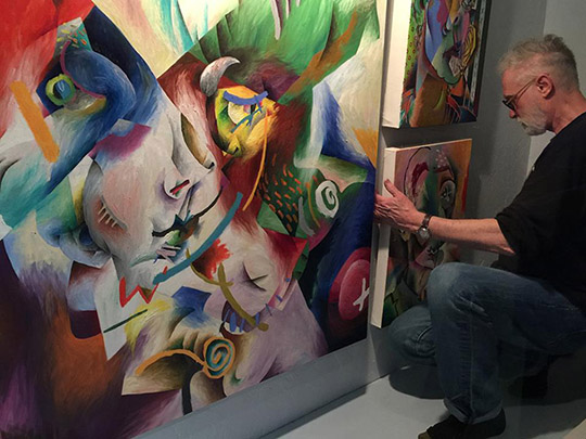
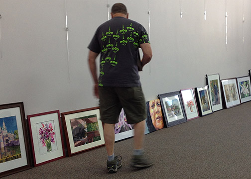
It was a busy week setting up my solo show, A Pair of Trowzers, at the new Gallery 5, in Oakhurst, CA. Many of my pieces are large and have to been transported from my studio to the gallery a couple at a time strapped to a contractors rack installed on my pick-up truck. I had to resign myself, early on, that not much new painting would be accomplished that week, as all waking hours would be needed to mount the exhibit. I’m pretty spoiled in that area, holding myself to at least 4 hours of dedicated painting time a day (from 4pm — 8pm). If other crisis prevent me from getting into the studio earlier in the day, I always at least have those 4 hours to hold onto. Not this week! Hey, getting a solo gig is always an accomplishment, so you’ve got to “roll wid it!”
We were successful in getting all artwork transported to the gallery before the rains hit that week, so, we had that going for us! Don’t know how many of you have been involved in the nuts and bolts of mounting a show, but there’s usually several days of moving the pieces around, leaning them against the walls to see how they work in the space and against each other. Well, I tried something new this time. When I discovered the gallery owner/curator, Jon Bock, had a floor plan available to me, I decided to build a quick a dirty 3D model of the space using Google Sketch Up and attempt a virtual organization of the exhibit. I feel having done so saved me a day or two in actually putting things together in the gallery. I only transported pieces I new I was going to use and I had plan for how it all fit together. I was CCO with several computer game companies from 1989 – 2011, so I’ve had a lot of exposure to 3D modeling and animation software. I wouldn’t recommend the uninitiated from sitting down and learning a 3D app just to accomplish this, but since the skills were in my toolbox, it was a no-brainer for me. If you’re in the area, I hope you’ll stop by and view the show.
Here are the particulars: A Pair of Trowzers
February 18 – March 26, 2017
11am-5pm Daily
Gallery 5
40982 Highway 41
Oakhurst, CA 93644
559 683-5551
Artist’s Reception, Saturday, March 18, 2017, 6pm-8pm
I’m back in the studio painting again now, my natural habitat.
In progress demo by Trowzers Akimbo
Tomorrow night, Wednesday, March 1st, will be the second night of four in my Painting Workshop at the Artists’ Loft, in North Fork, CA. If you missed last weeks first class, but wanted to be part of this workshop, don’t worry, you can start with this weeks installment and we’ll catch you up. Last week I walked the group through my personal 3 stage indirect painting approach, with a demo, and got everyone started on their own paintings. This week will start the one on one discussions, providing attendees with answers and help on the specific issues they’re facing with their own individual pieces. The workshop is open to all experience levels and oil, acrylic, watercolor and soft pastel mediums are all welcome. The cost is $35 per student per week, with sessions starting at 6pm and continuing to 8pm (our end time is soft, as we stick around until all questions are answered).
The Artists’ Loft
6pm – 8pm
Wednesdays, Feb 22 – Mar 15, 2017
32870 Road 222
North Fork, CA 93643
 Another central topic surrounding our competition judging discussion was the importance of who the selected judges are: their background and expertise. Organizations have a lot of tasks on their plate when putting together an exhibit or competition and too often judge selection it made quickly, without adequate consideration, in an effort to mark the task done and move on to one of the other items on the list. The problem is compounded if you’re making the selection for an organization who offers competitions annually or even more frequently. In attempts to avoid using the same qualified judges too often, it’s easy to relax standards a bit, in the name of adding variety to the judging panel. Don’t do it! Who is selected to judge the competition is the single most import decision made in an art competition. Unqualified judges make for unfair, competitor head-scratching decisions.