Painting in the “Pink”

Pretty in Pink Painting
“Pretty in Pink,” 30″ x 4,” oil on canvas, © 2017 Trowzers Akimbo.

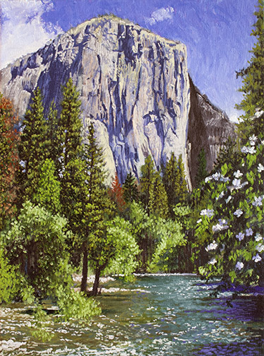
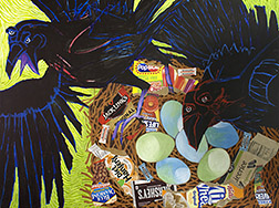
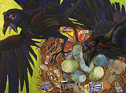
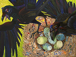
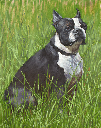
After completing two abstract bird paintings (“At Risk” and “Modern Building Materials”) for the “Avian: Birds in a Changing World” exhibit (a show to benefit our local Audubon Society chapter and Sierra Art Trails), I began thinking about what I wanted to enter in the Yosemite Renaissance show this year

“At Risk” (left) and “Modern Building Materials” (right), © 2017 Trowzers Akimbo

For those unaware of this exhibit and competition, Yosemite Renaissance is an annual show held in the Yosemite Museum Gallery, in Yosemite Village, in Yosemite National Park. It takes place in February, encourages non-traditional approaches to artworks focused on Yosemite and the surrounding Sierra Nevadas and offers a stiff competition, with only a 7% — 8% acceptance rate. After leaving Yosemite the show travels to various venues around California for a year. I love it, when I get into this show!

Yosemite Falls from Sentinel Swinging Bridge Painting
“Yosemite Falls from Sentinel Swinging Bridge,” 30″ x 40,” oil on canvas, © 2017 Trowzers Akimbo.

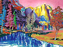
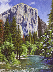
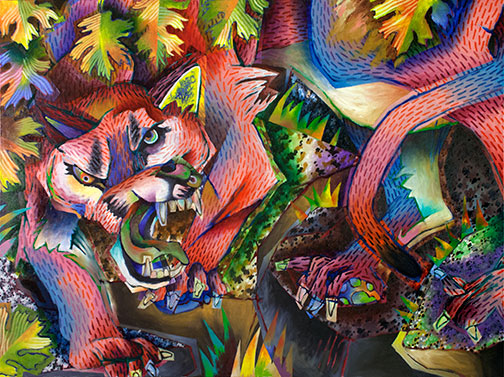
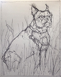
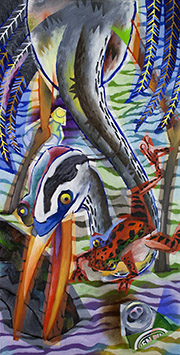
I had one piece, an abstract view of “Yosemite Falls from the Sentinel Swinging Bridge,” which was an appropriate piece to enter, but I wanted to submit something brand new, fresh off the easel and into the competition for the show. Around this time, a mountain lion had been spotted in our neighborhood, encouraging me to take a baseball bat with me each night, as I traveled out to the far corners of our property to turn on security lights. I believe this got into my head, as I decided to take on a mountain lion in my next painting. I’m going to walk you through my steps in painting “Pretty in Pink” here.

Mt. Lion Sketch
My rough computer sketch

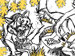
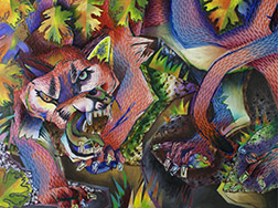
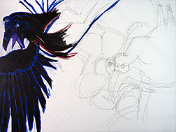
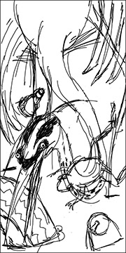
I started this one with a rough sketch, done with a Wacom Tablet and stylus connected to my computer. The computer is a great preliminary visualization tool, allowing me to easily grab a section of my sketch, move it, resize it, rotate it, etc and try what ifs, by turning layers off and on. Doing the same thing on paper, would be difficult and much more time consuming. Living in the Sierras, I’m told mountain lions are often near by, when I hike or mountain bike into wooded areas. They’re just out of site. I recall this being portrayed well in Michael Mann’s film version of “The Last of the Mohicans,” as Hawkeye and his Native American adopted father and brother are guiding the British colonel’s two daughters to a fortress to join their father. The older daughter silently perceives a mountain lion under the foliage, just off the trail, watching them pass. I decided to portray this silent laying in wait, graphically.

Mt. Lion Sketch on Canvas
My charcoal pencil/oil paint drawing on the canvas

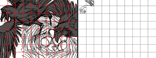
Often my sketch is just a rough concept, a starting point to be further developed on the canvas, but this sketch was spot on, so I started recreating it on my canvas, just as portrayed in the original sketch. Due to the complexity, it proved difficult to recreate accurately and I told myself next time I had a sketch this complex, I’d use a grid system to create the drawing on canvas. After a lot of adjustments, in charcoal pencil and oil paint, I finally had a drawing I was happy with on the canvas.

Mt Lion Base Color
Most of the base color blocked in.

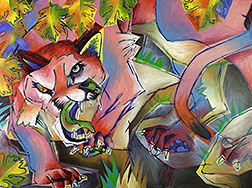
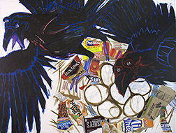
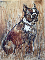
A few painting sessions and I had all the base color blocked in. If I think of a way I might want to vary the color, as I’m blocking in, I execute it right then. If it doesn’t work out, as I begin to refine the painting, I can always paint things over, but I rarely just lay in solid flat colors at this stage. Note how I’ve moved the cat’s muzzle down, as I blocked in the color. I continue to refine my drawing, as necessary, as the painting develops. With the base color in, my cat, background and foreground leaves are all pretty equal in importance. While my goal was to hide the puma, to a great degree, in its environment, I’m going to need to separate the lion a bit more from its environment.

Adding Patterns
Adding patterns

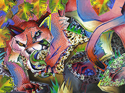
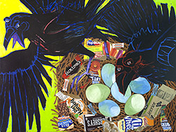
I added a hair pattern all over the mountain lion and different granite patterns to the rock surfaces. This adds a bit more complexity to the scene and, because patterns recede, is the first step in separating the mountain lion from the rest of the environment. Once the patterns dry, I’ll be able to use transparent glazing, as well as opaque painting to move planes forward or back and bring more importance to the cougar.

Detailing the Mt. Lion
Glazing, grass tuft detailing and leaf patterns

With a lot of the glazing completed I’m happy with the level of separation between cat and environ and the way certain planes advance, while others recede. I’ve also done some detailing on the stylized tufts of grass here. With so much of the painting completed, I determine how I want to finalize the foreground leaves, deciding on a here and there line pattern, inspired by the veins present on oak leaves.

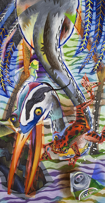
At this stage, all that’s left is to apply the pattern to the remaining leaves, add a few last bits of detailing here and there and somehow take the uniformity away from the violet glazing around the leaf on the right, above the lion’s rump. I decide that some loosely applied ochre paint is the answer here. All these final additions can be viewed in the finished painting at the top of this post.

I completed “Pink” just in time to make the Renaissance entry deadline and recently learned it has been accepted into this years show!

Poe’s Pets

Modern Building Materials Image
The finished painting

I’ve wanted to paint ravens for some time now, but never seemed to get around to it. I’m fascinated by the gamut of colors emanating from their shiny, deep black plumage, like an oil stain in the parking lot, after the rain. I’d always planned to paint a representational version, then the upcoming exhibition/competition, Avian: Birds in a Changing World, nudged me both towards painting them now and painting them as an abstraction.

The Avian prospectus encourages artists to make a statement concerning the effects our changing environment is having on our feathered friends and I felt the concept I had for a painting in that light, was better communicated through abstraction.

That painting now being complete, get comfortable and I’ll walk you through the process.

Raven Sketch Image
I worked out my sketch in Photoshop.

I had a clear concept, but I wasn’t sure how I wanted to present it. So, I started out by creating a rough sketch, in Photoshop, on my computer. I find it advantageous to do my thinking sketches on a computer, as you can easily try variations out on layers and changes are faster and cleaner than you can achieve with pencil, paper and eraser. The sketch was getting confusing, so I darkened the ravens to more clearly view their shape.

Ravens 01 Image
Executed my initial layout with shapes using acrylics.

Often the sketch I do at this stage is just a rough thumbnail concept of what I want the finish to be: the composition unresolved. This time, though, I realized my sketch was resolved enough to transfer as is to my 30″ by 40″ canvas. I had difficulty redrawing the sketch, in charcoal, on my canvas. I kept getting scale, shape or placement wrong. I decided to use acrylic paint instead. Following Matisse’s drawing with shape approach, utilized in his cut paper creations, I laid out the ravens as solid black shapes. The acrylics allowed me to quickly add or subtract from my drawing, due to their fast drying time. Eventually, I had a layout on my canvas with which I was happy. In hindsight, I would probably have been better off using a grid system to make the transfer.

Grid System Image.
With grid transfer system a grid is drawn over the original drawing (right). Then a proportional grid is drawn on the canvas and the sketch is recreated square by square.

Ravens 02 Image
Adding collage elements

With the drawing blocked in, I began adding some collage elements. The concept here is, that with all the refuge present in the contemporary environments the birds call home and less open, wild areas from which to collect natural building materials, the birds are resorting to incorporating elements of trash in their nest construction. I wanted to use actual litter elements to communicate this.

Ravens 03 Image
Blocked in the base colors, including the acid-green background.

All the collage elements in place, I laid down the nest darks and blocked in the other base colors. I was going for uneasiness in the viewer here and remembered a disturbing gas-lit poolroom scene van Gogh had painted. I borrowed the acid-green color present there for my background. Still, I didn’t feel the background was alive enough and borrowed another van Gogh

Ravens 04 Image
Added van Gogh brushwork to the background.

vehicle: swirling, pulsating brushwork, to the background. At this point I wasn’t quite sure what I wanted to do with the ravens themselves. I felt I’d better work on the birds a bit. Whatever I did to them was going to determine what I would need to do with the rest of the painting. I knew however I handled the ravens, they would need to feel black overall or they wouldn’t read as ravens.

Ravens 05 Image
Added color and pattern to the ravens & speckles to the eggs.

I decided to use the rainbow of color radiating from the shine present on the deep black raven feathers present on the real birds, that I spoke of earlier, as my inspiration for what I’d do with these guys. I started with the heads, then proceeded to the bodies, adding not only color, but also pattern. I also added the speckled pattern present on real raven eggs, before returning to work on the nest itself.

Ravens 06
Added mid-tones, lights and some gray twigs, along with some shadowing detail to the nest.

The nest now looked pretty flat to me. It needed a broader value range, if it was going to live in the same world as the ravens and their eggs. I added some light, mid-value and even a view gray twigs (for some color variation) to the nest. It still looked too flat, so I tried adding some shadowing to the twigs in one area of the nest. That seemed to be what the nest needed, so I continued adding the same shadowing throughout the rest of the nest.

Ravens 07 Image
Nest detail showing the shadowing applied to the twigs.

Looking the painting over, the edges where the raven on the left and the nest met the yellow-green background seemed to severe to me. I decided to soften the transitions with a bit of loose painting. You can see the result of these final touches in the finished version at the start of this post.

Painting a 90 Year Old Dog

Buck Painting
“Buck,” 10″ x 8,” oil on canvas.

My pop just celebrated his 90th birthday! My mom will be doing the same in January. Lucky for me, huh? My dad’s unbelievably difficult to buy gifts for. He doesn’t want much, but when he does want or need something, he just goes out and purchases it. Up until recently golf was his passion, so you could always pick him up something associated with that, but a deteriorating back put an end to his time on the greens.

Pop & Buck Photo
My dad at 9, with Buck and his grandparents, Dallas, TX.

So, I had no idea what I was going to get him for this very special birthday. Then my wife, Betty, came up with a great idea. My father had the worst of childhoods. His mother and father split up, when he was very young. When my dad was 5, his father stopped by on the way out of town to say he was pulling up stakes and didn’t know when he’d be able to see him again. My dad didn’t hear from his father again until his was 13 years old and didn’t see him again until he was 35. His mother took off with her boyfriend (later to become my pop’s step-father) around the same time, leaving her parents, my pop’s grandparents, to care for him. This was during the Great Depression of the 1930s. Stripped of all else, he held two precious possessions, the deep unconditional love of his grandfather and a boston terrier named Buck. Betty suggested I create a painting of Buck for him.

With only a week before the extended family party in L.A., I had to hunker down and make swift progress. My first decision was to work small. They have a small home, filled with the products of their many interests, anyway, so there isn’t a lot of wall space there. I chose an 10″ x 8″ canvas.

Buck Charcoal Layout Image
Charcoal pencil layout sketch.

I had a couple of old photographs of Buck, with my pop and his grandparents from the 1930s. These gave me an indication of the dogs specific markings, but I had to do a lot of online photo research of boston terriers to collect the more detailed information about the breed that I needed. I started with a soft charcoal pencil sketch on the canvas to establish my composition. Hard to maintain a clean line, at this small size, where every mark is magnified, but it will get the job done.

Buck Underpainting Image
My turp wash darks underpainting.

Squinting at my reference, I visualized the gross masses making up my darks, mid-tones and lights. Then, with my eyes fully open (no longer squinting) I moved on to a turpentine wash (actually I use Gamblin’s Gamsol) underpainting, in burnt umber, to establish the orchestration of my darks throughout the painting. Notice how the darks weave in and out of background, mid ground and foreground. It’s these dark shapes that cement your composition together and it’s why I do an underpainting first. Working this way allows me to sneak-up on the finish, closing in on the painting and building my confidence that things are going to work out, more with each step.

Buck End of Day 1 Image
My painting, end of a 6 hr. day 1.

I added basic transparent color washes, to dye each general area, so if I didn’t cover everything completely with opaque paint, I wouldn’t have any bright white holidays (missed areas) showing, before moving on to opaque painting, i.e.: transparent green over the grasses, transparent grays over the black patches on the dog. I always paint dark to light, but sometimes my underpainting darks are dark enough that it makes more sense to move right to the mid-tones and lights, then return to the dark areas and repaint them in the proper colors. At the end of about 6 hrs. on day one, I had most of the work behind me, just detailing the grass and a few adjustments on the dog left.

Buck Day 2 Image
Day 2, I added grass detail.

Day 2 only allowed me 2 or 3 hours of painting time, but I managed to make a few passes on the grasses, adding a couple of dark passes and a couple of light passes. I decided that I liked the idea of leaving the extreme, most distant areas of the grass background rough, but determined I’d need to blur the mid-ground grass details into the background a bit, to make it all work.

With my last day, day 3, I blurred the mid-ground grass detail a little into the background and added a few more light details to the foreground grasses. I also did a little more final detailing on the dog, Buck, to bring us to the finish, shown at the top of this post.

My pop was totally surprised and emotionally touched by the unexpected gift. The painting brought back a lot of pleasant childhood memories he hadn’t visited in quite some time.

For the Birds

At Risk Image
“At Risk,” 36″ x 18,” oil on canvas, $2,175.00.

Here’s my process on an abstraction I recently finished for the upcoming show titled “AVIAN: Birds in a Changing World.” The competition will be open to artist across North America and sponsored by local non-profit organizations Sierra Art Trails (the group that puts together our annual artist’s open studio tour) and Yosemite Audubon, with proceeds going to support the two organizations.

I’ve never painted a bird before and had some difficulty in selecting a subject. We’ve got a seasonal pond on our property, up here in the Sierra Nevada foothills, and, on occasion, a great blue heron will drop in for an hour or so to sample from the many frogs that call the basin home. We’re pretty excited when this occurs, so I figured that would be a good subject to begin with.

While our watershed is pretty pristine, these guys travel great distances, stopping for a quick meal at myriad locals as they go. Even up here, near Yosemite, I’m amazed at what people will dump in remote locations (I’m talking old sofas and refrigerators). I imagined what the herons might be facing when they feed in more urban areas.

Heron Sketch Image
A quick thumbnail sketch, done on my computer.

I started by collecting a lot of photos, from the Internet, of herons and frogs. Then created a quick thumbnail sketch on my computer. Given that everything on the heron is elongated, long legs, long neck, long beak, I thought utilizing a 1:2 ratio canvas might work well, so sketched using that aspect ratio. Usually, it takes two or three thumbnails, before I land on a composition or concept I like, but this time I felt I had something I could work with in my first sketch. I was a little concerned as to whether or not the frog’s placement over the bottom curve in the heron’s neck would be a problem, but I was confident I’d be able to work it out through color and value.

At Risk Day 1 Image
Day 1 progress.

I had a blank 36″ x 18″ canvas already, put it up on the easel and had at it. Even with the time eaten by the thumbnail concept sketch, I got pretty far with the painting that first session (with a large part of the day taken up by communications and marketing, I clear at least four hours, at the end of each day, to paint).

Heron Stage 2 Image
With base color down, I started to paint.

Three more sessions and I had most of the base color blocked in and could start actually painting. I began by dividing the heron’s neck into two surfaces, with a line down the center, adding a few stylized feather tufts in the process. I also added a pattern to the front of the neck, inspired by the coloring actually on the bird. I scrubbed in a bit of Indian Red at the neck base to delineate it from the body. Inspiration prompted me to add a bit of blue and green to the frog, so I slapped that in, before the thought evaporated. I decided to make the right side to the heron’s head a kind of negative of the left. Finally, I added quill spines to the feathers and tried out a possible paint pattern application. At the time, I felt the light yellow spines might need to be toned down, both in chroma and value, but decided to wait until the painting was more complete, before making that decision.

Pond Ripple Photo
One of several reference photos used to determine my pond surface pattern.

From the start, I’d planned some kind of pattern for the surface of the pond. Since I paint both foreground and background images with color of equal intensity, I need to rely on other graphic means to achieve separation and a hierarchy of importance. Patterns recede, so I knew using one here would be a good way to move the heron and frog to the forefront of interest. I didn’t want realism here, I wanted a graphic solution, but a solution inspired by reality. I went to the Internet again for reference.

At Risk Stage 3 Image
Painting with the pond surface pattern added.

Testing my solution out as a layer overlay in Photoshop, I refined my pattern until I was confident it would work, before committing it to paint. I do this often if I’m considering something that will require a lot of scrapping out and repainting, if it doesn’t work. A huge time and frustration saver. Here’s the painting with the surface pattern added.

Jump ahead about 3 more sessions and I’ve made a lot of painting progress. I’ve separated the frog from the heron’s neck with a medium blue and cad yellow/orange and added a black pattern to his skin. Your mind is geared to interpret everything as 3 dimensional, so even when it’s confronted with a clearly 2 dimensional image, its tendency is to process it in 3D terms. For example, it interprets large elements as being closer to it than smaller ones and an element that overlaps the edge of another element as being in front of that element, etc. This is so we can safely navigate a 3 dimensional world.

At Risk Stage 4 Image
About 3 sessions later.

A lot of what I’m doing, in my abstracts, is trying to bring attention back to the 2 dimensional surface of my canvases and override any projected illusion of 3 dimensional depth…to flatten my paintings. With that in mind, I’ve continued outside contours, defined additional forms and added a feather tuft pattern to the heron’s body. I’ve applied the earlier established pattern to all the feathers and brought attention to their 2 dimensional surface contours, with a swatch of pink paint. I added a label to the beer can, detailed it’s top and continued some of its contours across the pond surface. I moved the top of the plastic bottle forward by added a soft deep violet shape behind it. I defined a new plane along the top of the heron’s beak/mouth. I’ve also begun to detail the tire. At this point, I decided the light yellow feather spines were working fine and didn’t need to be changed.

Another 6 sessions and I arrived at the finish shown at the top of this post. Through those sessions I added patterns to the heron’s legs and frog’s belly, used color and value to define the planes that make up the frog, added nostrils to the heron and darkened the inside of his mouth. I also, added detail to the geometric color shape continued outside of the heron’s beak, further separated the two planes of his neck with a pale blue and added more surface form detail, with the addition of blue, to the right wing of the heron. Additionally, I added a surface contour running across the tire, heron’s beak and neck and pond surface. A few droplets of foam flying from the frog and a bit of minor adjustment here and there and I determined it finished. Wish me luck!

Pastel Painting Priscilla Bugg

Portrait of Priscilla Image
“Portrait of Priscilla Bugg,” 16” x 12,” pastel on paper, $700.00.

I haven’t created a pastel portrait in a while, so I thought I’d walk you through the process involved in creating this one.

It was started live, during a Yosemite Western Artists (YWA) model session. YWA is the only artist group up here in my area of the California side of the Sierra Nevada Mountains. I live in the foothills, just south of Yosemite National Park. Luckily, they sponsor a lot of art activities including weekly 3 hour live model sessions, monthly plein air outings and photography group get togethers, as well as the annual Tri-County art competition and exhibit. This particular Friday, a young woman named Priscilla Bugg, who has been posing for the group since she was a little girl, was our model.

Portrait of Priscilla Start Image
My pastel by the end of the live model session.

It began pretty humbly. Our models pose for 20 minutes, then take a 10 or 15 minute rest break, then pose again for another 20 minutes, etc., etc., so of the 3 hour session, you only get about 2 hours of actual painting time. I like to add a few strokes, step back and see how what I’ve done compares to what’s up on the model stand, add a few more strokes, step back again and see how what I’ve done compares to the model…you get the picture. If I get a whole painting roughed out by the end of the session, I’m happy.

Invariable, no matter how carefully I sketch out/layout my subject, prior to actually painting, I don’t notice where my drawing is off until I have all the 3 dimensional forms blocked in. That’s when I realize things like the face is not wide enough or too wide or the nose is too big or small. I believe this has to do with the fact that the layout is just outline. Once you add form to outline it changes. For example, take a look at the line drawn and form rendered pipes below. Both are exactly the same size and shape, yet the form rendered version appears smaller in diameter (they ARE supposed to be pipes!) then the line drawing.

Outline - Form Image
The span of a outline drawn object appears changed, when form is added.

Priscilla 5/2 Image
Began correcting forms & color first day in the studio.

So, when I got to the studio, put the day’s pastel painting on the easel and compared it to the reference photos I’d taken, I could see a lot of the forms were off. I set to work by  raising the height of her forehead, reshaping her eyes and I began widening the left side of her face, at the cheek bone.

The big difference in working with pastels when compared to other mediums, is the fact that you can’t mix custom colors on a palette, prior to applying them to your painting. You can mix all the custom colors you desire with pastels, however, you have to mix them on the painting itself. This takes a bit more planing as you work. You’ll often see me applying garish colors on my first or second pass. I do this knowing they’ll be made more subtle with later passes. If I don’t apply those purples, blues and greens with my early passes, the subtle version of those colors won’t be there, when I’m finished.

Priscilla 5/3 Image
Modifying facial colors and values.

During my next session I added more detailing to and around her eyes. I also reshaped and detailed her mouth (including the Lauren Hutton gap between her teeth, cute!). The rest of my time, that day, was taken up with modification of the facial colors and values overall, adding a lot of pale pinks, oranges and yellows to neutralize the greens and purples a bit. Her face is really starting to have volume.

Priscilla 6/8 Image
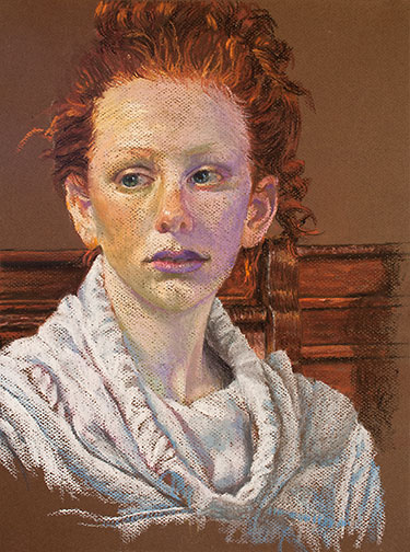
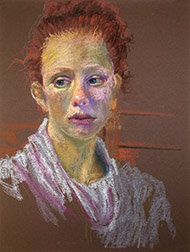
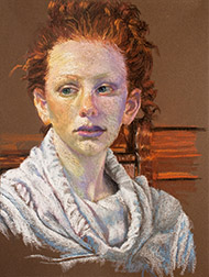
Another session, a longer one, and I had time to make a lot of progress. I finalized the shape of her face, made more changes to her facial skin tones, did a bit more work on her mouth, did a lot of work on her hair (I changed the shape and I added darks and lights) and I began to work on her neck with some new cool pale blues and some lights. I also reconstructed her ears.
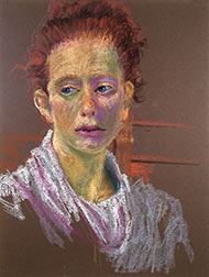
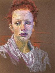
Priscilla 6/12
Face, neck, sweatshirt and background work.

In this, the 2nd to the last session, I added a bit more warmth (warm colors) to her face, pretty much finished all the detailing on her neck and then began detailing the hooded sweatshirt she’s wearing. I also started working on what is showing of the chair she’s sitting in and the other woodwork behind her.

My work during the very last session took her to the finish, shown at the top of this post, and included the final detailing of the woodwork behind her and finicky touches here and there overall. She really went through a lot of changes from the initial sketch of Priscilla live to my last, in studio, session. They don’t always change this drastically, but when they do, I think it makes for a more entertaining ride for the viewer!

Painting Andersen’s Mountaineering Cabin

Anderson's Mountaineering Cabin Image
“Anderson’s Mountaineering Cabin,” 12” x 9” oil on canvas, Framed $913.00, Unframed $785.00

I recently finished this painting, begun en plein air, in Yosemite, during my stay as a Yosemite Renaissance artist in residence and I thought I’d walk you through its various stages from start to finish.

As many of you may have heard, during my residency, I invited many of my local artist friends to come up to the park and paint with me. This whole trip came together quickly, but even with short notice, 7 of them were able to make it. On this, our last day, 4 artists were painting with me.

Anderson’s Cabin, is located in Pioneer Village, in Wawona, a collection of historic Yosemite structures from all over the park, brought together in one location to form a little trip back in time hamlet. There are many great structures to paint there, but we all decided on this one on that particular day.

Anderson Cabin Turp Wash Image
My ink blue turp wash underpainting, quickly maps out the scene lighting.

I started this outdoor painting, as I most often do, with an ink blue turpentine wash (50% painting medium, 50% solvent) underpainting. I find shadows outdoors tend to be cool, so the blue is a good choice and since I always work from dark to light, using the one color prevents me from having to mix multiple dark colors, prior to getting all my darks blocked in. Mapping the scene lighting out quickly is critical in plein air painting, as the light changes very quickly. Not having to mix multiple dark colors significantly speeds the process.

Anderson's Cabin Plein Air Image
My painting at the end of the plein air, on location painting session.

With the darks laid out, I quickly washed in general area color, prior to roughing in opaque paint. That way, if I miss tiny patches, known as holidays, with the opaque paint, they don’t show, the underlying canvas having been pre-tinted. With my darks down in ink blue, I begin adding medium value opaque colors, then lights and finally start replacing the ink blue dark wash with dark colors of the correct hue. Here’s the painting at the end of my 4 hour, on location, painting session.

I’m rarely happy with the final result of my plein air sessions and generally either work into the canvas back in my studio or use the painting as a color sketch for a larger studio painting. I’d committed to a show of the works we produced during the week, so, in the interest of time I’ve decided to add more detail to the actual plein air canvas this round.

Anderson's Cabin 5/25 Image
After 1st day in the studio

Reviewing the reference photos I shot on location, I realize that in painting the roof I painted out all the shadows from the trees. During this first session in the studio, I begin returning the shadows to the roof, add dark grout to the chimney and lines separating the individual logs that make up the walls of the cabin. I also finalize the sky and clouds, since everything else will be painted over this.

Anderson's Cabin 5/30
End of 2nd studio session

During my next session I finish most of the detailing to the roof (I found I needed to add light values, as well, in order to get the shadows correct), I begin to detail the log walls of the cabin and start adding back branches (painted out by the sky) and foliage to the trees behind the cabin.

Anderson's Cabin 6/1 Image
End of 3rd studio session

Another day and it’s about working the values on the chimney side of the cabin. I needed to adjust until that side of the building  looked like it was truly in shadow. Detailing the stone chimney, including adding the light that hits its stones here and there was a bit tricky, but I finally got it to a point where I was satisfied. I realized the ground shadows, there in the morning, but painted from memory, at the end of the day, were wrong, so I changed those.

Anderson's Cabin 6/6
A couple of sessions later

Through a couple more sessions I detail the foliage and trunks of the trees.

One last session of final details, including the detailing of the rock border around the grass in front of the chimney, takes me to the finish, shown at the top of this post.

I popped the painting into a floater frame and took it wet, along with the other finish (El Cap & Dogwood) and plein paintings I created during the week, over to Gallery 5, so I could help Jon Bock install the show. The show is titled, “A Week in the Park: Plein Air Works by Trowzers Akimbo & Friends.” It’ll be there through June 22, 2017.

Painting El Capitan & Dogwood

El Cap & Dogwood Image
“El Cap with Dogwood,” 12” x 9” oil on canvas, framed $913.00, unframed $785.00

This is the monumental rock face in Yosemite that Alex Honnold just solo free climbed (Saturday June 3, 2017) in under 4 hours, breaking all previous records. Kudos to Alex. He may be able to climb it, but can he paint it?

I recently finished this painting in my studio, beginning it, on location, during my Yosemite Renaissance artist in residence stay in the park from May 8 – 14, 2017. To be more precise I began this piece, plein air, on the Saturday of my stay, May 13.

I’ve covered the details surrounding the discovery and difficulties encountered in actually getting setup to paint this site in earlier blog posts: Artist in Residence – Day 4, Day 5 and Day 6, if you’re interested. This post is going to be about the actual painting of that monument.

Through trial and error, I’ve come to the conclusion that the best way, for me, to paint plein air is by using the Indirect Painting method. I’ve tried the Direct Painting approach, most recently in the first few days of this residency, but I’ve always been unhappy with the results. In a nutshell, with Indirect Painting an underpainting, usually monochrome, is done before the full color over-painting is begun. By contrast, Direct Painting starts laying down full color from the get-go.

Here’s why I believe Indirect Painting is best. All painting should start with the darks in the scene and progress through the medium values, ending with the lights. And always, the painting should be worked as a whole. The darks are the armature that hold the entire painting together. Get your darks right and your halfway home with the entire painting. You want to work the painting as a whole, because each color or value you add, changes what’s already there, through juxtaposition. If you slave away on this corner or that, rendering to finish, while leaving the rest of the canvas untouched, you’re setting yourself up for a fall. When you add the rest of the color you’ll learn it changes what you so diligently rendered up front. The colors in that early rendering no longer look correct.

Anderson Cabin Turp Wash Image
Don’t have a shot of my El Cap monochrome turp wash, but here’s one from the following day.

The light changes quickly, when you’re painting outside, so it’s important to establish the lighting quickly. You can always choose to adapt to the light later in the day, if you like that better than what you started with, but if you don’t get that first lighting scheme down quickly, you’ll have no record of it. With direct painting you’re losing valuable time, mixing this color dark for the tree trunks, that color dark for the foliage, another dark color for the water, etc., all in an attempt to get all your darks down quickly. By using the Indirect Painting method, I mix one color and using turpentine washes (50% painting medium, 50% solvent) lay down all my darks quickly. I’ve speedily established the morning’s lighting scheme and I’m ready to start painting in color.

Plein Air El Cap & Dogwood Image
My plein air painting at day’s end. Note that many of the darks are my underpainting.

So after completing my darks underpainting, I spent the rest of the day laying down opaque color with confidence, knowing I had a darks map of the morning’s lighting conditions. In fact, I could concentrate on the colors of medium and light value first, knowing my underpainting darks were there and that I could change them to their proper colors later, if necessary. You may have noticed that my underpainting is ink blue. I find most outdoor shadows are cool, so the color is a good choice for plein air painting. When I do an underpainting of an indoor subject, like a still life or portrait, I’m more likely to use the warmer, burnt umber.

El Cap & Dogwood 05/17 Image
About 8 more hrs. working on the original plein air painting, in the studio.

Back in the studio, working from reference photos I’d taken that day out in the field, I tore into my original plein air painting, adding more detail, at a more relaxed pace. Since so much of the painting was resolved that day, on location, I felt comfortable concentrating my effort directly on the rock, rather than working up the detail in the entire painting gradually. El Cap was the hero here, I needed the confidence that it was working, before I could relax and work up the supporting cast. I also reworked the sky at this time. I liked the color and clouds in one of my later photos better than what I’d painted on location.

El Cap & Dogwood 05/22 Image
Adding detail to the foliage and river.

Comfortable that El Capitan was pretty much resolved, I started detailing the rest of the painting, working on it as a whole now: trees, bushes, river, dogwood, etc. You’ve probably noticed I like color. I carefully inspect every subject for less than obvious color I can enhance, the blues in the shadows on the right, cast on the river by the trees, for example. I also put back the aqua in the Merced River that I remembered being there in the morning, but missing when I finally got to the river at the end of the day. Unfortunately, your darks underpainting doesn’t help you remember what color things were when you started. There’s a special  advantage gained by, at least, starting your paintings on location, that’s lost when you paint from photos exclusively: color memory acquired through actually being there.

El Cap & Dogwood 05/23 Image
Getting the whitewater in and more detailing to the foliage.

Getting close to the finish here. Added more light values to the foliage. Notice how just adding the white water brings the river to life, bubbling and churning. Where I had a pond before, we’re now looking at the Merced River. I find it’s worth taking the time to place these small shape accurately, even if painted loosely, they can make the difference in whether your subject appears static or alive. I also added more detail to the dogwood here.

With just another session or two, I arrived at the finish (shown at the top of this post) : my final level of light values and a little necessary nit-picking here and there. Just in time for Alex to scale it!