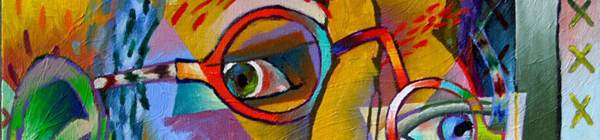
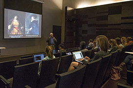
Is an art school education really necessary for those that intend to make creating art their profession? Can’t you just learn everything you need to know about art, on your own, through practice? What do you actually gain from a formal art school education?
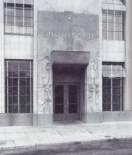
Chouinard Drawing Class
We’ve all run into self-taught artists in our lives with incredible abilities. Which begs the question, do you really need a formal and generally expensive, art school education to create great art? The answer, I believe, is no, but let’s discuss why I still recommend an art school education to anyone seriously interested in becoming a professional artist.
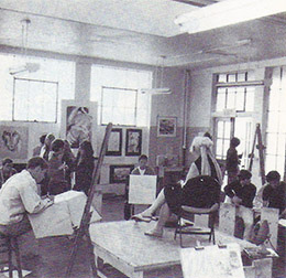
Contemporary CalArts Drawing Class
Sure some can reach an extremely high level of proficiency, as an artist, on their own and stand toe to toe with artists who have benefited from an art school education, without one. However, it takes an individual with an extremely high level of discipline, perseverance and hunger for knowledge about the arts, to pull it off. It also takes a long, long time to gain the same knowledge, on your own, that you’d receive in the typical 4 years dedicated to an art school education. But it CAN be done. Hell, Vincent van Gogh did it!
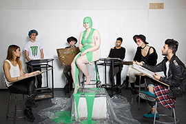
Art History Class
So, what are the benefits of a formal art school education? Thoroughness, truncation, concentration and camaraderie with hundreds of other artist, from around the world, experiencing what you are experiencing, at the same time. Realize you’re learning from professors with a lifetime of unique formal and, in the field, collected knowledge. Each one is passing this accumulated knowledge on to you. Quite the shortcut! You also gain a knowledge of art history you likely never would have acquired on your own. All organized and catalogued by significance. Artists and art movements you didn’t even know existed, that will prove important to the work you’ll create in the future. Art history informs of the important work that has come before us and explains why it is important. It prevents us from trying to reinvent the wheel, but instead enables us to stand on the shoulders of the giants in art.
So, get an art school education if you can, but don’t despair if it isn’t in the cards. With proper dedication and exposure, you can get there on your own, the journey is just a significantly longer one.
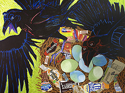
I’ve wanted to paint ravens for some time now, but never seemed to get around to it. I’m fascinated by the gamut of colors emanating from their shiny, deep black plumage, like an oil stain in the parking lot, after the rain. I’d always planned to paint a representational version, then the upcoming exhibition/competition, Avian: Birds in a Changing World, nudged me both towards painting them now and painting them as an abstraction.
The Avian prospectus encourages artists to make a statement concerning the effects our changing environment is having on our feathered friends and I felt the concept I had for a painting in that light, was better communicated through abstraction.
That painting now being complete, get comfortable and I’ll walk you through the process.
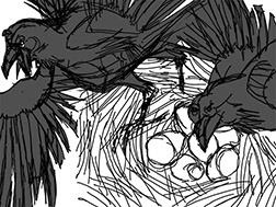
I worked out my sketch in Photoshop.
I had a clear concept, but I wasn’t sure how I wanted to present it. So, I started out by creating a rough sketch, in Photoshop, on my computer. I find it advantageous to do my thinking sketches on a computer, as you can easily try variations out on layers and changes are faster and cleaner than you can achieve with pencil, paper and eraser. The sketch was getting confusing, so I darkened the ravens to more clearly view their shape.
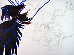
Executed my initial layout with shapes using acrylics.
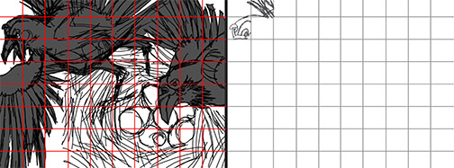
Often the sketch I do at this stage is just a rough thumbnail concept of what I want the finish to be: the composition unresolved. This time, though, I realized my sketch was resolved enough to transfer as is to my 30″ by 40″ canvas. I had difficulty redrawing the sketch, in charcoal, on my canvas. I kept getting scale, shape or placement wrong. I decided to use acrylic paint instead. Following Matisse’s drawing with shape approach, utilized in his cut paper creations, I laid out the ravens as solid black shapes. The acrylics allowed me to quickly add or subtract from my drawing, due to their fast drying time. Eventually, I had a layout on my canvas with which I was happy. In hindsight, I would probably have been better off using a grid system to make the transfer.
With grid transfer system a grid is drawn over the original drawing (right). Then a proportional grid is drawn on the canvas and the sketch is recreated square by square.Adding collage elements
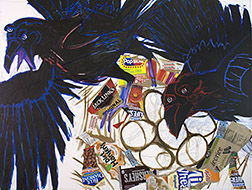
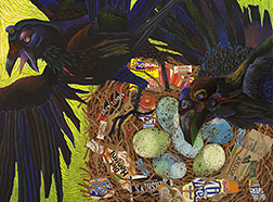
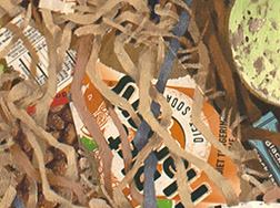
With the drawing blocked in, I began adding some collage elements. The concept here is, that with all the refuge present in the contemporary environments the birds call home and less open, wild areas from which to collect natural building materials, the birds are resorting to incorporating elements of trash in their nest construction. I wanted to use actual litter elements to communicate this.
Blocked in the base colors, including the acid-green background.
All the collage elements in place, I laid down the nest darks and blocked in the other base colors. I was going for uneasiness in the viewer here and remembered a disturbing gas-lit poolroom scene van Gogh had painted. I borrowed the acid-green color present there for my background. Still, I didn’t feel the background was alive enough and borrowed another van Gogh
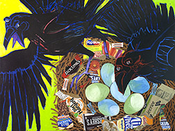
Added van Gogh brushwork to the background.
vehicle: swirling, pulsating brushwork, to the background. At this point I wasn’t quite sure what I wanted to do with the ravens themselves. I felt I’d better work on the birds a bit. Whatever I did to them was going to determine what I would need to do with the rest of the painting. I knew however I handled the ravens, they would need to feel black overall or they wouldn’t read as ravens.
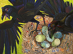
Added color and pattern to the ravens & speckles to the eggs.
I decided to use the rainbow of color radiating from the shine present on the deep black raven feathers present on the real birds, that I spoke of earlier, as my inspiration for what I’d do with these guys. I started with the heads, then proceeded to the bodies, adding not only color, but also pattern. I also added the speckled pattern present on real raven eggs, before returning to work on the nest itself.
Added mid-tones, lights and some gray twigs, along with some shadowing detail to the nest.
The nest now looked pretty flat to me. It needed a broader value range, if it was going to live in the same world as the ravens and their eggs. I added some light, mid-value and even a view gray twigs (for some color variation) to the nest. It still looked too flat, so I tried adding some shadowing to the twigs in one area of the nest. That seemed to be what the nest needed, so I continued adding the same shadowing throughout the rest of the nest.
Nest detail showing the shadowing applied to the twigs.
Looking the painting over, the edges where the raven on the left and the nest met the yellow-green background seemed to severe to me. I decided to soften the transitions with a bit of loose painting. You can see the result of these final touches in the finished version at the start of this post.
We all carry prejudice. Life experience teaches us what we like, as well as what we don’t like, so much. You probably have a favorite color. Prefer salty snacks over sugary ones, or vice versa. Maybe you like snug fitting clothes or want your garments to hang looser…no problem!
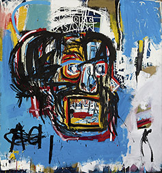
“Untitled,” Jean-Michel Basquiate
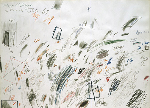
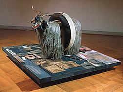
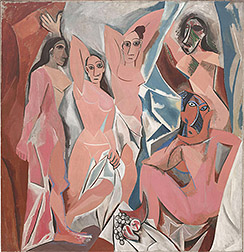
I do feel prejudice can become a huge problem, if you’re an artist. I have artist friends who dismiss entire schools of art or bodies of work, because they don’t like that kind of thing, or worse, believe it falls below the bar they’ve arbitrarily set for what IS or IS NOT art. Here’s a rude awakening to any of you out there that find yourself in one of these camps, IT’S ALL ART! Yes, it’s all art, but within each art genre there is GOOD and there is BAD art! No one gains anything from BAD art, unless it’s a reminder to avoid going in that direction, but if you write-off GOOD art, of any school or collection, because it’s foreign to you or not your thing, you do yourself a disservice, turning your back on available knowledge: concepts, techniques, solutions, etc., that could inspire new directions in your own work.
“Monogram,” Robert Rauschenberg
Ridding yourself of bias takes a change of mind and heart, but it’s worth it. I’ve considered myself an artist, since I was a little kid and I’ll admit, by the time I walked through the doors of art school, I’d built up quite a library of art prejudice. There was more I disliked, than I liked in contemporary fine art. But art school was a wonderful, true education for me. Here I could no longer choose what it was in art I would focus my attentions on. For the next four years my professors were going to make those choices, enlightening me to what was important in art and explaining why that was so. As if a blindfold had been removed from eyes, suddenly I saw how all the pieces fit together in the timeline jigsaw puzzle that is the history of art. I had a new library of concepts and solutions to draw from (excuse the pun) that helped resolve problems in my own personal work. With understanding and appreciation came a new appetite, there is now so much more visual information for me to digest, in art museums and the world at large.
“Les Demoiselles d’Avignon,” Pablo Picasso
As artists, we can’t afford the personal likes and dislikes in art that the rest of the population holds. We must keep our minds open and approach each new visual stimulus free of preconceived ideas, absorbing whatever it has to share with us. You don’t have to drop everything and register for art school to open your mind. The Internet has made gaining knowledge about subjects we don’t understand easy and instantaneous. The best place to start is with the art you like the least.
In time you’ll be harvesting information from Banksy as well as Caravaggio!
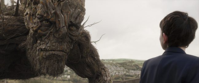
I recently viewed the film, “A Monster Calls.” I was intrigued by the trailer, when they first began promoting the film, but somehow it slipped by me while it was in theaters and even when it was first available online, through iTunes and Amazon. Luckily, I was reminded of it again recently, when HBO listed it as one of their new movie additions. This is a must see for all artists and art enthusiasts. The film is a feast for the eyes and imagination.
Liam Neeson is the voice of the Monster.
Based on the Patrick Ness novel of the same name (he also wrote the screenplay), it tells the story of Conor O’Malley, a 12 year old coming to terms with tremendous tragedy and loss. Conor’s cerebral battle is presented onscreen, metaphorically, in form of a tree monster, which presents him with symbolic stories, designed to help the boy deal with the overwhelming emotional attack he must survive.
Watercolor techniques.
Though the films includes performances by the notably talented Felicity Jones, Sigourney Weaver and Liam Neeson (as the voice of the monster), it’s Lewis MacDougall’s performance, as Conor, that shines in this movie. Most scenes are comprised of Mr. MacDougall, before the lens, all alone, skillfully communicating Conor’s anxiety during this emotional wrestling match, but it’s the animated story sequences in this film that make it unique.
A tour de force of animation techniques.
A tour de force of 2 dimensional watercolor work, stop motion and computer generated (CG ) imagery, these gems are like nothing you’ve ever seen in motion before. They exhibit what is graphically possible in animation today, but seldom sought after, in this era of CG emulation of real world imagery.
Kudos to the animation team! Do your right brain a favor and experience this film!
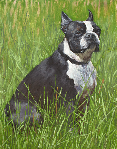
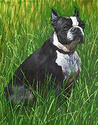
My pop just celebrated his 90th birthday! My mom will be doing the same in January. Lucky for me, huh? My dad’s unbelievably difficult to buy gifts for. He doesn’t want much, but when he does want or need something, he just goes out and purchases it. Up until recently golf was his passion, so you could always pick him up something associated with that, but a deteriorating back put an end to his time on the greens.
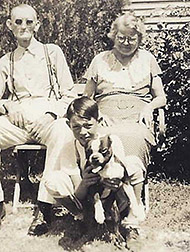
My dad at 9, with Buck and his grandparents, Dallas, TX.
So, I had no idea what I was going to get him for this very special birthday. Then my wife, Betty, came up with a great idea. My father had the worst of childhoods. His mother and father split up, when he was very young. When my dad was 5, his father stopped by on the way out of town to say he was pulling up stakes and didn’t know when he’d be able to see him again. My dad didn’t hear from his father again until his was 13 years old and didn’t see him again until he was 35. His mother took off with her boyfriend (later to become my pop’s step-father) around the same time, leaving her parents, my pop’s grandparents, to care for him. This was during the Great Depression of the 1930s. Stripped of all else, he held two precious possessions, the deep unconditional love of his grandfather and a boston terrier named Buck. Betty suggested I create a painting of Buck for him.
With only a week before the extended family party in L.A., I had to hunker down and make swift progress. My first decision was to work small. They have a small home, filled with the products of their many interests, anyway, so there isn’t a lot of wall space there. I chose an 10″ x 8″ canvas.
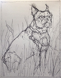
Charcoal pencil layout sketch.
I had a couple of old photographs of Buck, with my pop and his grandparents from the 1930s. These gave me an indication of the dogs specific markings, but I had to do a lot of online photo research of boston terriers to collect the more detailed information about the breed that I needed. I started with a soft charcoal pencil sketch on the canvas to establish my composition. Hard to maintain a clean line, at this small size, where every mark is magnified, but it will get the job done.
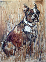
My turp wash darks underpainting.
Squinting at my reference, I visualized the gross masses making up my darks, mid-tones and lights. Then, with my eyes fully open (no longer squinting) I moved on to a turpentine wash (actually I use Gamblin’s Gamsol) underpainting, in burnt umber, to establish the orchestration of my darks throughout the painting. Notice how the darks weave in and out of background, mid ground and foreground. It’s these dark shapes that cement your composition together and it’s why I do an underpainting first. Working this way allows me to sneak-up on the finish, closing in on the painting and building my confidence that things are going to work out, more with each step.
My painting, end of a 6 hr. day 1.
I added basic transparent color washes, to dye each general area, so if I didn’t cover everything completely with opaque paint, I wouldn’t have any bright white holidays (missed areas) showing, before moving on to opaque painting, i.e.: transparent green over the grasses, transparent grays over the black patches on the dog. I always paint dark to light, but sometimes my underpainting darks are dark enough that it makes more sense to move right to the mid-tones and lights, then return to the dark areas and repaint them in the proper colors. At the end of about 6 hrs. on day one, I had most of the work behind me, just detailing the grass and a few adjustments on the dog left.
Day 2, I added grass detail.
Day 2 only allowed me 2 or 3 hours of painting time, but I managed to make a few passes on the grasses, adding a couple of dark passes and a couple of light passes. I decided that I liked the idea of leaving the extreme, most distant areas of the grass background rough, but determined I’d need to blur the mid-ground grass details into the background a bit, to make it all work.
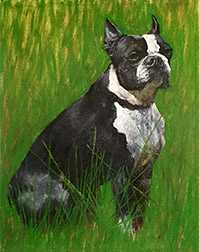
With my last day, day 3, I blurred the mid-ground grass detail a little into the background and added a few more light details to the foreground grasses. I also did a little more final detailing on the dog, Buck, to bring us to the finish, shown at the top of this post.
My pop was totally surprised and emotionally touched by the unexpected gift. The painting brought back a lot of pleasant childhood memories he hadn’t visited in quite some time.
Computers and computer software have played a major role in my working life. As some of you may know, prior to becoming a full-time fine artist, I spent a considerable amount of time earning my living by developing computer games, as chief creative officer. So, I’ve been using image editing applications, like Photoshop (PS), since they first appeared for sale (and many others, before PS arrived on the scene). Finding my way around in apps, like PS, is pretty second nature to me.
Where in the past when I had an idea for a major painting change or addition I wasn’t 100% sure would work, I just had to bite the bullet and try it with paint. When it didn’t work out, I had to scrape out and repair, if I was working with oils, paint over my change, trying to remember what was there before, if working with acrylics or start over from scratch, if working with watercolors. These days, I instead turn to the computer to try out a quick digital preview test, before committing to paint.
You don’t have to be an expert with computer image editing software to perform these digital previews. In most cases you’re just using very basic image editing tools. You also don’t have to purchase Photoshop. There’s a pretty good free image editor offered at: www.pixlr.com that will do the trick.
I’m going to demonstrate my process in Photoshop, but Pixlr works very similarly.
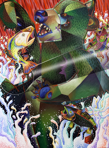
The bear before I tried the hair pattern.
When I was painting the bear in my picture, “Rare Sighting,” from the start I’d intended to cover him with some type of hair pattern, but the detailing I put into the bear was a lot of work. I was concerned about adding the hair pattern on top of this great effort, without testing it first. I didn’t want to have to go back and re-render large parts of the bear, painting the pattern out, if the hair turned out to be a mistake. So I turned to PS.
The bear with the hair pattern on a separate layer.
I shot the bear with my digital camera, but you could use your smart phone or tablet to take the shot. I transferred the digital shot to my computer and opened it in PS. Then I created a separate layer, on top of my digital painting image and I painted the hair pattern on this new layer. An added bonus in working this way is that you can turn the layer off and on, flashing back and forth from the painting with the change to the painting without. Something you could never do, if you just added the change to the actual painting.
You’re not limited to simple, straightforward changes like this one. As you become more proficient with the image editor, you can try out just about anything. I’ve tested glazing, color changes, textures, gradients, shadows, you name it, only executing them in the actual painting if they work. I’ve abandoned as many tests, as those I’ve followed through with, but when I followed through, I did so with complete confidence.
I’ve had some tell me they feel this is cheating. That’s a whole lotta’ bull! As the saying goes, they need to get with the program! To not take advantage of new visualization tools made available in the artist paintbox would just be ridiculous! Save yourself a lot of headaches and give digital previewing a try.
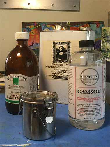
Did you realize you can easily reclaim your dirty brush cleaning solvent, whether turpentine, Turpenoid or Gamsol? For years I was collecting my dirty solvent in an old closed container for later collection by (or delivery to) a toxic waste center. Then I learned about the simple painting solvent reclamation process.
When dirty brush cleaning solvents are left undisturbed for a period of time, all the paint solids settle to the bottom of the solvent container, with clean solvent, only, left on top. This allows you to pour off the clean solvent into a temporary container, leaving the paint solids, settled in the bottom of the solvent container, behind. Then it’s just a matter of wiping the solids out of the bottom of the container, with paper towels or old disposable rags and disposing of the dirty paper towels or rags properly (I’ll discuss this shortly). You can now pour your reclaimed, clean solvent back into your brush cleaning container.
How long the solids take to settle depends on the paint colors you’ve been using, but they usually settle, for the most part, overnight. If you let them settle for a couple of days you get an even cleaner separation. I generally paint during the working week and take the weekends off to deal with household chores. My approach is to use the solvent all week, let the solids settle over the weekend and do my reclamation before I begin painting on Monday. The reclaimed solvent looks almost like I’ve poured it out clean from it original bottle or can.
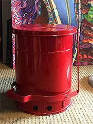
My “firesafe” can.
Now, what to do with those dirty, paint soaked paper towels or rags. You do know you should have a firesafe can in your studio don’t you? When you paint with oils, the solvents, mediums and paints themselves are highly flammable. Remember those cautionary film strips in elementary school that talked about old oil and paint soaked rags, out in the garage, spontaneously bursting into flame? Well, the rags you’re using while painting, to wipe your brushes, palette, spills, etc., are those spontaneously combustable items they we referring to in those films. All these materials should be isolated, in a firesafe can, while in your studio, until you put them into your regular trash for collection.
I purchased my firesafe can online at www.uline.com or you can ask your local hardware store about one. Keeping your painting rags and other discarded painting materials (old tubes, latex gloves, etc.) in a firesafe can is important, whether you adopt my solvent reclamation routine or not. You don’t want to be responsible for setting your home ablaze, while you’re away from the house or sleeping.
When I was a child I only pulled out the supplies and created art when the mood struck me. This practice continued through my teen years. I run into many adult artists today who are still slaves to mood, when it comes to getting creative work done.
This is fine, if art is a hobby with you and your productivity isn’t of concern, but if you consider yourself a professional artist, you can’t afford this luxury, you need to be able to paint on demand. A client is unlikely to have the patients to wait until the mood strikes you to receive their commissioned piece and galleries avoid artists who don’t consistently deliver. I’ve had several artist friends in whom particular galleries were interested, until they saw their limited inventory.
I understand the hesitation in starting a new work, a blank canvas is very intimidating. The same questions go through all our heads. What do I paint? What if the painting doesn’t go well? Are my best works behind me? Etc. etc., the list goes on and on. And your fear will conjure up any excuse to keep you out of the studio: the house needs dusting, the cat’s due for its bath, the sofa cushions need to be rotated! Be confident in knowing all artists have to overcome these same psychological barriers to get started with a new work, the road blocks never go away. The challenge is in ignoring your doubts and jumping in with both feet.
Set a regular time to create & stick to it!
Starting gets easier with time, but it’ll never get easier if you don’t force yourself to push on. How? Set up a given time to work. Only you can determine how much time you have for this. Make it the same time each day, week, month, whatever, but when that time comes along, CREATE, regardless of mood. Don’t allow yourself to leave before your appointed time is up, no matter how it’s going. With the improved self discipline, your productivity increases, your skills improve and your confidence grows. The more mileage you put in at the easel, the easier it becomes to paint yourself out of bad situations you encounter. Experience is knowledge!
A wise artist I worked with at my first position out of art school, Lou DeWitte, defined the professional for me. Lou was 50 years my senior, with a long history as a professional. He’d worked on the credits for “Citizen Kane,” as a young man. He told me the amateur delivers 100%, 10% of the time. Giving 10% on this occasion, 60% on that, 30% on another, etc. But the professional, while delivering 100% the same 10% of the time, delivers 95% the other 90% of the time. Bottom line, even the professional is only as good as they can be, at any given time, but you can always count on them to deliver!
I’m a 3rd generation artists. My maternal grandfather was an artist (and a hilariously funny individual). He used to sketch things for us on a little yellow notepad, on demand. He owned a custom bedspread and drapery business, down on South San Pedro Street, in Los Angeles, where he designed and fabricated beautiful custom bedspreads and coordinated draperies for particular individuals, interior designers and hotel chains. He designed many of his own fabrics and all of his quilting patterns.
Normal, non-squinting view of subject.
One of his daughters, my mother, was an even more diverse artist: painting oils, watercolors, creating and teaching ceramics, writing poetry, designing sets for local dramatic productions (acting in some of them), designing and fabricating unbelievable exotic costumes and working as a fashion designer for 30 years.
It goes without saying, that I had lots of support, once I showed an interest in art. My mom shared a lot of creative tools and methods with me, as I was becoming an artist. One of the most valuable, one I still use constantly today, is squinting.
Squinting detail reduction simulation.
Squinting is a great tool in helping you to simplify your subject matter, helping you eliminate details and identify the masses. Before I ever put pencil or brush to canvas, I squint to identify the mass shapes of the darks, mid-values and lights in my subject matter. What I see while squinting is what I indicate in my turp wash underpainting (the armature on which I build my painting).
I open my eyes fully, while painting, of course, to see the actually subtleties of the color and value before me, but I keep the masses in mind throughout the painting process to maintain a simplified, powerful relationship across my value range (darks, mid-tones and lights). If I lose sight of this relationship, I squint again for a refresher.
Note actual mass values are determined with eyes open.
I’ve found this to be a wonderful way to separate out surface detail from value (grayscale) substance. I can confidently add as much surface detail (window dressing) as I want to my finished painting, but by squinting I reduce my subject down to basic shapes and values, eliminating any confusion, caused by the detail, in identifying the basic masses from which I want to build my composition.
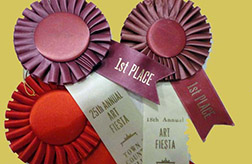
Among the many things discussed this weekend with 3 artist friends, during our 8 hour round trip journey to the San Francisco Bay area, was judging in art competitions. We belong to a local chapter of a San Francisco based art organization and had volunteered to transport our member paintings up and back from the annual exhibit held at our headquarters gallery.
We’re, all four, often asked to judge various competitions or to be involved with the selection of judges. I, personally, believe in a 3 judge system. Having a single judge, I feel, is unfair to the entrants, as it’s very one-sided, reflecting the nonobjective personal tastes and opinions of a single individual. While having two judges is a little better, with the decision making a bit more objective, the decision weighting is now just 50/50 and the two judges decisions can cancel each other out. A piece that one judge loves, can be knocked out of prize competition because the other judge doesn’t agree. With 3 judges, prize winning works are selected through majority decisions, each single judges judgement call is tempered by the judgement of the other two. I feel so strongly about the fairness of the 3 judge system, that I consider this in deciding whether or not to participate in a competition.
Another central topic surrounding our competition judging discussion was the importance of who the selected judges are: their background and expertise. Organizations have a lot of tasks on their plate when putting together an exhibit or competition and too often judge selection it made quickly, without adequate consideration, in an effort to mark the task done and move on to one of the other items on the list. The problem is compounded if you’re making the selection for an organization who offers competitions annually or even more frequently. In attempts to avoid using the same qualified judges too often, it’s easy to relax standards a bit, in the name of adding variety to the judging panel. Don’t do it! Who is selected to judge the competition is the single most import decision made in an art competition. Unqualified judges make for unfair, competitor head-scratching decisions.
Selecting judges with expertise specific to the flavor of your competition is another important consideration. If you’re mounting a representational art only competition, you don’t want to bring in judges known for their fantastic abstract work. If you’re including an abstraction category in your competition, you don’t want to only invite hardcore realists to do your judging.
While a lot of this is just common sense, when the calls for entry have gone out and you’re under the gun to get everything done before the posted show opening night date, it’s easy to use up the time necessary to consider and vet appropriate judges. You owe it to yourself, organization and competitors to never let that happen.
 So, get an art school education if you can, but don’t despair if it isn’t in the cards. With proper dedication and exposure, you can get there on your own, the journey is just a significantly longer one.
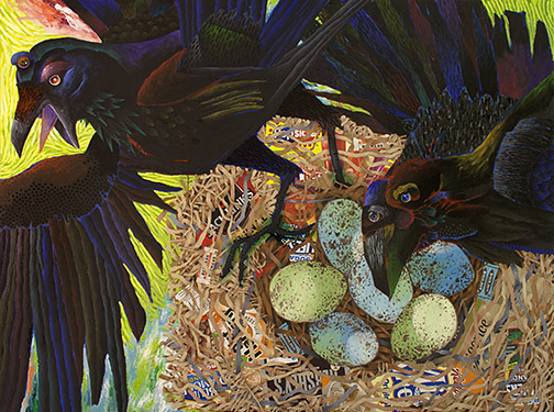


 Another central topic surrounding our competition judging discussion was the importance of who the selected judges are: their background and expertise. Organizations have a lot of tasks on their plate when putting together an exhibit or competition and too often judge selection it made quickly, without adequate consideration, in an effort to mark the task done and move on to one of the other items on the list. The problem is compounded if you’re making the selection for an organization who offers competitions annually or even more frequently. In attempts to avoid using the same qualified judges too often, it’s easy to relax standards a bit, in the name of adding variety to the judging panel. Don’t do it! Who is selected to judge the competition is the single most import decision made in an art competition. Unqualified judges make for unfair, competitor head-scratching decisions.