Be Good to Your Brushes & They’ll Be Good to You!

Brushes Photo

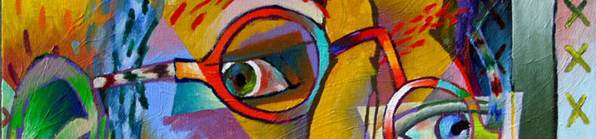
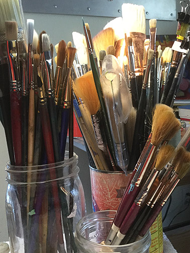
I believe in investing in good brushes. I know it’s a poor artist that blames their tools, but I’m annoyed by brushes with wild hairs sticking out this way or that, applying color everywhere but where I want it to go. As I’ve grown older, I’ve reluctantly learned to accept hair from my head in the sink, but I’ll be damned if I’m going to accept it falling from my paint brushes, when I clean them.

Brush Cleaner Photo
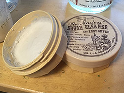
Good brushes are expensive, so it makes sense to care for them properly, extending their life as long as is possible. When I was a kid, there weren’t any specialized products available for cleaning brushes, so the best choice was a bar of Ivory soap. Times have changed and today there are specialized products that not only aid in keeping your brushes clean, but also even condition the hair in your brushes. Two of the most popular are Speedball’s Pink Soap and my favorite, The Master’s Brush Cleaner and Conditioner.

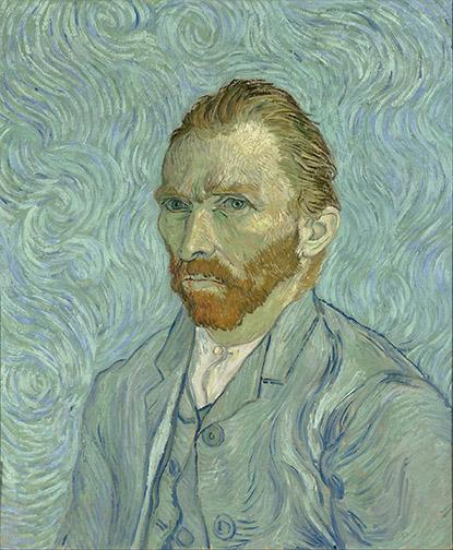
Using the proper brush for the medium with which you’re working, I’ve learned, plays a huge role in brush life. If you’re painting with oils or watercolors, you can use either natural, synthetic or blended brushes. If you’re painting with acrylics, do yourself a favor and restrict yourself to synthetic brushes. Using natural hair brushes or even natural/synthetic blends with acrylics will quickly turn even the very best of these brushes to junk. I’ve learned this the hard way, through experience. If you’re painting with oils, you’ll get the best results with natural hair brushes, especially natural hair bristle brushes. They’ve yet to develop a synthetic bristle brush as stiff as a natural hog’s hair brush. A stiffer brush better moves paint in its fresh out of the tube consistency. With watercolors, purchase Kolinsky Sable brushes, if you can, otherwise buy the best synthetic sables you can afford.

Keep your acrylic brushes wet, at all times, when working with them. If you don’t, you won’t be able to get all the pigment our of your brushes, during your end of the day clean-up. Don’t leave them sitting in the water. Instead dip the hair of the brushes in the water from time to time, during your painting sessions, to keep them wet. Leaving them standing in water will loosen the hairs from the ferrules and break the paint down on the brush handles, causing it to crack and pop off, resulting in loose ferrules on the brush handles. Having to keep brushes wet is one of the  reasons synthetic brushes are the best solution for acrylics, natural hair breaks-down, when kept wet all day.

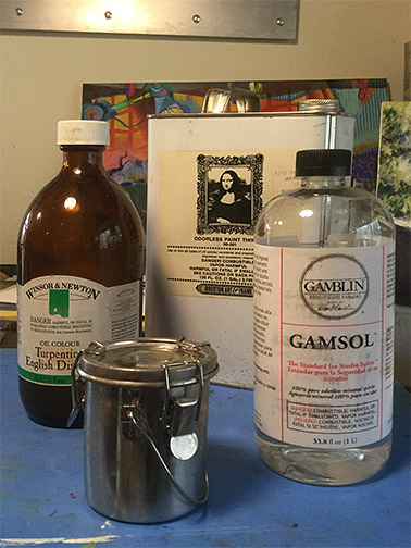
I avoid dipping a completely dry brush into paint, first wetting it with the solvent or medium I’m using. With oils this is linseed oil, painting medium or turpentine (or an odorless substitute). With acrylics or watercolors this is just water. I believe this prevents the pigment from latching onto or being absorbed into brush hairs.

At the end of every painting session and I mean every painting session (don’t close the studio door and tell yourself you’ll deal with cleaning your brushes tomorrow), I first get my brushes as clean as I can with the solvent I’m using. I then use my brush cleaning product and clean my brushes until the soap foam being produced is no longer tinted with color, being sure to pay attention to the area where the hairs meet the ferrule (I gently squeeze the hairs between my thumb and finger here to get all the pigment out).

Brush Before Photo
“Frizzies,” without cardboard shaping.

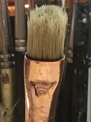
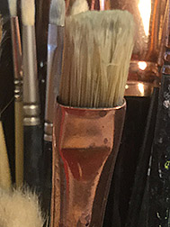
Lately I’ve adopted one last step to my brush care. I’m sure you’ve noticed how perfectly your brushes are shaped when you first bring them home from the art store. That’s because the manufacturers have dipped them into a soluble solution, prior to shaping them. This solution washes out with the first use, leaving even the best of brushes with a case of the frizzies. I’ve always done most of my own house painting. I’m cheap, have always known my way around paints and brushes and it’s difficult for me to hand over thousands of dollars to someone else, to do for me, what I can do myself. I’ve always wrapped my house painting brushes, after I’ve cleaned them, in newspaper or their original cardboard cases, if they came with them, to help the brushes maintain their original shape. It took hearing one or two others were doing this with their fine art brushes, for it to occur to me that this might be something good to try out. I’m now a convert!

Brush After Photo
Brush after cardboard shaping.

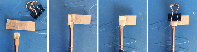
With round brushes, while they’re still wet from my cleaning them with brush cleaning soap, I just shape them back to a point with my fingers. With flat brushes, however, while they’re still wet, I wrap them in thin cardboard, held in place with a small binder clip. I use cardboard from old cereal boxes, cut into strips a little wider than the distance from the bottom of the flat part of the ferrule to a little past the end of the brush hair. I leave the cardboard longer in length than what is needed to wrap around the brush, for easier handling. I use these cardboard strips over and over again on brushes of the same width. Through trial and error, you’ll be amazed how close you can get to achieving a shape similar to the one they had, when you brought them home from the art store.

Brush Wrapping Steps PhotosWith proper care, brushes can live a long, useful life. I’m still working with some of the brushes I purchased back in art school!

Painting a 90 Year Old Dog

Buck Painting
“Buck,” 10″ x 8,” oil on canvas.

My pop just celebrated his 90th birthday! My mom will be doing the same in January. Lucky for me, huh? My dad’s unbelievably difficult to buy gifts for. He doesn’t want much, but when he does want or need something, he just goes out and purchases it. Up until recently golf was his passion, so you could always pick him up something associated with that, but a deteriorating back put an end to his time on the greens.

Pop & Buck Photo
My dad at 9, with Buck and his grandparents, Dallas, TX.

So, I had no idea what I was going to get him for this very special birthday. Then my wife, Betty, came up with a great idea. My father had the worst of childhoods. His mother and father split up, when he was very young. When my dad was 5, his father stopped by on the way out of town to say he was pulling up stakes and didn’t know when he’d be able to see him again. My dad didn’t hear from his father again until his was 13 years old and didn’t see him again until he was 35. His mother took off with her boyfriend (later to become my pop’s step-father) around the same time, leaving her parents, my pop’s grandparents, to care for him. This was during the Great Depression of the 1930s. Stripped of all else, he held two precious possessions, the deep unconditional love of his grandfather and a boston terrier named Buck. Betty suggested I create a painting of Buck for him.

With only a week before the extended family party in L.A., I had to hunker down and make swift progress. My first decision was to work small. They have a small home, filled with the products of their many interests, anyway, so there isn’t a lot of wall space there. I chose an 10″ x 8″ canvas.

Buck Charcoal Layout Image
Charcoal pencil layout sketch.

I had a couple of old photographs of Buck, with my pop and his grandparents from the 1930s. These gave me an indication of the dogs specific markings, but I had to do a lot of online photo research of boston terriers to collect the more detailed information about the breed that I needed. I started with a soft charcoal pencil sketch on the canvas to establish my composition. Hard to maintain a clean line, at this small size, where every mark is magnified, but it will get the job done.

Buck Underpainting Image
My turp wash darks underpainting.

Squinting at my reference, I visualized the gross masses making up my darks, mid-tones and lights. Then, with my eyes fully open (no longer squinting) I moved on to a turpentine wash (actually I use Gamblin’s Gamsol) underpainting, in burnt umber, to establish the orchestration of my darks throughout the painting. Notice how the darks weave in and out of background, mid ground and foreground. It’s these dark shapes that cement your composition together and it’s why I do an underpainting first. Working this way allows me to sneak-up on the finish, closing in on the painting and building my confidence that things are going to work out, more with each step.

Buck End of Day 1 Image
My painting, end of a 6 hr. day 1.

I added basic transparent color washes, to dye each general area, so if I didn’t cover everything completely with opaque paint, I wouldn’t have any bright white holidays (missed areas) showing, before moving on to opaque painting, i.e.: transparent green over the grasses, transparent grays over the black patches on the dog. I always paint dark to light, but sometimes my underpainting darks are dark enough that it makes more sense to move right to the mid-tones and lights, then return to the dark areas and repaint them in the proper colors. At the end of about 6 hrs. on day one, I had most of the work behind me, just detailing the grass and a few adjustments on the dog left.

Buck Day 2 Image
Day 2, I added grass detail.

Day 2 only allowed me 2 or 3 hours of painting time, but I managed to make a few passes on the grasses, adding a couple of dark passes and a couple of light passes. I decided that I liked the idea of leaving the extreme, most distant areas of the grass background rough, but determined I’d need to blur the mid-ground grass details into the background a bit, to make it all work.

With my last day, day 3, I blurred the mid-ground grass detail a little into the background and added a few more light details to the foreground grasses. I also did a little more final detailing on the dog, Buck, to bring us to the finish, shown at the top of this post.

My pop was totally surprised and emotionally touched by the unexpected gift. The painting brought back a lot of pleasant childhood memories he hadn’t visited in quite some time.

Painting & the Digital Preview

Rare Sighting Image

Computers and computer software have played a major role in my working life. As some of you may know, prior to becoming a full-time fine artist, I spent a considerable amount of time earning my living by developing computer games, as chief creative officer. So, I’ve been using image editing applications, like Photoshop (PS), since they first appeared for sale (and many others, before PS arrived on the scene). Finding my way around in apps, like PS, is pretty second nature to me.

Where in the past when I had an idea for a major painting change or addition I wasn’t 100% sure would work, I just had to bite the bullet and try it with paint. When it didn’t work out, I had to scrape out and repair, if I was working with oils, paint over my change, trying to remember what was there before, if working with acrylics or start over from scratch, if working with watercolors. These days, I instead turn to the computer to try out a quick digital preview test, before committing to paint.

You don’t have to be an expert with computer image editing software to perform these digital previews. In most cases you’re just using very basic image editing tools. You also don’t have to purchase Photoshop. There’s a pretty good free image editor offered at: www.pixlr.com that will do the trick.

I’m going to demonstrate my process in Photoshop, but Pixlr works very similarly.

Bear Without Hair Image
The bear before I tried the hair pattern.

When I was painting the bear in my picture, “Rare Sighting,” from the start I’d intended to cover him with some type of hair pattern, but the detailing I put into the bear was a lot of work. I was concerned about adding the hair pattern on top of this great effort, without testing it first. I didn’t want to have to go back and re-render large parts of the bear, painting the pattern out, if the hair turned out to be a mistake. So I turned to PS.

Bear With Hair Image
The bear with the hair pattern on a separate layer.

I shot the bear with my digital camera, but you could use your smart phone or tablet to take the shot. I transferred the digital shot to my computer and opened it in PS. Then I created a separate layer, on top of my digital painting image and I painted the hair pattern on this new layer. An added bonus in working this way is that you can turn the layer off and on, flashing back and forth from the painting with the change to the painting without. Something you could never do, if you just added the change to the actual painting.

You’re not limited to simple, straightforward changes like this one. As you become more proficient with the image editor, you can try out just about anything. I’ve tested glazing, color changes, textures, gradients, shadows, you name it, only executing them in the actual painting if they work. I’ve abandoned as many tests, as those I’ve followed through with, but when I followed through, I did so with complete confidence.

I’ve had some tell me they feel this is cheating. That’s a whole lotta’ bull! As the saying goes, they need to get with the program! To not take advantage of new visualization tools made available in the artist paintbox would just be ridiculous! Save yourself a lot of headaches and give digital previewing a try.

Turpentine, Good to the Last Drop!

Solvents Photo

Did you realize you can easily reclaim your dirty brush cleaning solvent, whether turpentine, Turpenoid or Gamsol? For years I was collecting my dirty solvent in an old closed container for later collection by (or delivery to) a toxic waste center. Then I learned about the simple painting solvent reclamation process.

When dirty brush cleaning solvents are left undisturbed for a period of time, all the paint solids settle to the bottom of the solvent container, with clean solvent, only, left on top. This allows you to pour off the clean solvent into a temporary container, leaving the paint solids, settled in the bottom of the solvent container, behind. Then it’s just a matter of wiping the solids out of the bottom of the container, with paper towels or old disposable rags and disposing of the dirty paper towels or rags properly (I’ll discuss this shortly). You can now pour your reclaimed, clean solvent back into your brush cleaning container.

How long the solids take to settle depends on the paint colors you’ve been using, but they usually settle, for the most part, overnight. If you let them settle for a couple of days you get an even cleaner separation. I generally paint during the working week and take the weekends off to deal with household chores. My approach is to use the solvent all week, let the solids settle over the weekend and do my reclamation before I begin painting on Monday. The reclaimed solvent looks almost like I’ve poured it out clean from it original bottle or can.

Firesafe Can Photo
My “firesafe” can.

Now, what to do with those dirty, paint soaked paper towels or rags. You do know you should have a firesafe can in your studio don’t you? When you paint with oils, the solvents, mediums and paints themselves are highly flammable. Remember those cautionary film strips in elementary school that talked about old oil and paint soaked rags, out in the garage, spontaneously bursting into flame? Well, the rags you’re using while painting, to wipe your brushes, palette, spills, etc., are those spontaneously combustable items they we referring to in those films. All these materials should be isolated, in a firesafe can, while in your studio, until you put them into your regular trash for collection.

I purchased my firesafe can online at www.uline.com or you can ask your local hardware store about one. Keeping your painting rags and other discarded painting materials (old tubes, latex gloves, etc.) in a firesafe can is important, whether you adopt my solvent reclamation routine or not. You don’t want to be responsible for setting your home ablaze, while you’re away from the house or sleeping.

Who’s in Charge Here?

The Scream Image
“The Scream,” Evard Munch

When I was a child I only pulled out the supplies and created art when the mood struck me. This practice continued through my teen years. I run into many adult artists today who are still slaves to mood, when it comes to getting creative work done.

This is fine, if art is a hobby with you and your productivity isn’t of concern, but if you consider yourself a professional artist, you can’t afford this luxury, you need to be able to paint on demand. A client is unlikely to have the patients to wait until the mood strikes you to receive their commissioned piece and galleries avoid artists who don’t consistently deliver. I’ve had several artist friends in whom particular galleries were interested, until they saw their limited inventory.

I understand the hesitation in starting a new work, a blank canvas is very intimidating. The same questions go through all our heads. What do I paint? What if the painting doesn’t go well? Are my best works behind me? Etc. etc., the list goes on and on. And your fear will conjure up any excuse to keep you out of the studio: the house needs dusting, the cat’s due for its bath, the sofa cushions need to be rotated! Be confident in knowing all artists have to overcome these same psychological barriers to get started with a new work, the road blocks never go away. The challenge is in ignoring your doubts and jumping in with both feet.

Calendar Image
Set a regular time to create & stick to it!

Starting gets easier with time, but it’ll never get easier if you don’t force yourself to push on. How? Set up a given time to work. Only you can determine how much time you have for this. Make it the same time each day, week, month, whatever, but when that time comes along, CREATE, regardless of mood. Don’t allow yourself to leave before your appointed time is up, no matter how it’s going. With the improved self discipline, your productivity increases, your skills improve and your confidence grows. The more mileage you put in at the easel, the easier it becomes to paint yourself out of bad situations you encounter. Experience is knowledge!

A wise artist I worked with at my first position out of art school, Lou DeWitte, defined the professional for me. Lou was 50 years my senior, with a long history as a professional. He’d worked on the credits for “Citizen Kane,” as a young man. He told me the amateur delivers 100%, 10% of the time. Giving 10% on this occasion, 60% on that, 30% on another, etc. But the professional, while delivering 100% the same 10% of the time, delivers 95% the other 90% of the time. Bottom line, even the professional is only as good as they can be, at any given time, but you can always count on them to deliver!

Things My Mother Taught Me

Turp Wash Image
Turp wash underpainting.

I’m a 3rd generation artists. My maternal grandfather was an artist (and a hilariously funny individual). He used to sketch things for us on a little yellow notepad, on demand. He owned a custom bedspread and drapery business, down on South San Pedro Street, in Los Angeles, where he designed and fabricated beautiful custom bedspreads and coordinated draperies for particular individuals, interior designers and hotel chains. He designed many of his own fabrics and all of his quilting patterns.

Girl with Lamb Normal Photo
Normal, non-squinting view of subject.

One of his daughters, my mother, was an even more diverse artist: painting oils, watercolors, creating and teaching ceramics, writing poetry, designing sets for local dramatic productions (acting in some of them), designing and fabricating unbelievable exotic costumes and working as a fashion designer for 30 years.

It goes without saying, that I had lots of support, once I showed an interest in art. My mom shared a lot of creative tools and methods with me, as I was becoming an artist. One of the most valuable, one I still use constantly today, is squinting.

Squinting View Photo
Squinting detail reduction simulation.

Squinting is a great tool in helping you to simplify your subject matter, helping you eliminate details and identify the masses. Before I ever put pencil or brush to canvas, I squint to identify the mass shapes of the darks, mid-values and lights in my subject matter. What I see while squinting is what I indicate in my turp wash underpainting (the armature on which I build my painting).

I open my eyes fully, while painting, of course, to see the actually subtleties of the color and value before me, but I keep the masses in mind throughout the painting process to maintain a simplified, powerful relationship across my value range (darks, mid-tones and lights). If I lose sight of this relationship, I squint again for a refresher.

Turp Wash Small Image
Note actual mass values are determined with eyes open.

I’ve found this to be a wonderful way to separate out surface detail from value (grayscale) substance. I can confidently add as much surface detail (window dressing) as I want to my finished painting, but by squinting I reduce my subject down to basic shapes and values, eliminating any confusion, caused by the detail, in identifying the basic masses from which I want to build my composition.

Why Impressionism?

Monet Haystack Image
“Haystacks, Effect of Snow and Sun,” by Claude Monet

Many factors came together, at a particular place in time, for Impressionism, one, to come about and two, to succeed.

First was the arrival of a fairly efficient method of making tangible, hold in you hands, copies of the images captured by a camera. Cameras, in the form of the Camera Obscura, had been in use by artists since before the Italian Renaissance,  but a practical means of recording the images viewed through a box with a lens didn’t come about until about 1840. It’s also significant that this development (excuse the pun) was revealed by Louis Daguerre, in Paris.

Louis Daguerre Photo
Daguerreotype of Louis Daguerre.

Photography quickly replaced the artists as visual documenter and encouraged them to look introspectively at what it was they did. Turner, Delacroix and Manet were some of the first to move away from treating their paintings as if they were a window through which to view subject matter, paying more attention to the canvas surface and its 2 dimensional attributes. They flattened their picture planes and explored the expressive qualities in paint application.

Driven by the needs of its growing textile industry, The Industrial Revolution introduced new, brightly-colored pigments to the artist’s palette: cadmium yellows, reds, oranges and greens, cobalt based colors like blue and violet. Prior to this, only earth toned colors were available. The most brilliant paint color in the Renaissance palette was something like an Indian Red.

American John Rand enabled artist color portability with the invention of the tin paint tube, in 1841. Before his invention, the most popular container for storage of mixed colors was a ram’s bladder. A bit of discouragement in transportation of paints.

Goethe Color Wheel Image
Goethe’s color wheel from his 1810, “Theory of Colours.”

The french easel appearing in the mid-19th Century, also encouraging outdoor, on location work, but one of the biggest developments changing the direction of painting was artists exposure to 19th Century scientific discussions of Color Theory. Although color theory principals actually appeared in the notebooks of Leonardo da Vinci, the study was furthered by Isaac Newton in the 18th Century, then fine tuned and published widely throughout the 19th Century, accelerated largely by the color needs of Industrial Revolution’s textile industry. Primary, secondary, complimentary and tertiary color and how it is produced in nature was being discussed openly for the first time, along with the publication of Color Wheels and charts, leading directly to the Impressionist use of Broken Color and Pointillism.

So these developments and innovations brought Impressionism to the canvases of Monet, Renoir, Cassatt, Pissarro, Degas, Morisot and the others, but “If you build it they will come,” does not always work out, the paintings of these iconoclasts were far from well received. In fact, the label Impressionists was derived from an insult by a French art critic, of the period, Louis Leroy, who described an exhibition of the work as merely impressions of paintings. Bad boys and girls that they were, the painters proudly adopted the insult as a label for their movement.

Paul Derrand-Ruel Image
“Portrait of Paul Derrand-Ruel,” by Pierre-Auguste Renoir.

Like the Beatle’s George Martin, there was another individual, behind the Impressionist’s curtain, a French expatriate art dealer, living in London, Paul Derrand-Ruel, crucial to Impressionisms success. Derrand-Ruel believed in their work, when no one else did, and put his money where his belief was, purchasing their canvases in bulk, providing them additional monthly  funds, paying their bills for rent, tailors, paint suppliers, doctors, etc., keeping them afloat and painting. He also provided moral support, even offering a room in his home to Monet, for use as a studio. Derrand-Ruel loaned Monet the funds to purchase his now famous home Giverny. The art dealer tried many methods, at the time untraditional, to gain popularity for his artists, print reproductions, solo shows, but it was a trip to America with 300 paintings that proved the ultimate solution. American buyers carried none of negative prejudice towards the work, present in Europe, and lapped the canvases up.

Ironically, through the efforts of Paul Derrand-Ruel, it was America, not France, responsible for survival of the artists and the success of Impressionism!

Judgement Call

Judging Photo

Among the many things discussed this weekend with 3 artist friends, during our 8 hour round trip journey to the San Francisco Bay area, was judging in art competitions. We belong to a local chapter of a San Francisco based art organization and had volunteered to transport our member paintings up and back from the annual exhibit held at our headquarters gallery.

We’re, all four, often asked to judge various competitions or to be involved with the selection of judges. I, personally, believe in a 3 judge system. Having a single judge, I feel, is unfair to the entrants, as it’s very one-sided, reflecting the nonobjective personal tastes and opinions of a single individual. While having two judges is a little better, with the decision making a bit more objective, the decision weighting is now just 50/50 and the two judges decisions can cancel each other out. A piece that one judge loves, can be knocked out of prize competition because the other judge doesn’t agree. With 3 judges, prize winning works are selected through majority decisions, each single judges judgement call is tempered by the judgement of the other two. I feel so strongly about the fairness of the 3 judge system, that I consider this in deciding whether or not to participate in a competition.

Ribbons PhotoAnother central topic surrounding our competition judging discussion was the importance of who the selected judges are: their background and expertise. Organizations have a lot of tasks on their plate when putting together an exhibit or competition and too often judge selection it made quickly, without adequate consideration, in an effort to mark the task done and move on to one of the other items on the list. The problem is compounded if you’re making the selection for an organization who offers competitions annually or even more frequently. In attempts to avoid using the same qualified judges too often, it’s easy to relax standards a bit, in the name of adding variety to the judging panel. Don’t do it! Who is selected to judge the competition is the single most import decision made in an art competition. Unqualified judges make for unfair, competitor head-scratching decisions.

Selecting judges with expertise specific to the flavor of your competition is another important consideration. If you’re mounting a representational art only competition, you don’t want to bring in judges known for their fantastic abstract work. If you’re including an abstraction category in your competition, you don’t want to only invite hardcore realists to do your judging.

While a lot of this is just common sense, when the calls for entry have gone out and you’re under the gun to get everything done before the posted show opening night date, it’s easy to use up the time necessary to consider and vet appropriate judges. You owe it to yourself, organization and competitors to never let that happen.

Little Known Facts About van Gogh

Self Portrait Image
“Self Portrait,” Vincent van Gogh

Vincent van Gogh’s work spoke to me at a young age (6 or 7) and I’ve continued the conversation with this very special Dutch artist my entire life. I first discovered his work in a Child Craft encyclopedia, one of the volumes in the full set my parents had purchased to support the new family they’d begun. It was the first of many books in which I’d learn about his tortured life and magnificent product over the years. With each tome new pieces were added to the complicated picture puzzle of his life.

Vincent never showed any special affinity, interest or talent as an artist before he decided he wanted to be one at age 28. 9 years later, at age 37, he was dead. Over just 9 years he’d taught himself, first to draw (2 years), then to paint, producing 2,100 works of art and establishing himself as one of the most influential artists in Western Art. Not so much a little known fact as a phenomenon often overlooked.

While it appeared the older Vincent was taking great advantage of his  younger brother Theo, in actuality it was a business arrangement. While Theo was supplying the funds that enabled Vincent to paint, all the paintings belonged to Theo and Vincent shipped them off to his brother, as soon as they were dry enough to travel.

Vincent was a kind, compassionate individual, in the extreme. In his earlier attempted vocation, as a missionary in Belgium, he ruined his own health, first giving away all his food and most of his clothing to the poor miners there and then sleeping on a bed of straw on the floor, after he’d torn all his bedding into bandages for the treatment of those injured in the mines. Uncomfortably with his sacrifices, the church asked his family to bring him home.

Sudden Shower Image
“Sudden Shower over Shin‑Ohashi Bridge and Atake,” by Hiroshige

Later, when he was painting in Arles and would pick up funds wired to him from Theo, he’d often arrive home from the post with just pennies in his pockets, having given the bulk of his newly received funds to the poor and homeless he met on the street.

From Hiroshige Image
Van Gogh’s copy of the Hiroshige print.

Van Gogh was heavily influenced by Japan’s reopening of trade with the West after 200 years of isolationism. There was such an insurgence of Japanese objects in Europe, that Japanese prints were found, wrapped around ceramic objects, used as packing. Van Gogh’s work began to include outlines, an element missing from Western painting for centuries, but a primary element in Japanese prints. His areas of color were greatly flattened. And something I’d never noticed, prior to recently reading a van Gogh biography translated from Dutch, Vincent eliminated shadows from his paintings. Shadows do not exist in Japanese prints.

Bedroom Image
“Bedroom at Arles”

Even his migration to the south of France, his attempt to begin an artist’s colony there, was, in his words in a letter to his brother Theo, the seeds of a “new Japan,” as he understood it. His “Bedroom at Arles” a depiction of his new monastic Japanese dwelling place.

Contrary to common belief, Vincent’s work was gaining notoriety during his lifetime and he was offered multiple shows in Paris. Unfortunately, he inflicted a great dilemma upon himself. On one hand he was desperate for financial success, to remove himself as financial burden from Theo, but afraid that the same success would ruin him as a painter. Afraid that popular paintings would dissuade him from experimentation and encourage him to repaint the same paintings over and over again.

Tough case!


For the Birds

At Risk Image
“At Risk,” 36″ x 18,” oil on canvas, $2,175.00.

Here’s my process on an abstraction I recently finished for the upcoming show titled “AVIAN: Birds in a Changing World.” The competition will be open to artist across North America and sponsored by local non-profit organizations Sierra Art Trails (the group that puts together our annual artist’s open studio tour) and Yosemite Audubon, with proceeds going to support the two organizations.

I’ve never painted a bird before and had some difficulty in selecting a subject. We’ve got a seasonal pond on our property, up here in the Sierra Nevada foothills, and, on occasion, a great blue heron will drop in for an hour or so to sample from the many frogs that call the basin home. We’re pretty excited when this occurs, so I figured that would be a good subject to begin with.

While our watershed is pretty pristine, these guys travel great distances, stopping for a quick meal at myriad locals as they go. Even up here, near Yosemite, I’m amazed at what people will dump in remote locations (I’m talking old sofas and refrigerators). I imagined what the herons might be facing when they feed in more urban areas.

Heron Sketch Image
A quick thumbnail sketch, done on my computer.

I started by collecting a lot of photos, from the Internet, of herons and frogs. Then created a quick thumbnail sketch on my computer. Given that everything on the heron is elongated, long legs, long neck, long beak, I thought utilizing a 1:2 ratio canvas might work well, so sketched using that aspect ratio. Usually, it takes two or three thumbnails, before I land on a composition or concept I like, but this time I felt I had something I could work with in my first sketch. I was a little concerned as to whether or not the frog’s placement over the bottom curve in the heron’s neck would be a problem, but I was confident I’d be able to work it out through color and value.

At Risk Day 1 Image
Day 1 progress.

I had a blank 36″ x 18″ canvas already, put it up on the easel and had at it. Even with the time eaten by the thumbnail concept sketch, I got pretty far with the painting that first session (with a large part of the day taken up by communications and marketing, I clear at least four hours, at the end of each day, to paint).

Heron Stage 2 Image
With base color down, I started to paint.

Three more sessions and I had most of the base color blocked in and could start actually painting. I began by dividing the heron’s neck into two surfaces, with a line down the center, adding a few stylized feather tufts in the process. I also added a pattern to the front of the neck, inspired by the coloring actually on the bird. I scrubbed in a bit of Indian Red at the neck base to delineate it from the body. Inspiration prompted me to add a bit of blue and green to the frog, so I slapped that in, before the thought evaporated. I decided to make the right side to the heron’s head a kind of negative of the left. Finally, I added quill spines to the feathers and tried out a possible paint pattern application. At the time, I felt the light yellow spines might need to be toned down, both in chroma and value, but decided to wait until the painting was more complete, before making that decision.

Pond Ripple Photo
One of several reference photos used to determine my pond surface pattern.

From the start, I’d planned some kind of pattern for the surface of the pond. Since I paint both foreground and background images with color of equal intensity, I need to rely on other graphic means to achieve separation and a hierarchy of importance. Patterns recede, so I knew using one here would be a good way to move the heron and frog to the forefront of interest. I didn’t want realism here, I wanted a graphic solution, but a solution inspired by reality. I went to the Internet again for reference.

At Risk Stage 3 Image
Painting with the pond surface pattern added.

Testing my solution out as a layer overlay in Photoshop, I refined my pattern until I was confident it would work, before committing it to paint. I do this often if I’m considering something that will require a lot of scrapping out and repainting, if it doesn’t work. A huge time and frustration saver. Here’s the painting with the surface pattern added.

Jump ahead about 3 more sessions and I’ve made a lot of painting progress. I’ve separated the frog from the heron’s neck with a medium blue and cad yellow/orange and added a black pattern to his skin. Your mind is geared to interpret everything as 3 dimensional, so even when it’s confronted with a clearly 2 dimensional image, its tendency is to process it in 3D terms. For example, it interprets large elements as being closer to it than smaller ones and an element that overlaps the edge of another element as being in front of that element, etc. This is so we can safely navigate a 3 dimensional world.

At Risk Stage 4 Image
About 3 sessions later.

A lot of what I’m doing, in my abstracts, is trying to bring attention back to the 2 dimensional surface of my canvases and override any projected illusion of 3 dimensional depth…to flatten my paintings. With that in mind, I’ve continued outside contours, defined additional forms and added a feather tuft pattern to the heron’s body. I’ve applied the earlier established pattern to all the feathers and brought attention to their 2 dimensional surface contours, with a swatch of pink paint. I added a label to the beer can, detailed it’s top and continued some of its contours across the pond surface. I moved the top of the plastic bottle forward by added a soft deep violet shape behind it. I defined a new plane along the top of the heron’s beak/mouth. I’ve also begun to detail the tire. At this point, I decided the light yellow feather spines were working fine and didn’t need to be changed.

Another 6 sessions and I arrived at the finish shown at the top of this post. Through those sessions I added patterns to the heron’s legs and frog’s belly, used color and value to define the planes that make up the frog, added nostrils to the heron and darkened the inside of his mouth. I also, added detail to the geometric color shape continued outside of the heron’s beak, further separated the two planes of his neck with a pale blue and added more surface form detail, with the addition of blue, to the right wing of the heron. Additionally, I added a surface contour running across the tire, heron’s beak and neck and pond surface. A few droplets of foam flying from the frog and a bit of minor adjustment here and there and I determined it finished. Wish me luck!