Pastel Painting Priscilla Bugg

Portrait of Priscilla Image
“Portrait of Priscilla Bugg,” 16” x 12,” pastel on paper, $700.00.

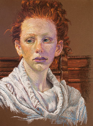
I haven’t created a pastel portrait in a while, so I thought I’d walk you through the process involved in creating this one.

It was started live, during a Yosemite Western Artists (YWA) model session. YWA is the only artist group up here in my area of the California side of the Sierra Nevada Mountains. I live in the foothills, just south of Yosemite National Park. Luckily, they sponsor a lot of art activities including weekly 3 hour live model sessions, monthly plein air outings and photography group get togethers, as well as the annual Tri-County art competition and exhibit. This particular Friday, a young woman named Priscilla Bugg, who has been posing for the group since she was a little girl, was our model.

Portrait of Priscilla Start Image
My pastel by the end of the live model session.

It began pretty humbly. Our models pose for 20 minutes, then take a 10 or 15 minute rest break, then pose again for another 20 minutes, etc., etc., so of the 3 hour session, you only get about 2 hours of actual painting time. I like to add a few strokes, step back and see how what I’ve done compares to what’s up on the model stand, add a few more strokes, step back again and see how what I’ve done compares to the model…you get the picture. If I get a whole painting roughed out by the end of the session, I’m happy.

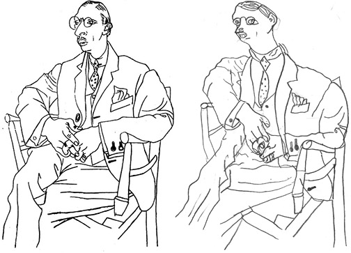
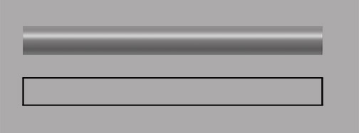
Invariable, no matter how carefully I sketch out/layout my subject, prior to actually painting, I don’t notice where my drawing is off until I have all the 3 dimensional forms blocked in. That’s when I realize things like the face is not wide enough or too wide or the nose is too big or small. I believe this has to do with the fact that the layout is just outline. Once you add form to outline it changes. For example, take a look at the line drawn and form rendered pipes below. Both are exactly the same size and shape, yet the form rendered version appears smaller in diameter (they ARE supposed to be pipes!) then the line drawing.

Outline - Form Image
The span of a outline drawn object appears changed, when form is added.
Priscilla 5/2 Image
Began correcting forms & color first day in the studio.

So, when I got to the studio, put the day’s pastel painting on the easel and compared it to the reference photos I’d taken, I could see a lot of the forms were off. I set to work by  raising the height of her forehead, reshaping her eyes and I began widening the left side of her face, at the cheek bone.

The big difference in working with pastels when compared to other mediums, is the fact that you can’t mix custom colors on a palette, prior to applying them to your painting. You can mix all the custom colors you desire with pastels, however, you have to mix them on the painting itself. This takes a bit more planing as you work. You’ll often see me applying garish colors on my first or second pass. I do this knowing they’ll be made more subtle with later passes. If I don’t apply those purples, blues and greens with my early passes, the subtle version of those colors won’t be there, when I’m finished.

Priscilla 5/3 Image
Modifying facial colors and values.

During my next session I added more detailing to and around her eyes. I also reshaped and detailed her mouth (including the Lauren Hutton gap between her teeth, cute!). The rest of my time, that day, was taken up with modification of the facial colors and values overall, adding a lot of pale pinks, oranges and yellows to neutralize the greens and purples a bit. Her face is really starting to have volume.

Priscilla 6/8 Image
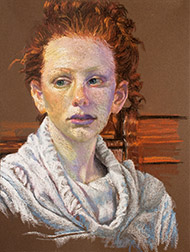
Another session, a longer one, and I had time to make a lot of progress. I finalized the shape of her face, made more changes to her facial skin tones, did a bit more work on her mouth, did a lot of work on her hair (I changed the shape and I added darks and lights) and I began to work on her neck with some new cool pale blues and some lights. I also reconstructed her ears.

Priscilla 6/12
Face, neck, sweatshirt and background work.

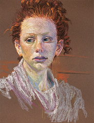
In this, the 2nd to the last session, I added a bit more warmth (warm colors) to her face, pretty much finished all the detailing on her neck and then began detailing the hooded sweatshirt she’s wearing. I also started working on what is showing of the chair she’s sitting in and the other woodwork behind her.

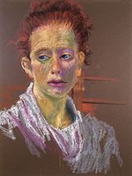
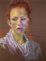
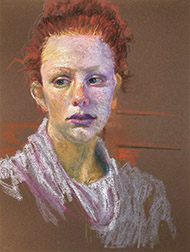
My work during the very last session took her to the finish, shown at the top of this post, and included the final detailing of the woodwork behind her and finicky touches here and there overall. She really went through a lot of changes from the initial sketch of Priscilla live to my last, in studio, session. They don’t always change this drastically, but when they do, I think it makes for a more entertaining ride for the viewer!

The Balancing Act

Bare Tree and Pond Image
In progress pastel painting, “Bare Tree and Pond.”

I chose to use pastels during last month’s Yosemite Western Artists pleinair outing. It had been awhile since I’d worked with the medium and I committed to perform a pastel painting demo in June. I like to have a lot of new samples, in the medium I’ll be using, to display during demos, so it will be pastels from now until the June.

I spend most of my time painting in oils, but last year I painted in acrylics all year long in prep for a week of taking park visitors out to paint Yosemite, on behalf of the Yosemite Conservancy’s Art Center. They didn’t want me taking groups out to paint in oils for fear they’d irresponsibly dispose of their solvents.

I work in a wide variety of mediums, oils, acrylics, watercolors, pastels (haven’t dabbled in encaustics, yet), always have. I think I’ve discovered something useful to all artists in my experience doing this.

With great painting the elements in your subject matter determine application. You apply paint different when painting water than you do when painting trees or rocks, for example. Here’s where balance comes into play: whenever you become comfortable with any given medium (balance), you begin to take its application for granted.  It becomes too easy to rely on past “pat” successful application approaches, instead of letting elements determine fresh methods of application.

When you work with a medium you haven’t touched for awhile, you have no choice but to work with the attributes particular to that medium, redetermining application approaches. You’re a bit out of balance for awhile. The attributes of pastels, for example, force different application solutions when painting water, trees or rocks, than working with oils does. Acrylics, another unique set of attributes, as is the case with watercolors or graphite pencils or encaustics, etc.

When you return to your original medium of choice, you do so with fresh eyes (having been away from it for a time) and possibly new application approaches. For me, anyway, this ongoing introduction of imbalance, through use of a variety of mediums has kept me moving forward and cut down on repetition. I highly recommend it!


Who’s Teaching Who?

(Image: Drawing from upside-down reference. (Left) Reference: Picasso’s Stravinsky, (Right) Student Drawing)

I’ve volunteered as a teaching artist in the Mariposa School System for the Mariposa County Arts Council this year. I’m teaching art to two 5th grade glasses, one hour a week, over twelve weeks. I’m a little more than halfway through the session right now.

I started them off with several right brain drawing exercises: the dual human profiles that create a vase in negative space, drawing a complex image, while viewing it upside down, contour drawing without looking at your paper, etc. (one of my high school art teachers, Betty Edwards, actually wrote the book on right brain drawing techniques). Enough for them to gain a glimpse of what it feels like to draw in the right brain zone, as a seasoned artist does. Few of them could stay in the zone long, so in a short time, during every session, the buzz of talking would rise and I’d have to focus them once again, reminding them that they couldn’t be working in the right brain and talking at the same time. The left brain handles all communication. The right brain is incapable of conversation.

We soon moved on to single point (vanishing point) perspective, discussions of the events and developments that triggered the transition from representational art to abstract art, systems utilized in abstract art, actual painting using these systems and last week, team work on a large collaborative painting (the most fun, so far).

Working with these individuals, about to transition into adolescence, has been a joy and eye opening. In these two classes of 24 to 30 students each, only a small percentage, 2 or 3 students per class, show a focused interest in art. I’m guessing this aligns with the percentage of our society, as a whole, that shares this level of interest. Naturally, these students of focused interest also show the most potential (also a likely reflection of society).

More than this, to some degree, the art exercises reveal the personalities and psychological states of the students. The whole class appears to truly enjoy learning about and participating in art, but a couple students have difficulty following instructions, others ignore the exercise and draw or paint what they want, one or two ask a lot questions, a couple are insecure about whether they are doing things properly, another seeks precision, there are a couple of clowns, one does not participate and another’s actions reveal them to be working out some problems.

I wonder if exercises in other subjects reveal similar things, if the same students exhibit the same behaviors consistently across all subjects or if students respond differently to each subject? Makes me wish I had more time with these kids. Would love to see who each of these individuals becomes in the future.