Picasso Haters!

Girl Before a Mirror Image
“Girl Before a Mirror,” Pablo Picasso

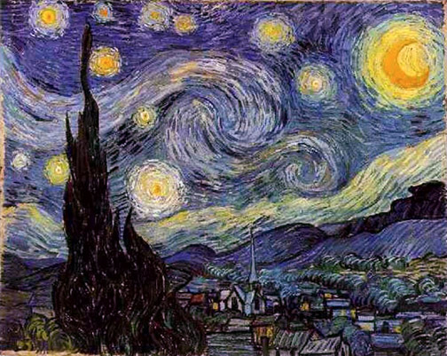
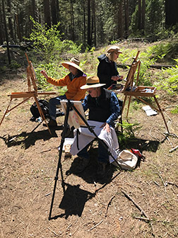
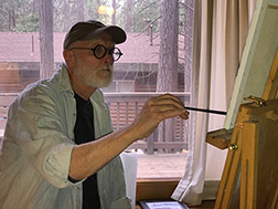
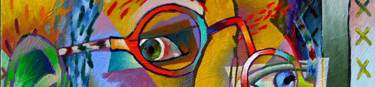
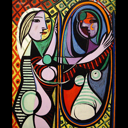
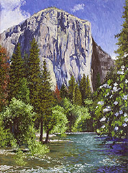
I work both abstractly and representationally, so my work connects me with representational painters and enthusiasts, as well as those who work with or love abstraction. Because I use multiple viewpoint perspective* in my abstract work , it often initiates conversations about cubism and Picasso. Contributing to these discussions, I’ve discovered a whole lot of people who tell me they don’t like Picasso…in fact, some say they HATE Picasso!

Rare Sighting Image
My multiple viewpoint perspective painting, “Rare Sighting,” 40” x 30, ”oil on canvas, $4,000.00.

Further inquisition reveals that most of this group misunderstand what they’re perceiving when they stand before a Picasso work. You’ll often overhear a judgement like, “That’s not art!,” from someone viewing one of this Spaniard’s paintings or sculptures. In a way, they’re right, it’s NOT a particular KIND of art. The reality is that since the middle or late 19th century Art has been divided into categories.

Prior to the mid 19th century all Art fell into one category, representational art.  Art had actually been more of a  commercial endeavor and was often the product of a team of craftsmen, working under the direction of a master craftsman to arrive at a product commissioned by a paying customer. Most of those commissions were initiated by the Catholic or Orthodox Churches, which both required an almost impossible number of images, sculptures, stained glass windows, alters and even churches to communicate their message to an illiterate public. These collections of craftsmen were often capable of designing and fabricated all the above listed items for their customers, a kind of one stop shop. Representational imagery was key to communication, so the competition among the Art Shops was fierce as to who could delivery the most convincing Realism.

Camera Obscura Image
Demonstration of an early Camera Obscura

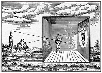
The artisans had no qualms or guilts surrounding mechanical assistance in arriving at their representational ends. They were competing with each other in a race to create the most realistic images possible. Realism translated into bucks, more commissions meant more money in their pockets, so when the single or vanishing point perspective system, for achieving realistic perspective, was uncovered, they lapped it up. The camera obscura, a mechanical device that allowed projection of the world onto a piece of paper, panel or canvas for tracing, introduced during the Italian Renaissance,  was welcomed by many of these craftsman, as a quick and accurate method for achieving realism. The point is, Art was a highly commercial endeavor, the faster, more accurate and efficient images could be created, the better. No one cared how they got there. There was no such thing as a Fine Art, only paying customers.

In the 16th Century Protestantism arrived and brought with it The Reformation, which sought to return believers to religious fundamentals and strip away, what was felt, were blasphemous religious practices, among them, the creation of graven images or idolatry. Remember the printing press had been invented by now and people were beginning to read, the church was no longer dependent on imagery for communication.

With the loss of this meal ticket, the popularity of the multi-artist studio began to give way to solo artist practitioners. They may have utilized an assistant or two, but the production process was greatly scaled down. Efficiency and the assistance of whatever devices were available was as important as ever. The major customers now, were civic institutions or wealthy patrons interested in having pertinent events, important individuals or history (real or fictional) recorded for posterity. Again, communication was the goal and realism the best vehicle for the communication.

Early Photographer Photo
Early photographer

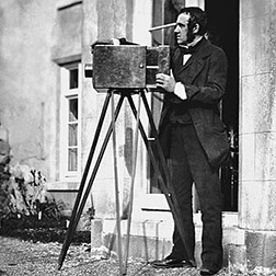
Remember the artist’s friend the camera obscura? Well, over time it was fitted with a ground lens and reduced in size, from its original configuration as a small room, to something that could be carried around and used on location. In the middle of the 19th a practical method appeared that could take the image captured directly by the camera and reproduce multiple copies of it. Photography was born. With real images of people and events now available, painted versions, as documentation, were less necessary or desirable.

This unexpected development (excuse the pun), changed the way artists perceived what it was they were doing. They became more introspective, started looking at how they applied paint, how they mixed color, how they delivered the illusion of space, etc. One outcome was Impressionism, where, less concerned with realism, artists applied paint loosely and dabbed raw color directly on the canvas, requiring viewers to complete the paintings, in their mind’s eye. Here, for the first time, a division in art begins. Art is divided into art for commercial purposes (illustration) and a new Fine Art, an art for art’s sake.

Galleries for public viewing of art began to appear in the middle 18th century, where, prior to this, all would have been secreted away in private collections of the church, royalty or the wealthy. These public spaces really took off in the 19th century, where the average citizen now had access to viewing art in every city, around the world.

With the stage now set for Picasso’s entrance, I’ll present the man himself in my next post and explain why he is considered the creative genius of the 19th and 20th centuries.

*An approach that considers the subject matter from all sides, then represents that data, at the same time, in a single image…think cubism.

Painting El Capitan & Dogwood

El Cap & Dogwood Image
“El Cap with Dogwood,” 12” x 9” oil on canvas, framed $913.00, unframed $785.00

This is the monumental rock face in Yosemite that Alex Honnold just solo free climbed (Saturday June 3, 2017) in under 4 hours, breaking all previous records. Kudos to Alex. He may be able to climb it, but can he paint it?

I recently finished this painting in my studio, beginning it, on location, during my Yosemite Renaissance artist in residence stay in the park from May 8 – 14, 2017. To be more precise I began this piece, plein air, on the Saturday of my stay, May 13.

I’ve covered the details surrounding the discovery and difficulties encountered in actually getting setup to paint this site in earlier blog posts: Artist in Residence – Day 4, Day 5 and Day 6, if you’re interested. This post is going to be about the actual painting of that monument.

Through trial and error, I’ve come to the conclusion that the best way, for me, to paint plein air is by using the Indirect Painting method. I’ve tried the Direct Painting approach, most recently in the first few days of this residency, but I’ve always been unhappy with the results. In a nutshell, with Indirect Painting an underpainting, usually monochrome, is done before the full color over-painting is begun. By contrast, Direct Painting starts laying down full color from the get-go.

Here’s why I believe Indirect Painting is best. All painting should start with the darks in the scene and progress through the medium values, ending with the lights. And always, the painting should be worked as a whole. The darks are the armature that hold the entire painting together. Get your darks right and your halfway home with the entire painting. You want to work the painting as a whole, because each color or value you add, changes what’s already there, through juxtaposition. If you slave away on this corner or that, rendering to finish, while leaving the rest of the canvas untouched, you’re setting yourself up for a fall. When you add the rest of the color you’ll learn it changes what you so diligently rendered up front. The colors in that early rendering no longer look correct.

Anderson Cabin Turp Wash Image
Don’t have a shot of my El Cap monochrome turp wash, but here’s one from the following day.

The light changes quickly, when you’re painting outside, so it’s important to establish the lighting quickly. You can always choose to adapt to the light later in the day, if you like that better than what you started with, but if you don’t get that first lighting scheme down quickly, you’ll have no record of it. With direct painting you’re losing valuable time, mixing this color dark for the tree trunks, that color dark for the foliage, another dark color for the water, etc., all in an attempt to get all your darks down quickly. By using the Indirect Painting method, I mix one color and using turpentine washes (50% painting medium, 50% solvent) lay down all my darks quickly. I’ve speedily established the morning’s lighting scheme and I’m ready to start painting in color.

Plein Air El Cap & Dogwood Image
My plein air painting at day’s end. Note that many of the darks are my underpainting.

So after completing my darks underpainting, I spent the rest of the day laying down opaque color with confidence, knowing I had a darks map of the morning’s lighting conditions. In fact, I could concentrate on the colors of medium and light value first, knowing my underpainting darks were there and that I could change them to their proper colors later, if necessary. You may have noticed that my underpainting is ink blue. I find most outdoor shadows are cool, so the color is a good choice for plein air painting. When I do an underpainting of an indoor subject, like a still life or portrait, I’m more likely to use the warmer, burnt umber.

El Cap & Dogwood 05/17 Image
About 8 more hrs. working on the original plein air painting, in the studio.

Back in the studio, working from reference photos I’d taken that day out in the field, I tore into my original plein air painting, adding more detail, at a more relaxed pace. Since so much of the painting was resolved that day, on location, I felt comfortable concentrating my effort directly on the rock, rather than working up the detail in the entire painting gradually. El Cap was the hero here, I needed the confidence that it was working, before I could relax and work up the supporting cast. I also reworked the sky at this time. I liked the color and clouds in one of my later photos better than what I’d painted on location.

El Cap & Dogwood 05/22 Image
Adding detail to the foliage and river.

Comfortable that El Capitan was pretty much resolved, I started detailing the rest of the painting, working on it as a whole now: trees, bushes, river, dogwood, etc. You’ve probably noticed I like color. I carefully inspect every subject for less than obvious color I can enhance, the blues in the shadows on the right, cast on the river by the trees, for example. I also put back the aqua in the Merced River that I remembered being there in the morning, but missing when I finally got to the river at the end of the day. Unfortunately, your darks underpainting doesn’t help you remember what color things were when you started. There’s a special  advantage gained by, at least, starting your paintings on location, that’s lost when you paint from photos exclusively: color memory acquired through actually being there.

El Cap & Dogwood 05/23 Image
Getting the whitewater in and more detailing to the foliage.

Getting close to the finish here. Added more light values to the foliage. Notice how just adding the white water brings the river to life, bubbling and churning. Where I had a pond before, we’re now looking at the Merced River. I find it’s worth taking the time to place these small shape accurately, even if painted loosely, they can make the difference in whether your subject appears static or alive. I also added more detail to the dogwood here.

With just another session or two, I arrived at the finish (shown at the top of this post) : my final level of light values and a little necessary nit-picking here and there. Just in time for Alex to scale it!

Got Color! – Part 2

Subtractive Color Wheel Image
The Subtractive Color Wheel

In my last post I talked a bit about how the two color systems, Additive Color and Subtractive Color work and how our eyes physically perceive color. In this post we’ll get down to the fun and helpful part of the color theory discussion: the color wheel and how to use it.

How the color wheel is laid out, is vitally important to its function. The 3 Primary Colors: yellow, red and blue are at 12 o’clock, 4 o’clock and 8 o’clock. They form the Triad of the color wheel. At locations halfway between each of the primary colors, as you work your way around the wheel, are the Secondary Colors: orange, violet and green. Colors that are next to each other on the color wheel are referred to as Analogous Colors, colors directly across from each other are Complementary Colors.

Understanding this information can assist you in establishing Mood in your paintings. For the most harmonious, serene mood in your work use analogous colors, colors next to or near each other on the color wheel. For the most lively color themes in your paintings, utilize complementary or near complimentary colors: colors opposite each other on the color wheel.

Select any color, at any location on the color wheel. Locate the color directly across from it, its Compliment, and realize that the complement is made up of all the colors in the color spectrum that the first color lacks. For example: red’s complement, green, is made up of blue and yellow. Orange’s (red and yellow) complement is blue. When you abut pure complements of identical value against each other, the two colors are so lively they’ll create a color vibration producing an optical illusion in your eye of a third color along their adjoining sides.

Too often, I’ve seen painters using black to darken their paints. Black paints are made from charcoal. So adding black to darken your colors is kinda’ like adding a  charcoal briquette to your color. It makes your colors dirty.  Since the world is lit by a spectrum of colored light (remember the discussion of the Additive Color spectrum in my last blog) there is color even in shadows. They’re really not black. A better solution, than using black, is to bring the value of your colors down by adding a dark version of the compliment or a near compliment. Using the complimentary color is also the best way to mute colors that are too bright for your purpose. The muted colors and grays you create are scrumptious (did I just say scrumptious?)!

Color Strip Image
Starting with orange & adding its complement turquoise until we arrive at pure turquoise.
The grey created halfway between orange & turquoise.

If you must use black and you’re working with oils, at least take a look at the new black, Chromatic Black, created by Gamblin Artists Colors. They avoided charcoal and instead mixed very dark versions of Phthalo Green and its compliment Alizarin Crimson to create a black. So you may still be using black, but you’ll be working with color not charcoal.

And here’s probably the most important thing the color wheel can assist you with. Ever stand there pondering your subject matter, whether an old barn on location or a live model in the studio and ask yourself, “What the hell IS that color in the shadow?” We’ve all been there, many times! Determine the color of lit area of your subject and know the shadow is going to be some value of its compliment. Colored light casts a complimentary colored shadow. Doubt this? Grab a light source, a colored piece of cellophane, a white card and an egg and find yourself a dark room. Point your light wrapped in the colored cellophane at the egg resting on the white card. The shadow cast will be a brilliant version of the cellophane’s complimentary color.

Add a color wheel to your paintbox. Use it religiously and in no time you will have it committed to memory. The colors in your paintings will be become cleaner and more lively!

Got Color! – Part 1

Subtractive Color Wheel Image
The Subtractive Color Wheel

It’s surprising the number of artists I encounter who have never been introduced to the color wheel and the important role it plays in color theory. Many have seen it, but most have never been shown how to use it. Yet, it’s one of the most important tools in your paintbox.

The color wheel can help you identify the true color present in your subject matter, especially in the shadows, help you properly mix and mute paints and chose an appropriate palette for establishing the mood of your undertaking.

There are actually two color systems (three if you include the Munsell’s system), one for the color of light, Additive Color and one for color of pigment, Subtractive Color. I’ll give you a brief description of both systems (we’ll save discussion of Munsell’s system for a later time) and then describe how to use the Subtractive color wheel to your benefit in painting.

Additive Primaries Image
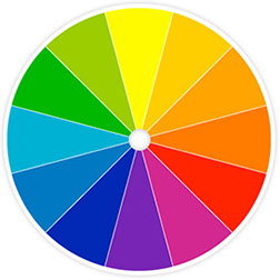
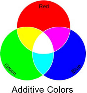
Additive color theory is important to understand, though, since it is all about how the LIGHT color spectum functions, unless you’re a photographer or lighting director in theater or film you won’t have the opportunity to manipulate it.  It is the system by which you view color in the world. The primary colors in the Additive color system are red, blue and green (not red, blue and yellow, the primaries in the Subtractive color system). Mixing all 3 primaries results in white light. When you see an object as red, like an apple, the molecular make up of the apple is such that it is absorbing all colors in the light spectrum, but red. Because the apple can’t absorb the red light, the red light rays bounce off the surface of the apple and back to your eye. Ironically, you could say the apple is every color but red, since it’s absorbing all the other colors in the light spectrum, but red.

Subtractive Primaries Image
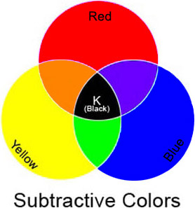
In subtractive color theory the primary colors are the more familiar red, blue and yellow. This is the system we work in, when we mix paints. The combination of all three primaries in this system result in black. You’re mixing pigments in this system, not light. Your eye perceives the colors you mix, however, in the same way it perceives the colors of the light spectrum. The molecular structure of any particular pigment color absorbs all color but the color you perceive. Blue, for example, absorbs all colors of the spectrum accept blue light and, therefore, bounces or reflects the blue light back to your eye.

Confused? I know this can  be a little disorienting at first. Be comforted in knowing it’s not as important to understand how the eye physically perceives color, as it is to understand how the color wheel can help you work with color, when you’re painting. I think I’ve probably given you enough to ponder here, so I’ll break this one post in two and cover the function of the color wheel and its benefits to the painter in my next post.

Too Good to Be True

Starry Night Image
Vincent Van Gogh’s “Starry Night.”

Any painter I’ve ever met, regardless of experience, possessed the desire to expand their abilities with each new canvas. I never met anyone who felt they possessed all available knowledge or had developed all necessary skills. We’re all seeking growth, but there are hazards to avoid along the way. When you encounter an artist that seems to always get it right, always chooses the best point of view, lays out the best composition, chooses the perfect palette, puts down paint with seemingly effortless skill and confidence and consistently delivers one beautiful image after another, it’s a good bet there are yards and yards of canvas in their history.

Beware of those who would offer you shortcuts to becoming a master painter. Along the path to accomplishment you’ll be offered both knowledge and illusions. It’s important to absorb the first and avoid the last. When someone tells me these colors must be used in creating the perfect flesh tones or that counting the number of hard and soft edges in my paintings will lead me to Nirvana, I run as fast as I can in the opposite direction. Flesh tones change based on environment: available light, reflection, what the model is wearing, etc. How edges are rendered should be suggested by the subject matter, not arbitrarily contrived in one direction or another by me. The greatest KNOWLEDGE I ever received was that everything I needed to know was right there in front of me, I only needed to learn to SEE it.

Value Guide Image
Value Guide

That’s where the years of experience come in, learning to see, takes time. Baby steps at first, giant strides later. The good news is, all of us can achieve it, the only requirement is a passion for getting there.

Color Wheel Image
The Color Wheel

Consider Vincent Van Gogh. A man in his 20s decides, one day, that painting is his future. Lacking any affinity for his newly chosen profession, he embarks first on teaching himself to draw. The first products are crude and childlike, but within 2 years of drawing anything and everything he encounters he becomes a master draftsman. He then picks up paints and travels down a similar road, producing crude amateur works first (his Potato Eater period), masterpieces later. Friends know I can never get over the realization that while Mr. Van Gogh made one of the greatest contributions to art, both in number and quality of works, his time as an artist, from deciding it was what he wanted to do, until he breathed his last breath, numbered only 9-10 years.

Right Brain Drawing Image
Drawing on the Right Side of the Brain by Betty Edwards

There ARE some good solid vehicles available to inform us of what we’re looking for with our artist’s eye: right brain drawing exercises, the color wheel, value guides and the rule of thirds, for example, but be forever suspicious of the quick-fixes presented. There are no shortcuts to good painting, we have to put in the mileage!

The Power in Painting with Friends

Painting Annette Photo
Painting with the YWA, © 2015 Trowzers Akimbo

I’m a recluse by nature. I rarely volunteer to leave my home studio. Necessity has to drag me out the door, kicking and screaming: re-supply needs or occasions it just would not be right to avoid. I rarely initiate get-togethers, but do attend, when others put them together. I like to work, work, work! For me painting is a solitary undertaking, my best results achieved while all alone, uninterrupted, in the zone. Sound familiar?

I’m primarily an abstract painter. It was a sudden realization in the late ’80s that I might have something to say, using multiple viewpoint perspective, that drew me away from my commercial (animation direction, illustration, computer game creative direction) work towards fine art. As a kid, from birth through high school, I did create representational works and, of course, my commercial endeavors required my work to be representational, in one form or another, but my adult fine art works were abstractions.

A few years ago, some portrait work from artist friend, Terry Robinson, was posted on Facebook. Terry and I first met and worked together, when I was the Chief Creative Officer at Sierra Online, a computer game company in the Sierra Mountains (unbelievable, huh!). When I realized the postings were occurring weekly, I asked Terry about them. He let me know he was meeting weekly with a group that brought in a live model and encouraged me to join them.

Like a lot of us, drawing from life had slowly migrated to the bottom of my daily to do list, since I’d left art school, and here was an opportunity to move it back towards the top.

So, I showed up one Friday for a Yosemite Western Artists (YWA) live model session. This one small, seemingly insignificant action broadly expanded my world.

The Yosemite Western Artists are primarily representational artists. Fearing that my abstractions would cause these strangers to gather up torches and pitchforks and drive me from the building, I first worked representationally with the group. My first surprise was that I enjoyed working representationally again and that I had a lot of areas still to explore in this direction. I realized I was a different artist than the one who’d abandoned representational work in high school. Another was that, weeks later when I abstracted from the model during a session, that others were interested, not necessarily appalled, by what I was doing. In fact, based on member request, I’ve since hosted workshops on abstraction.

YWA also introduced me to plein air painting (a big part of what I do these days), through their monthly group outings.

Trowzers, Terry & Vicki Photo
Plain air with friends, © 2017 Kerby Smith

The relationships I’ve developed with other artists, through the group has not only been good for the soul, but it’s provided me with kindred spirits that love to discuss art and art challenges as much as I do. I haven’t rolled art around this much in conversation, since I left art school. And collectively they’ve exposed me to art competitions, gallery and exhibit opportunities in the local area that, for the 24 years I’ve been painting up here, I had no idea existed. I’ve learned of brilliant artists whom I’d never heard of and museum exhibits I surely would have missed, left to my own devices. These accidental acquaintances have blown my world wide open. I suppose this is how and why so called schools of painting, in distinct geographical areas, developed, like Impressionism, Post Impressionism, Abstract Expressionism and Pop Art: groups of artist circling the wagons and within painting, discussing, critiquing and supporting each other, as they drove their creative expessions in new directions.

I’ve since widened my creative circle by joining another organization, the Society of Western Artists, a group originally established in the ’30s, with current locations in Fresno, CA (near my studio in the Sierras) and the San Francisco Bay Area. While newer to this organization, I’ve already had extended conversations on art, through road trips, as we’ve transported works for group exhibitions from Fresno to San Francisco.

When I first stepped through the doorway of the historic Gertrude Schoolhouse (headquarters for YWA), I never saw any of this coming. Thank you Terry for dragging me out of my cocoon!

If you, yourself, don’t already belong to an active artist group in your area, I recommend you join one quickly. The rewards, both practical and spiritual, will be unpredicted and immeasurable!


Artist in Residence in Yosemite – Day 7

Anderson's Cabin Image
My days work, © 2017 Trowzers Akimbo

We traveled out to paint, a large group, this final day, Sunday, May 13th, of my week-long Yosemite Renaissance artist in residence stay in Yosemite. The painters, in addition to myself, included Terry Robinson, Lura & Kerby Smith and Vicki Thomas.

We decided to avoid the tourist insanity that was going in the Valley on Saturday and select a painting location closer to the cabin. Our first choice was Alder Creek, but the two ladies in our group were leery of navigating the steep drop, while carrying there painting equipment from our parking location, along the roadway, to the bank of the creek. Lura had recently injured her leg and wasn’t sure how well it would hold up traveling down the steep trail. While beautiful, the vistas offered by Alder Creek were too similar to the churning water paintings I’d created of Chilnualna Falls the first 3 days of my stay, for me to bother nudging the ladies down the hill. We decided to choose a location from the offerings of Wawona’s Pioneer Village.

After individually scouting the many offerings presented by the Pioneer Village, we all independently  set up in front of the Anderson Mountaineer’s Cabin. There’s plenty to choose from, as far as painting goes, here, I highly recommend it as a painting destination, if you’re in Yosemite. The local artist group I belong to, Yosemite Western Artists, travel up here as a plein air group often to paint. In fact, they’re heading up there again today.

Anderson's Cabin Plaque Photo
© 2017 Kerby Smith
Trowzers, Terry & Vicki Painting Photo
© 2017 Kerby Smith

At one point during the day we were joined by a visiting artist, who plopped down on an available log bench and began an ink drawing of the cabin in his small sketchbook. We introduced ourselves and he shared the drawing on which he’d been working. Turns out he and his son have got a challenge going to each do at least one drawing a day. I love the people you meet when you’re out painting plein air and in a location like Yosemite, those you meet are from around the world. Someone looking over my shoulder, as I work, told me I was new Bob Ross. Whether that’s a complement or a cut depends on how you feel about Mr. Ross. Must have been my “happy little trees.” Given the enthusiasm of the delivery, I’m sure it was meant as a compliment. That’s how I’m going to accept it, anyway!

We put in another long day, wrapping around 5pm, when the sun began shining through the backside of our canvases.

Trowzers Painting Indirectly Photo
Indirect painting, © 2017 Kerby Smith

Those of you who’ve been following these posts may recall that I set out on this week-long outing, switching from my normal indirect painting approach to direct painting to see if that technique would be faster and allow me to complete a plein air painting in a single day. Well, unhappy with the direct painting results, I switched back to my indirect painting technique on Day 5, the Half Dome painting from Glacier Point. I paint from dark to light, realizing that the darks are the armature that paintings are built upon. Direct painting required me to constantly clean my brushes and mix up darks of various hues. When I paint plein air indirectly, my underpainting is a monochrome turp wash (50% painting medium, 50% solvent) of ink blue, requiring no brush cleaning or additional color mixing. I get all my darks down more quickly (critical, given the rapidly changing light with plein air painting) and can move on to the opaque laying in of medium and light polychrome values. I’m much happier with the end results of this approach.

The bottom line is, I just don’t like my plein air painting final results. They look like color sketches to me. I can’t help but feel they require more time to deserve hanging in a frame. While I love the process of painting plein air (you absorb information about the scene unavailable painting from photos alone). In future, I think if the result warrants it, I’m just going to use the plein air painting as a color sketch for a larger, more finished painting.

As the day ended, I put my visitors in their vehicles, wished them a safe trip home and after a quick clean-up of the cabin, started down the mountain to my home in Oakhurst…a melancholy ending to a wonderful, fruitful week with friends!

P.S: I’ve just been informed there’s going to be a show of the work produced during the week, at Gallery 5, in Oakhurst, CA in a couple of weeks. Stay tuned to my blog for the details, which I’ll post once they’re available.

Artist in Residence – Day 6

El Cap with Dogwood Image
My in progress, end of day painting, © 2017 Trowzers Akimbo

On Day 6 of my Yosemite Renaissance artist residency in Yosemite, I’m joined by artists Vicki Thomas and Terry Robinson. Photographer/artist, Kerby Smith, has decided to stay over another night, so he’ll be with us on the last two days of the residency. Kerby’s wife and my artist friend of 25 years, Lura Schwarz Smith, will be joining us tonight and painting with us tomorrow. I actually met Lura (and Kerby for that matter) through my wife, potter/fabric artist, Betty Tikker Davis. Lura and Betty have been part of a small quilting group that have been getting together, once a week, at our house for 25 years. Anyway, this promised to be the largest group visiting me all week.

We’re traveling to Yosemite Valley to finally paint that elusive perfect view of El Capitan. Kerby had a scheduled photo shoot at Glacier Point, in the morning and will join us when he’s done. Terry was running late, so he plans to meet us at the painting location.

On arrival, the Valley is packed. Traffic is backed up near Bridal Veil Falls and visitors are double parking at the areas designated for cars, along the roadways, waiting for a slot to open up. We’re painting at a little known location, so chances are we’ll have a place to park. Trying to find the spot on my own, I realize I didn’t landmark it well enough and circle around twice, without success. I call both Kerby and Terry, who both know the location well, from my cell for guidance. We catch Terry as he’s entering the Valley and he guides us in.

As hoped, crowded as the Valley is today, parking alongside the road is wide open at our location. We’re good to go.

Tight Group Photo
© 2017 Kerby Smith

We want to avoid blocking the trail, which limits the perfect point of view to a small patch of semi-flat ground in which to set up, so we’re going to be a tightly packed group today. The setting offers us something from all the major food groups: a Yosemite monument, a rushing river and a blooming dogwood in the foreground (there was also a fallen redwood framing the scene in the foreground, but none of us included it). We paint until about 5pm.

The best of settings, great weather, good friends, an ideal plein air painting day!

Artist in Residence – Day 5

Half Dome Painting Image
My in progress 12” x 9” oil painting of Half Dome from Glacier Point.

With a promise of rain, we rose Friday morning, May 12th, and still headed over to Yosemite Valley to see if we could capture the stunning POV of El Capitan we witnessed yesterday. We were hoping we could get something accomplished, before the storm hit and, when it did, that the rain would be light.

Halfway there, our hopes faded, as we climbed into misty clouds that required the occasionally swish of windshield wipers to refresh our view. On arrival, it wasn’t raining, but all the rock monuments in the Valley were hidden behind clouds. We stopped a Pohono Bridge, hoping to set up and paint there.  Didn’t need clear skies for that, since it’s on the Valley floor, but with the snow melt swollen Merced River, there was no bank to set up painting gear, on either side of the river. Anyone wanting to paint this bridge will need to wait until later in the year.

We decided to pick up the Valley Loop trail there and walk the 1.5 miles to our El Cap beauty shot. We wanted to hang out in the Valley awhile and see if the clouds cleared from the monuments. A walk along the trail was a pretty beautiful time-killer. Much of the loop was underwater and we had to make our way forward, roadside, until we’d passed the flooded sections. A word of caution to anyone planning to trail in Yosemite Valley in the near future: if you’ve got summer mesh hiking footwear, be sure to bring along an extra pair of socks, you’re likely to get your feet wet.

El Cap was still deep in cloud cover, when we reached our destination and it started to rain. So, we pulled our hoods up over our heads and backtracked along the trail, the mile and a half to the cars. I decided I was heading back to Wawona to do some painting, in the cabin from reference shots taken earlier in the week, if I had to. Let the rain come down outside, I wasn’t going to miss out on a day of painting. Kerby decided he’d stay in the Valley for a while: he had a few photographic ideas he wanted to play out.

Me Painting in Cabin Photo
Photograph © 2017 Kerby Smith

Back at the cabin I looked around outside for something to paint. Itwasdefinitely going to rain, but I was willing to get started out in the open, take some reference shots and finish inside. I seriously considered the exterior of the cabin we were in staying in. It was interesting enough to paint, but who, other than those of us staying there, would find it interesting enough to want to buy it. I could imagine the gallery curator’s pitch, “It’s the cabin Trowzers Akimbo and the rest of his artist friends were staying in, while they were up in Yosemite painting for a week.” “Trowzers who?”

I decided a better idea would be to paint from one of the photos I’d taken earlier in the week. In fact, I had some good ones on my new Verizon phone, that I’d taken at the destined El Cap location. I just needed to get the photos from the new phone to my laptop and from there to my iPad. I linked Bluetooth between the two devices and attempted to send the photos over…nothing. After a few more tries, I gave up. This wasn’t going to work. Android didn’t seem to be interested in conversing in OS X with my MacBook Pro. With no Internet connection, I couldn’t get online to run down a solution to my problem. I seriously thought about chucking the idea of painting, at this point, and taking a well deserved nap the rest of the afternoon. A lessor man would have, but I’ve learned to embrace my neurosis and harness the fears of failure lurking there to keep me plodding forward towards success!

Small Half Dome Photo
Thursday’s photo of Half Dome from Glacier Point.

My digital SLR camera memory card was full and I’d emptied it onto my laptop, the night before, so I could clean the card and make room for new photos. I poured over the photos in the folder for something worthy of a painting. The only candidate far enough removed from the Chilnualna Falls paintings I’d been creating all week, was one of the shots I took yesterday of Half Dome, from Glacier Point. I loved the photo, but I wasn’t sure that once it was translated into a painting, it would still be legible as Half Dome to on-lookers: so much of the rock was obscured by the clouds and the Glacier Point perspective offers a less than typical point of view of the monument.

It having reached 3:30 or 4 pm, it was going to be this image or nothing. I set up my french paintbox near a window that would offer me the latest possible natural light and began slapping paint down on the canvas.

Only the finished painting will tell me whether Half Dome reads of not, but as you can see by the in progress painting above, at least I didn’t allow myself to succumb to a nap. Remember what Salvador Dalí said, “No masterpiece was ever created by a lazy artist!” Okay, Salvador, I skipped my nap, now where’s the masterpiece!

Artist in Residence – Day 4

Half Dome Photo
Half Dome from Glacier Point, Yosemite National Park, © 2017 Trowzers Akimbo

No painting the morning of my 4th day as a Yosemite Renaissance artist in residence, I had to drive down from the cabin to teach art to two 5th grade classes in Mariposa. It’s a twelve week teaching artist program on behalf of the Mariposa Arts Council and I still had 3 weeks left.

There’s been no cell phone reception on my AT&T phone, while I’ve been up in Wawona. The artist/photographer, Kerby Smith, who’s going to be with me over the next three days, tells me his Verizon cell phone is working in Wawona, so I picked up a Verizon burner phone in town, before I headed over to the school.

I’d agreed to meet Kerby at tunnel view, above Yosemite Valley, when I was done at the school. He wanted to share a couple of possible locations for painting in the valley, he’d discovered through his photography outings. I’ve learned that photographers search locations like Yosemite, for those special spots from which to take the money shots and they’re very protective of them. If a photographer friend ever offers to share one of these with you, take them up on it, it’ll be well worth your time.

So, Kerby showed me ideal settings for painting Bridal Veil Falls (more powerful than I’ve ever seen it, due to the warm weather snow melt) and El Capitan: a location with the Merced River and a blooming dogwood in the foreground. Too late to start a painting that day, we agreed to return tomorrow.

On the way back to the cabin, we discovered they just opened the road to Glacier Point, so we traveled on up. Still a lot of snow up there. It was cold and windy and clouds had started rolling in from a predicted storm to occur the following day. Among other vistas, I snapped the above shot for future painting reference. We returned to the cabin, well after dark to discover there were absolutely no signal bars on our Verizon phones. Without cell phone reception or an Internet connection, we were forced to talk to each other all night.

Under concern of the predicted storm, we decided to rise early and head back to Yosemite Valley to paint. Even if the weather services forecast was correct, maybe we could sneak in a few hours before the rain hit.