Brush Up

Applying Paint Photo

Too often we overlook the full capabilities of the tools in our paint boxes and forget that they were designed to ease our workload and extend the impact of our work. Let’s talk a bit about brushes.

Ancient Egyptian Brush Photo
Ancient Egyptian Brush formed from sticks flayed at one end.

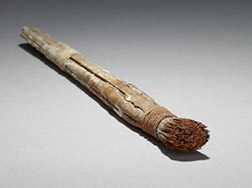
The artist paint brushes in our hands today are the product of centuries of evolution. They are modern marvels, the result of extensive, in the field, use and contemporary engineering. That’s all wasted, however, if we ignore all they can do.

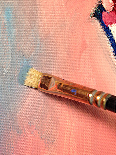
It’s important to use the proper brush for the job at hand. My favorite workhorse brush, when painting with oils or acrylics, is the bristle brush. This baby’s stiffness can move the thickest of paints across a canvas and is great for scumbling, dry brush and impasto techniques. It’s my go to brush for most of my painting needs.

When you’re painting wet into wet, especially in a single session, alla prima, you’ll find the bristle brush less effective in paint over paint application. It’s rigidity tends to pick up the wet paint from lower layers, mixing them with the new paint you’re attempting to apply, preventing you from applying clean new strokes. This is when you want to utilize your sable brushes. A light touch with one of these, will float the new color on top of the previous applied wet layers.

Glazing (transparent layers of color utilizing large amounts of painting mediums) can be accomplished by either bristle or sable brushes. It all depends on the viscosity of your mixture.

I covered the proper brush for the job in more detail in a previous post, “Be Good to Your Brushes & They’ll Be Good to You!

Grasses Image
Thin, overlapping vertical & diagonal strokes for grass.

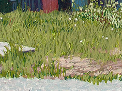
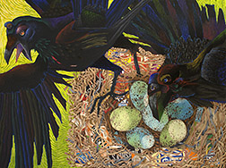
What I actually wanted to talk about in this post was allowing your brushes to do some of the work for you. All the subjects you paint possess visible characteristics quite different from each other. These characteristic are the result of things like growth patterns, chemical make-up, environment wear, etc. The leaves on a tree present a much different surface characteristic than, say, the granite face of Half Dome, in Yosemite, for example. Yet, it’s easy to ignore this fact and apply paint to canvas in the same uniform manner, when executing all elements in our compositions. Boring!

Clouds Image
Rolling a bristle brush around, with occasional edge flicks to communicate clouds.

Instead, pay attention to how the elements you’re painting grow, what they’re made of, how they move, how their surface reflects light and color and then allow your brushwork to communicate this. The British painter, Alwyn Crawshaw, famous for tv shows, books and videos on painting, suggests you try to become the element you’re painting, “I’m a fluffy little cloud!” Then paint the element accordingly. A bit over the top form me, but I get what he’s saying.

El Cap Detail Image
Crisp vertical strokes for granite.

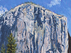
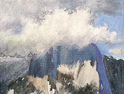
What does this actually mean: allow your brush to reflect the characteristics of various elements in your paintings? Well, when studying the granite face of a monument like Half Dome or El Capitan, in Yosemite, you’ll notice it has very chiseled characteristics with strong vertical concave and convex up and down forms. A great approach in painting these, might be to use the edge of a flat brush to create vertical strokes, occasionally rolling the brush a bit, from side to side, to vary width in the process.

Leaves Image
Globbed paint then flicked at the edges for leaves.

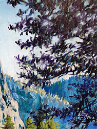
Foliage on trees often starts with a glob of paint and ends with a flick of the brush towards the edges. With clouds, rolling the brush around, then flicking an edge here and there might be the best solution. Ground is often a series of short horizontal strokes, reflecting the years of overlapping footprints of man and animals. The directions of strokes over a face in a portrait reflect the anatomical structure beneath. Strokes representing a flowing river tell of the repeating pattern it creates as it travels around rocks and over an uneven river bottom.

How you portray the various characteristics of the elements that make up your paintings is a personal choice, there’s no ONE good solution. I’m suggesting that your paintings will be more dynamic, more interesting, if you consider the actual structure, make up, of the elements in your compositions, then reflect this to your audience with how you use your brush in your paint application.

Say What You Think!

Painting Boop Photo
Photograph © 2016 Vicki Thomas

I’ve been teaching a lot lately, both to adults and, as a Teaching Artist, to kids in school. Having been creating art, in one form or another, since I was a tiny lad, I perform a lot of procedures, make a lot of decisions on auto-pilot, almost unconsciously, when at the easel. Many of these decisions involve critical creative fundamentals. Fundamentals I should be sharing with those in my classes. I’ve found these automatically performed functions to be the most difficult to relay to students. Not because they’re difficult to explain, but because, when I’m in the zone painting, I’m unaware that I’m even performing many of them.

So, I’ve made a conscious effort to make myself aware of every step that occurs, while I’m painting. To write them down, as they occur, for later communication to those in my workshops or classes. I’ve also found that talking through the process with other creative friends, verbalizing procedures, brings these buried faceted automatics out into the light. These conversations also reveal differences in how others works, providing me with even more information to share. If out of the blue, I begin a conversation with you about paint application or simplification of forms, let me apologize in advance, know the annoyance is serving a good cause!

Lifting procedures up onto the surface has been like a trip down memory lane. “When did I pick that up, who taught me that?” It’s a realization of how very many great teachers I’ve had, how many truly accomplished artists I’ve worked beside, how much information has been passed along. I’ve been extremely fortunate! It’s important to reveal and write all this stuff down, then pay it forward!

As Seen On TV

Jon Gnagy Photo
Jon Gnagy, host of “Learn to Draw.”

As far back as I can remember, I’ve considered myself an artist. This is likely because, from the age of 5 or 6, I was treated like an artist. My mother and her father, my grandfather, are/were both creative individuals, so I’m sure they were pleased I showed an interest and encouraged it.

I’ve learned, over time, that in addition to my love of art, from my mother I inherited a unique energy. I fall asleep at night (I actually resent having to sleep, at all), thinking about what I’m going to accomplish the next day and hop out of bed, the next morning, chaffing at the bit to get started. I continue driving forward until it’s, once again, time for bed. I thought everyone functioned like this, until many others pointed out to me that this was not, in fact, the case!

Oswald Cartoon Image
Oswald silent animated short.

I’m of that first television generation. To my recollection, there was always a television in our house. I took full advantage of that. My inherited energy prompted me to jump out of bed, early in the morning, on weekends and during vacations from school, long before anyone else in the house was awake. I’d immediately switch on the TV to a test pattern. Trying to be patient, I’d fidget through the farm report (first program broadcast in the morning), waiting for the old silent black and white animated shorts to begin. I’d watch, learn and dream about creating animation myself, someday.

Saturdays were different, than other days off, however. On Saturdays the National Broadcasting Network presented “Learn to Draw,” hosted by Jon Gnagy, as part of their early morning line-up.

Long before Bob Ross (Bob was likely sitting in front of the TV in his PJ’s, as well), Mr. Gnagy would host on-air draw-alongs, guiding us through the creation of elaborate compositions, utilizing simple geometric shapes: the ball, the cone, the cylinder and cube. Later I’d learn that this was not actually a Jon Gnagy original discovery, but was instead promoted by Modern Art giant, Paul Cézanne.

Gnagy Kits Photo
Jon Gnagy “Learn to Draw” kits.

Under Mr. Gnagy’s tutelage, I created snowy landscapes, asian seascapes, farm scenes, still lifes, you name it. Beginning in 1947 (before I was born, I must add), over time, his show grew in popularity, prompting the retail release of Jon Gnagy Art Studio Kits, sold in toy store. I was the recipient of many of these kits, as family friends and relatives saw them as perfect gifts for a young artist.

I don’t know what it was that made me think about Mr. Gnagy, lately, but something led me to search him out on the Internet. I learned that while Mr. Gnagy is long gone (he passed away in 1981), his studio kits are still alive and available thanks to the Martin F. Weber Company.

Warhol Self Portrait Image
Andy Warhol’s Self Portrait

My research has also informed me that I was not alone in my devotion to the Learn to Draw program. I found this quote from Pop Art giant, Andy Warhol, “I watched his show every week and I bought all his books.”

I wonder how many other artist, famous or infamous, spread out their drawing materials on the floor in front of the TV set and, along with me, spent a half hour of their Saturday mornings following the goateed instructor’s lead.


Chasing Shadows

Ahwahnee Bridge Detail Image
“Ahwahnee Bridge (detail),” by Trowzers Akimbo

One of the most difficult concepts for artists to understand or accept, I find, is color theory. It’s a tough buy-in to ask of anyone who’s been taught all their lives that the primary colors are red, blue and yellow (subtractive color) and that when these 3 are combined, a murky black is the result, to now understand, that with light (additive color), the primary colors are red, blue and green and, when combined, result in white. It doesn’t seem possible!

Subtractive Primaries Image           Additive Primaries Image

An extension of that reluctance of acceptance is the fact that shadows on an object are not just darker versions of the color of that object in light, but, in fact, completely different colors. For example, a red apple’s shadows are actually some form of green, not just a darker red. The consequence of this lack of acceptance is artists just adding black to colors to create shadows, resulting in myriad, otherwise beautifully executed, paintings continuing to exhibit dull, dirty, lifeless shadows.

Viewing Color Image
Red light reflected back to eye.

In hope of convincing those holdouts, let’s quickly review how the eye perceives the color of elements in the world. Clean white light is the resulting combination of all colors in the light spectrum. All colors in the light spectrum being those we see, when this white light is refracted, then reflected by a Prism or in a Rainbow. The various subjects we encounter in the world don’t actually have a color, per se. Instead their molecular make-up either absorbs the various colors of the light spectrum or reflects them off the surface of the subject and back to our eyes. So, when you perceive an apple as red, you’re doing so because that apple could not absorb red colored light and reflects that light back to your eyes. All other colors in the light spectrum (blue, purple, green, yellow, etc.) are absorbed by the apple. In the case of shadows, direct light is blocked, in turn, the light color being bounced back to our eyes is also blocked, leaving a combination of all remaining colors of light in the shadow. Confusing? Yes, but there’s a simpler way to remember this!

Color Wheel Image
The Color Wheel

The color wheel is one of the most important tools in an artist’s paintbox. Among other things, it’s your simple guide to the color in shadows. As it turns out, the shadow color of any given color is its compliment. Take the primaries red, blue and yellow. Yellow’s compliment is violet. Remember our discussion above, stating the shadows of any given color are a combination of all the remaining colors in the color spectrum? Well, those astute readers out there have likely already realized that yellow’s compliment, violet, is the combination of the two remaining primary colors, red and blue. The color wheel makes calculation unnecessary and locates each color’s compliment directly across from it on the wheel.

While there are other factors involved in determining the final color of a given shadow, like value, nearby reflected color, color of the surface on which the shadow falls, etc., knowing the base color of shadows, moves you away from black and assists you in using your eyes to determine what’s really there before you.

Carry a small color wheel around with you, use it diligently to help determine color in shadows and you’ll find, in a very short time, that you have it memorized. Your shadow depth will increase and your paintings become more lively!


Necking

Dirty Paint Tube Photo
Dirty paint tube neck.

I never used to even consider paint tube hygiene to be of any concern in my painting. I just put up with the built up dried, gooey, messy paint that collected around the neck of my paint tubes, the difficulty this caused in getting the caps to screw on properly and even broken paint tube caps. I just thought this was the way all painters lived: simply a cost of doing business in this bohemian world.

After a lifetime in this “dirty” world, I recently discovered a path to a cleaner life. It requires a change of habit and a bit of diligence, but I think I’m up for the task. I’m tired of grinding concentrated bits of pigment into the floor of my studio or tracking it through the house, when a bit of this goop, unseen, falls from the neck of a tube and ends up on the bottom of my shoe.

Clean Paint Tube Photo
Tube neck after cleaning and oiling.

How do you adapt this change in lifestyle? You start by removing the paint goop from the neck of each paint tube in your paintbox. If the tube is almost empty or the gunk is too difficult to remove, just give up on this tube and begin your new regimen of hygiene, when you’ve used the color up and replaced it with a new tube. Once the paint is removed from the neck, apply a drop of linseed, walnut or safflower oil (your oil of choice) to the threads on the neck of the tube. You won’t believe how smoothly the cap now screws on and off. From there, it’s just a matter of wiping away wet paint from the threads, whenever it begins to collect and applying the oil.

Stay the course and your paint tubes will function like well oiled machines. Ugh!

Why Art School?

Chouinard Facade Photo
Chouinard Art Institute (Early CalArts)

Is an art school education really necessary for those that intend to make creating art their profession? Can’t you just learn everything you need to know about art, on your own, through practice? What do you actually gain from a formal art school education?

Drawing Class Photo
Chouinard Drawing Class

We’ve all run into self-taught artists in our lives with incredible abilities. Which begs the question, do you really need a formal and generally expensive, art school education to create great art? The answer, I believe, is no, but let’s discuss why I still recommend an art school education to anyone seriously interested in becoming a professional artist.


Contemporary Drawing Class Photo
Contemporary CalArts Drawing Class

Sure some can reach an extremely high level of proficiency, as an artist, on their own and stand toe to toe with artists who have benefited from an art school education, without one. However, it takes an individual with an extremely high level of discipline, perseverance and hunger for knowledge about the arts, to pull it off. It also takes a long, long time to gain the same knowledge, on your own, that you’d receive in the typical 4 years dedicated to an art school education. But it CAN be done. Hell, Vincent van Gogh did it!

Art History Class Photo
Art History Class

So, what are the benefits of a formal art school education? Thoroughness, truncation, concentration and camaraderie with hundreds of other artist, from around the world, experiencing what you are experiencing, at the same time. Realize you’re learning from professors with a lifetime of unique formal and, in the field, collected knowledge. Each one is passing this accumulated knowledge on to you. Quite the shortcut! You also gain a knowledge of art history you likely never would have acquired on your own. All organized and catalogued by significance. Artists and art movements you didn’t even know existed, that will prove important to the work you’ll create in the future. Art history informs of the important work that has come before us and explains why it is important. It prevents us from trying to reinvent the wheel, but instead enables us to stand on the shoulders of the giants in art.

Paint Sink Photo
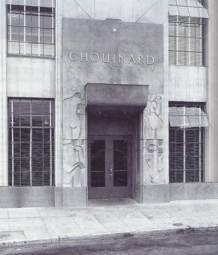
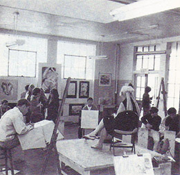
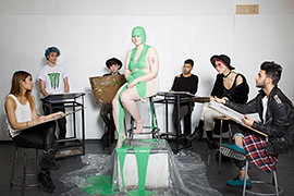
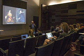
So, get an art school education if you can, but don’t despair if it isn’t in the cards. With proper dedication and exposure, you can get there on your own, the journey is just a significantly longer one.

Poe’s Pets

Modern Building Materials Image
The finished painting

I’ve wanted to paint ravens for some time now, but never seemed to get around to it. I’m fascinated by the gamut of colors emanating from their shiny, deep black plumage, like an oil stain in the parking lot, after the rain. I’d always planned to paint a representational version, then the upcoming exhibition/competition, Avian: Birds in a Changing World, nudged me both towards painting them now and painting them as an abstraction.

The Avian prospectus encourages artists to make a statement concerning the effects our changing environment is having on our feathered friends and I felt the concept I had for a painting in that light, was better communicated through abstraction.

That painting now being complete, get comfortable and I’ll walk you through the process.

Raven Sketch Image
I worked out my sketch in Photoshop.

I had a clear concept, but I wasn’t sure how I wanted to present it. So, I started out by creating a rough sketch, in Photoshop, on my computer. I find it advantageous to do my thinking sketches on a computer, as you can easily try variations out on layers and changes are faster and cleaner than you can achieve with pencil, paper and eraser. The sketch was getting confusing, so I darkened the ravens to more clearly view their shape.

Ravens 01 Image
Executed my initial layout with shapes using acrylics.

Often the sketch I do at this stage is just a rough thumbnail concept of what I want the finish to be: the composition unresolved. This time, though, I realized my sketch was resolved enough to transfer as is to my 30″ by 40″ canvas. I had difficulty redrawing the sketch, in charcoal, on my canvas. I kept getting scale, shape or placement wrong. I decided to use acrylic paint instead. Following Matisse’s drawing with shape approach, utilized in his cut paper creations, I laid out the ravens as solid black shapes. The acrylics allowed me to quickly add or subtract from my drawing, due to their fast drying time. Eventually, I had a layout on my canvas with which I was happy. In hindsight, I would probably have been better off using a grid system to make the transfer.

Grid System Image.
With grid transfer system a grid is drawn over the original drawing (right). Then a proportional grid is drawn on the canvas and the sketch is recreated square by square.
Ravens 02 Image
Adding collage elements

With the drawing blocked in, I began adding some collage elements. The concept here is, that with all the refuge present in the contemporary environments the birds call home and less open, wild areas from which to collect natural building materials, the birds are resorting to incorporating elements of trash in their nest construction. I wanted to use actual litter elements to communicate this.

Ravens 03 Image
Blocked in the base colors, including the acid-green background.

All the collage elements in place, I laid down the nest darks and blocked in the other base colors. I was going for uneasiness in the viewer here and remembered a disturbing gas-lit poolroom scene van Gogh had painted. I borrowed the acid-green color present there for my background. Still, I didn’t feel the background was alive enough and borrowed another van Gogh

Ravens 04 Image
Added van Gogh brushwork to the background.

vehicle: swirling, pulsating brushwork, to the background. At this point I wasn’t quite sure what I wanted to do with the ravens themselves. I felt I’d better work on the birds a bit. Whatever I did to them was going to determine what I would need to do with the rest of the painting. I knew however I handled the ravens, they would need to feel black overall or they wouldn’t read as ravens.

Ravens 05 Image
Added color and pattern to the ravens & speckles to the eggs.

I decided to use the rainbow of color radiating from the shine present on the deep black raven feathers present on the real birds, that I spoke of earlier, as my inspiration for what I’d do with these guys. I started with the heads, then proceeded to the bodies, adding not only color, but also pattern. I also added the speckled pattern present on real raven eggs, before returning to work on the nest itself.

Ravens 06
Added mid-tones, lights and some gray twigs, along with some shadowing detail to the nest.

The nest now looked pretty flat to me. It needed a broader value range, if it was going to live in the same world as the ravens and their eggs. I added some light, mid-value and even a view gray twigs (for some color variation) to the nest. It still looked too flat, so I tried adding some shadowing to the twigs in one area of the nest. That seemed to be what the nest needed, so I continued adding the same shadowing throughout the rest of the nest.

Ravens 07 Image
Nest detail showing the shadowing applied to the twigs.

Looking the painting over, the edges where the raven on the left and the nest met the yellow-green background seemed to severe to me. I decided to soften the transitions with a bit of loose painting. You can see the result of these final touches in the finished version at the start of this post.

Au Revoir, Dear Friend

Photo of Dennis Lewis
Dennis Lewis, at home at his easel.

Old friends are the most valuable friends. They know your true name. That is, they know who you really are, stripped away of any accomplishments or well developed facades. They befriended the lump of clay in its raw, unrefined state. A life barometer, their praise, criticism and most of all continued friendship, slices through the layers to the man or woman behind the curtain. They are a cornerstone in the foundation of your life.

I lost one of these dear, stabilizing friends this week. Dennis Lewis, master painter, teacher, lecturer and most beautiful of human beings, husband to designer, Sheryl Lewis and 3 wonderful, creative children, Christopher, Nathanial and Christina. He left us after a brave multi-year battle with cancer.

Rose of Sharon Image
“Rose of Sharon,” by Dennis Lewis. Featuring his beautiful wife, Sheryl.

Dennis and I met our first week at Chouinard Art Institute. I was sitting on the sidewalk, out in front of the school, during a break between classes. My back against the wall, staring at the ground, this was the first time I’d ever begun a school year without knowing anyone else attending. I heard, “Hey, man,” and looked up to find Dennis starring down at me. “This your first week here?” I responded that it was and he said he thought so, he’d seen me in his life drawing class. He explained it was his first week, too. We were both 18 years old, at the time, and this was the beginning of what became a 50 year long friendship. This was Dennis’ way, reaching out to anyone he encountered who seemed lonely, confused or needed help in some way. He had the biggest heart and kindest manner of anyone I’ve ever encountered. And he was so humble. He was one of the most talented individuals I knew in art school and that talent skyrocketed throughout his life. He’s responsible for the design of album covers for many of the movers and shakers in the recording industry, countless movie posters and several of his commissioned paintings hang on the walls of the Pentagon. Yet, he was constantly seeking out strangers of talent and asking them to show him how they did what they did, expanding his learning, only sharing his own work with them, if they asked. As a result of this, he could number many notables in art, as his friends.

Hair Image
“Hair,” by Dennis Lewis. A challenge to his son, “You think you can grow an afro as big as the one I had back in the day?”

I’ve been fortunate, in that Dennis and I have often lived in close proximity to each other. Many of the positions I’ve held have been packaged with the responsibility to recruit others, for assistance in realizing accomplishment of creative projects. Dennis never refused my requests for help, allowing us the joy of working together many times in our careers. He even packed up his family and moved from L.A. to the Sierra Nevada foothills to help me build a creative organization for a pioneering company, in the early days of computer game development, Sierra Online. I say joy, because Dennis is a hilarious guy. He tells a story like no one else. Anyone who ever attended one of his demos, can attest to this. They were not a demo you wanted to attend with a full bladder!

To some degree our lives traveled along similar paths. At 5 or 6 years of age, we both decided we’d be artists, after receiving praise from our mothers, for something we’d created. We both entered and graduated from the same art school in the same period and chose identical areas of study while students there. For most of our adult lives we earned our daily bread as commercial artists and recently, at the same time, without consulting each other, both decided to pursue fine art full time. Identically, we fell in love with the Sierras, during our time at Sierra Online and settled here.

Our being located near each other, in pursuit of fine art, has allowed us to paint and draw together on a regular bases, both in the studio and out in  the pastoral locals Yosemite and the surrounding mountains offer. A tremendous gift, recent years with my good friend and creative sounding board. With his passing, I’m out of balance. On some level, I was painting for Dennis. His absence has left a tremendous void in the lives of all that knew and loved him and to know Dennis, was to love him.

Au Revoir, Bud, please keep a place for me on whichever plain or in whichever dimension you settle!

Learning to Love What you Hate!

Cy Twombly Painting
“Untitled (Bolsena),” Cy Twombly

We all carry prejudice. Life experience teaches us what we like, as well as what we don’t like, so much. You probably have a favorite color. Prefer salty snacks over sugary ones, or vice versa. Maybe you like snug fitting clothes or want your garments to hang looser…no problem!

Basquiat Painting
“Untitled,” Jean-Michel Basquiate

I do feel prejudice can become a huge problem, if you’re an artist. I have artist friends who dismiss entire schools of art or bodies of work, because they don’t like that kind of thing, or worse, believe it falls below the bar they’ve arbitrarily set for what IS or IS NOT art. Here’s a rude awakening to any of you out there that find yourself in one of these camps, IT’S ALL ART! Yes, it’s all art, but within each art genre there is GOOD and there is BAD art! No one gains anything from BAD art, unless it’s a reminder to avoid going in that direction, but if you write-off GOOD art, of any school or collection, because it’s foreign to you or not your thing, you do yourself a disservice, turning your back on available knowledge: concepts, techniques, solutions, etc., that could inspire new directions in your own work.

Rauschenberg Assemblage
“Monogram,” Robert Rauschenberg

Ridding yourself of bias takes a change of mind and heart, but it’s worth it. I’ve considered myself an artist, since I was a little kid and I’ll admit, by the time I walked through the doors of art school, I’d built up quite a library of art prejudice. There was more I disliked, than I liked in contemporary fine art. But art school was a wonderful, true education for me. Here I could no longer choose what it was in art I would focus my attentions on. For the next four years my professors were going to make those choices, enlightening me to what was important in art and explaining why that was so. As if a blindfold had been removed from eyes, suddenly I saw how all the pieces fit together in the timeline jigsaw puzzle that is the history of art. I had a new library of concepts and solutions to draw from (excuse the pun) that helped resolve problems in my own personal work. With understanding and appreciation came a new appetite, there is now so much more visual information for me to digest, in art museums and the world at large.

Les Demoiselles Painting
“Les Demoiselles d’Avignon,” Pablo Picasso

As artists, we can’t afford the personal likes and dislikes in art that the rest of the population holds. We must keep our minds open and approach each new visual stimulus free of preconceived ideas, absorbing whatever it has to share with us. You don’t have to drop everything and register for art school to open your mind. The Internet has made gaining knowledge about subjects we don’t understand easy and instantaneous. The best place to start is with the art you like the least.

In time you’ll be harvesting information from Banksy as well as Caravaggio!

A Monster Calls: An Artist’s Film

A Monster Calls Poster

I recently viewed the film, “A Monster Calls.” I was intrigued by the trailer, when they first began promoting the film, but somehow it slipped by me while it was in theaters and even when it was first available online, through iTunes and Amazon. Luckily, I was reminded of it again recently, when HBO listed it as one of their new movie additions. This is a must see for all artists and art enthusiasts. The film is a feast for the eyes and imagination.

Tree Monster Image
Liam Neeson is the voice of the Monster.

Based on the Patrick Ness novel of the same name (he also wrote the screenplay), it tells the story of Conor O’Malley, a 12 year old coming to terms with tremendous tragedy and loss. Conor’s cerebral battle is presented onscreen, metaphorically, in form of a tree monster, which presents him with symbolic stories, designed to help the boy deal with the overwhelming emotional attack he must survive.

Will Save You Image
Watercolor techniques.

Though the films includes performances by the notably talented Felicity Jones, Sigourney Weaver and Liam Neeson (as the voice of the monster), it’s Lewis MacDougall’s performance, as Conor, that shines in this movie. Most scenes are comprised of Mr. MacDougall, before the lens, all alone, skillfully communicating Conor’s anxiety during this emotional wrestling match, but it’s the animated story sequences in this film that make it unique.

Dragon Image
A tour de force of animation techniques.

A tour de force of 2 dimensional watercolor work, stop motion and computer generated (CG ) imagery, these gems are like nothing you’ve ever seen in motion before. They exhibit what is graphically possible in animation today, but seldom sought after, in this era of CG emulation of real world imagery.

Kudos to the animation team! Do your right brain a favor and experience this film!