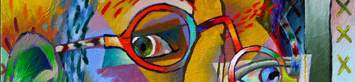
In a couple of past posts, Got Color! – Part 1 and Part 2, I spoke of how your use of color controls the life of your painting. Well, if color controls life, your use of value determines the level of drama in your paintings.
For those of you non-painters out there, value, in painting, refers to the gray scale levels in a painting: what’s left when you strip a painting of its color or hue, similar to what you’d see in a black and white photograph of a full color painting.

Most painters work with 9 values: 9 even incremental stages of gray from pure white to pure black. There are some painters out there who believe in reducing this spread, limiting their paintings to only 4 values. They believe the 4 value limit increases unity and cohesiveness in a painting. You’ll have to decide for yourself in which camp to pitch your tent.
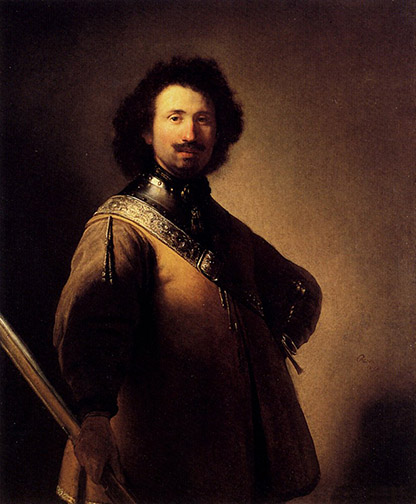
Colors with values at the light, white side of the scale are referred to as Tint. Colors with values at the dark side of the scale, towards black, are referred to as Shade. The more contrast you provide between your light values and your dark values (see Rembrandt’s, “Portrait of Joris de Caullery,” at the top of this post), the more tension, drama your painting will communicate. Paintings with all their values at the shade end of the value scale, exude a dark, melancholy feeling. Paintings with all their values on the light, tint end of the value scale, tend to be serene in mood.
Additionally, the darks in a painting act as a kind of armature or foundation, supporting the entire composition, as they weave in and out of background, mid ground and foreground.
When you determine how values will be used in your paintings, you are determining the drama to be communicated by your canvas, as surely as if you were a lighting director, lighting a set for a play or film.